March’s Font of the Month: Lithographer Text
While my wife Emily was getting her master’s degree at Dartmouth College, I often found myself on campus with time to kill. I spent most of it in Dartmouth’s iconic library building, which housed a massive mural, a letterpress studio, and plenty of beautiful spots to sit and work.
Virtually every visit to the library included a stop at the Evans Map Room. There was always something interesting on display, but the real attraction was the discards pile in the corner. The library was constantly circulating maps in and out of the collection, and discarded maps were free for the taking. It turns out that “If we don’t take this, it might get thrown away!” was a pretty convincing argument for Emily and me to grab maps that we didn’t need and had no space to display.
During the two years that we lived nearby, we collected over a dozen large-scale maps, all mounted on fabric and hung from a wooden rod—the kind of thing you might see in an old-fashioned classroom. They are mostly from the first half of the twentieth century and made in Europe, and feature locales across the world. Rolled up and standing on their side, many are taller than I am.
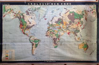
Recently, I’ve spent a long time staring at a German map from our collection entitled “Geologie der Erde” (“Geology of the World”). It was produced around 1921 by the Justus Perthes Publishing Company in Gotha, Germany and illustrated by Dr. Richard Rein. The photo above doesn’t do it justice…its beauty is all in the details.
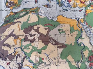
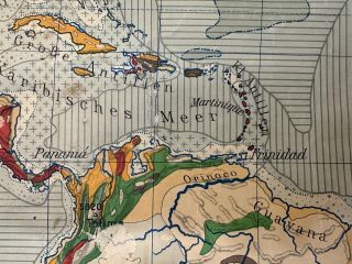
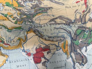
I’ve been asked before if I have a dream custom typeface project, and I think my answer might be to work on a typographic system for maps like this one. It requires such an elegant balance of density, variety, and legibility, cramming so many different kinds of information and styles into one unified design. I mean, this map has got everything: serif, sans serif, low contrast, high contrast, upright, italic, a backslanting contra-italic, and even a connected super-italic!
These days all our digital maps use a few weights of a UI-ish sans for everything…that was not always the case (full image), and it does feel like something has been lost. So I could wait for the perfect cartographic client to come along, or I could just start drawing.
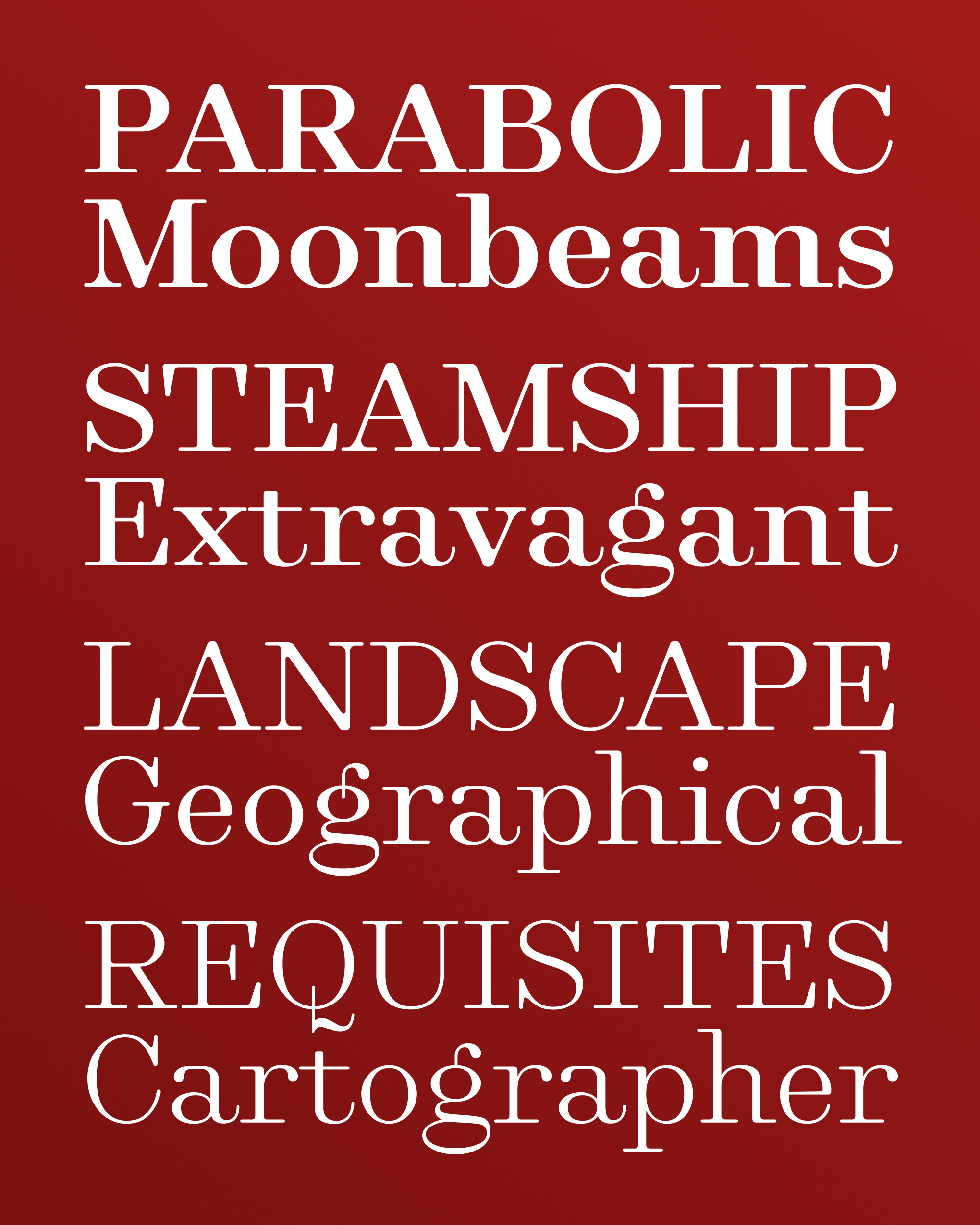
What I’m sending you this month is less of a usable typeface and more of a promise. The character set and features are limited, the kerning is sparse, and the drawing is rough, especially on the bold end. For next month’s edition, I hope you don’t mind if I continue to refine this design, while adding small caps, lining figures, and italics.
I think the font I’m sending you today as the foundational text styles for a larger upcoming family. I’ve tried to capture some of my favorite quirks from the map’s lettering and make them palatable for extended reading. I’m talking about the long serifs, the huge tail on the a, the horizontal stress of the g and its playful antenna, and the moments of abrupt flatness that come from a pointed pen, such as the high shoulders of letters like n and the flat top of the a.
Typographers will often eschew “Modern” Bodoni-esque typefaces for extended text because the contrast can be overwhelming. I tried to soften things up here, so hopefully it’s not too hard on the eyes. I’ve been using it for my email and web browsing over the past month and I don’t think it’s half bad!
Longtime club members may recall that I have another long-serifed, pointed pen-inspired font in my library called Club Lithographer. (For more on that font, see also this recent review of the design and its origins by Katerina Grushka.) Club Lithographer is italic-only, and I’ve wondered whether it should get an upright companion someday.
At some point in the process of making the font I’m sending you today, it dawned on me that I was kinda-sorta drawing that upright companion, albeit one for text, without any of the maple-syrupy, display-ish details. So I’ve started to think of this design and Club Lithographer as two antipodes of the same type family. You can convince me otherwise, but for now I’m simply calling this design Lithographer, and I hope that you enjoy it very much.