November’s Font of the Month: Bradley DJR Outline
For November, I’m sending you Bradley DJR Outline, a continuation of my Bradley revival that resurrects its outlined variant. American Type Founders published Bradley Outline in the late 1890s, a few years after the original design created by Herman Ihlenburg and based on lettering by Will H. Bradley.
This has been on my to-do-someday list for a long time, but never seemed like the most pressing thing. Bradley DJR is arguably the most holiday-coded font in my collection, and I needed something quick and easy to work on this month, so this seemed like the perfect moment to take my revival to the next level.
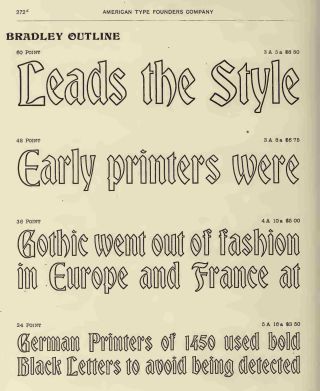
Bradley Outline as shown in ATF’s Specimens of printing types, 1897
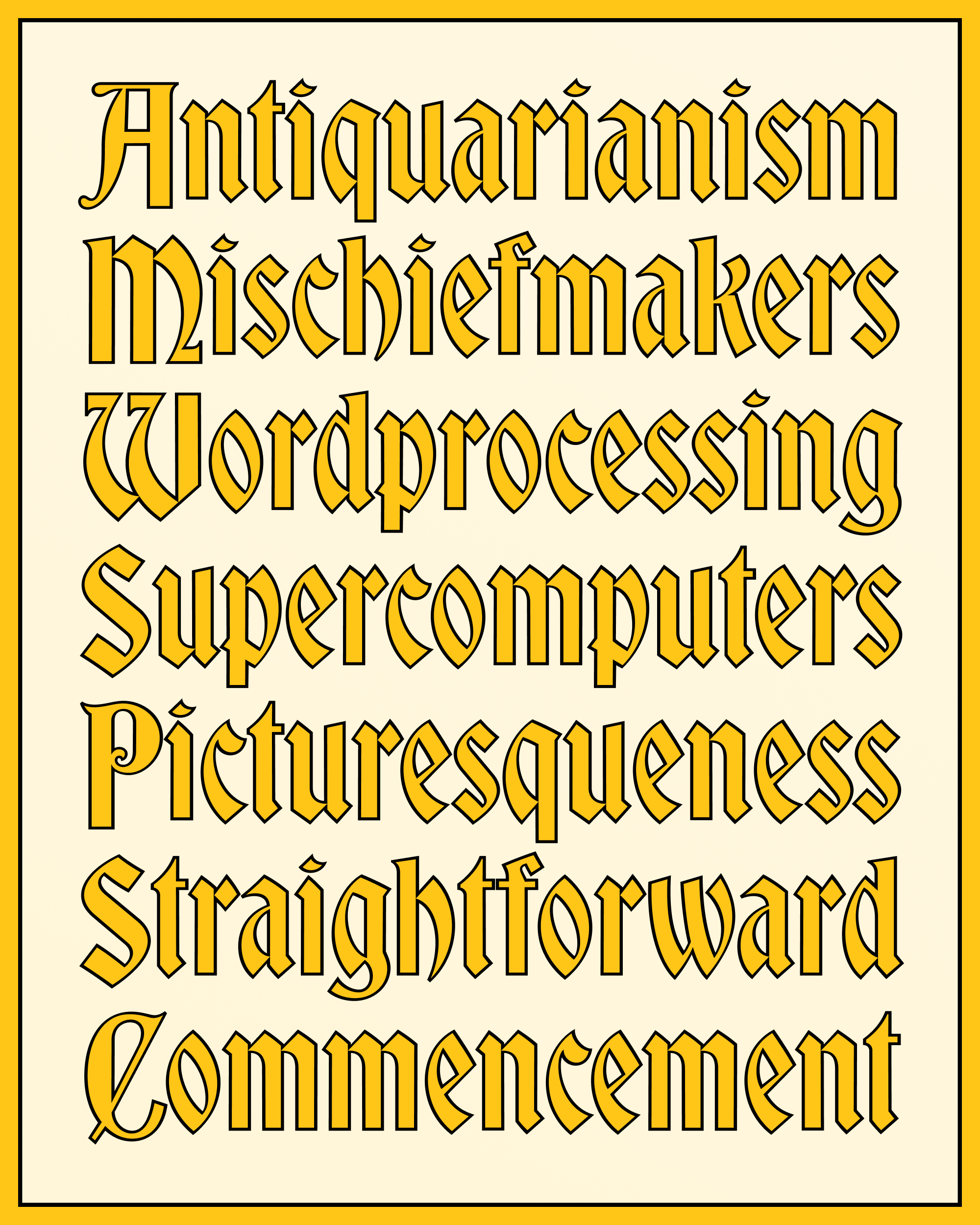
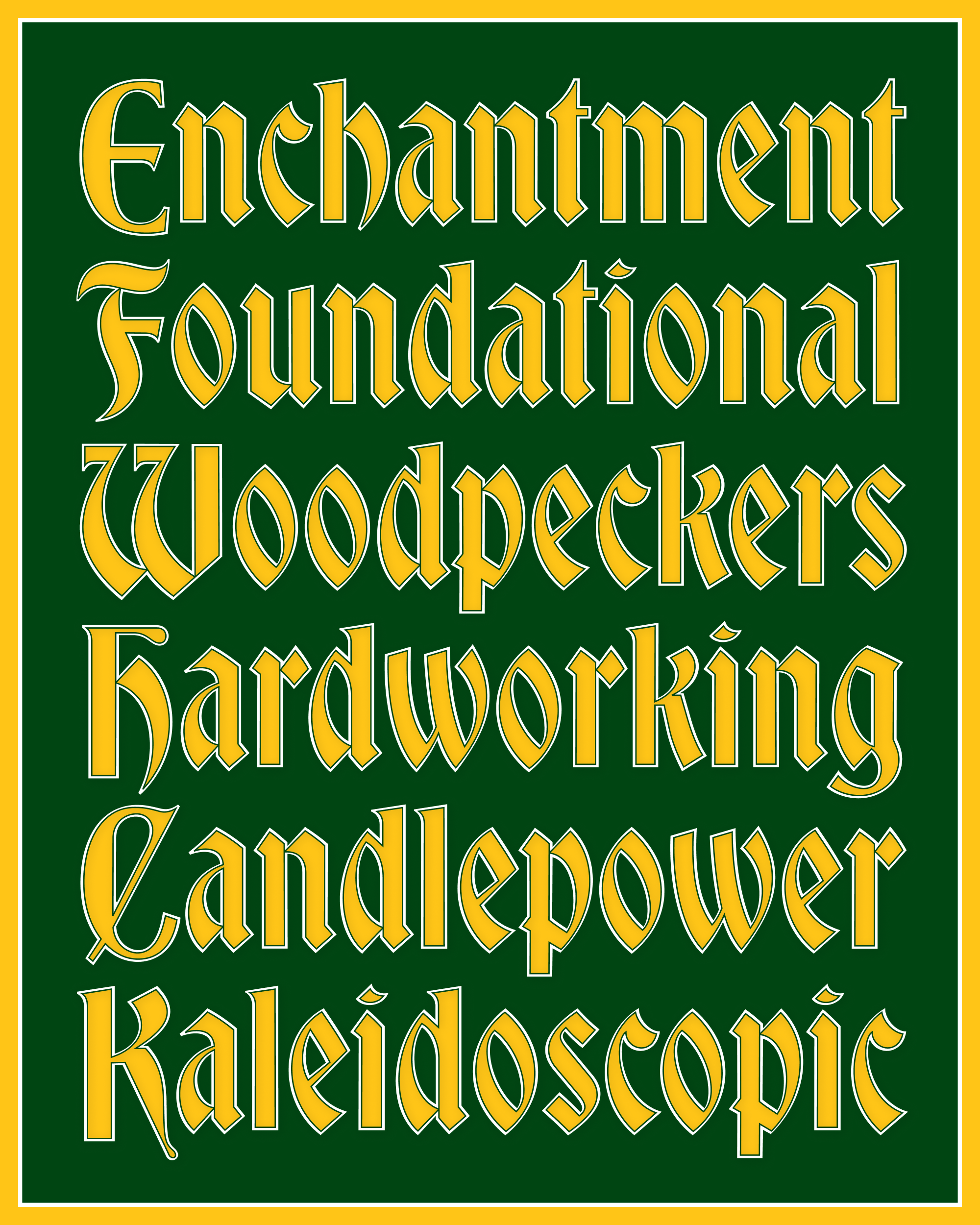
The original Bradley Outline has a charming handmade touch, giving the font a very different feel than the mechanical strokes we can easily create in our contemporary apps. My version strives to find a midpoint between the two, toning down some of the round corners and wobbly line quality that would make it jarring in a crisp, modern design, while hopefully preserving most of its appeal.
Unlike a purely mechanical outline, this stroke subtly modulates its contrast to follow Bradley’s diagonal axis of thicks and thins. On top of that, it opportunistically pinches at thin strokes and tight intersections to create a little extra space—this is most apparent in the crossbar of a, the northwest and southeast corners of s, and the tight interior space inside f.
At the last minute, I decided to add an interior stroke that separates the Outline from the Fill. (One reason this mailing is late again...I’m sorry!) Most of the time you probably won’t need it, but in some settings I think it really helps the letters pop!
I’ve been making color fonts for nearly a decade now, but I still struggle to find an intuitive way to present them to users.
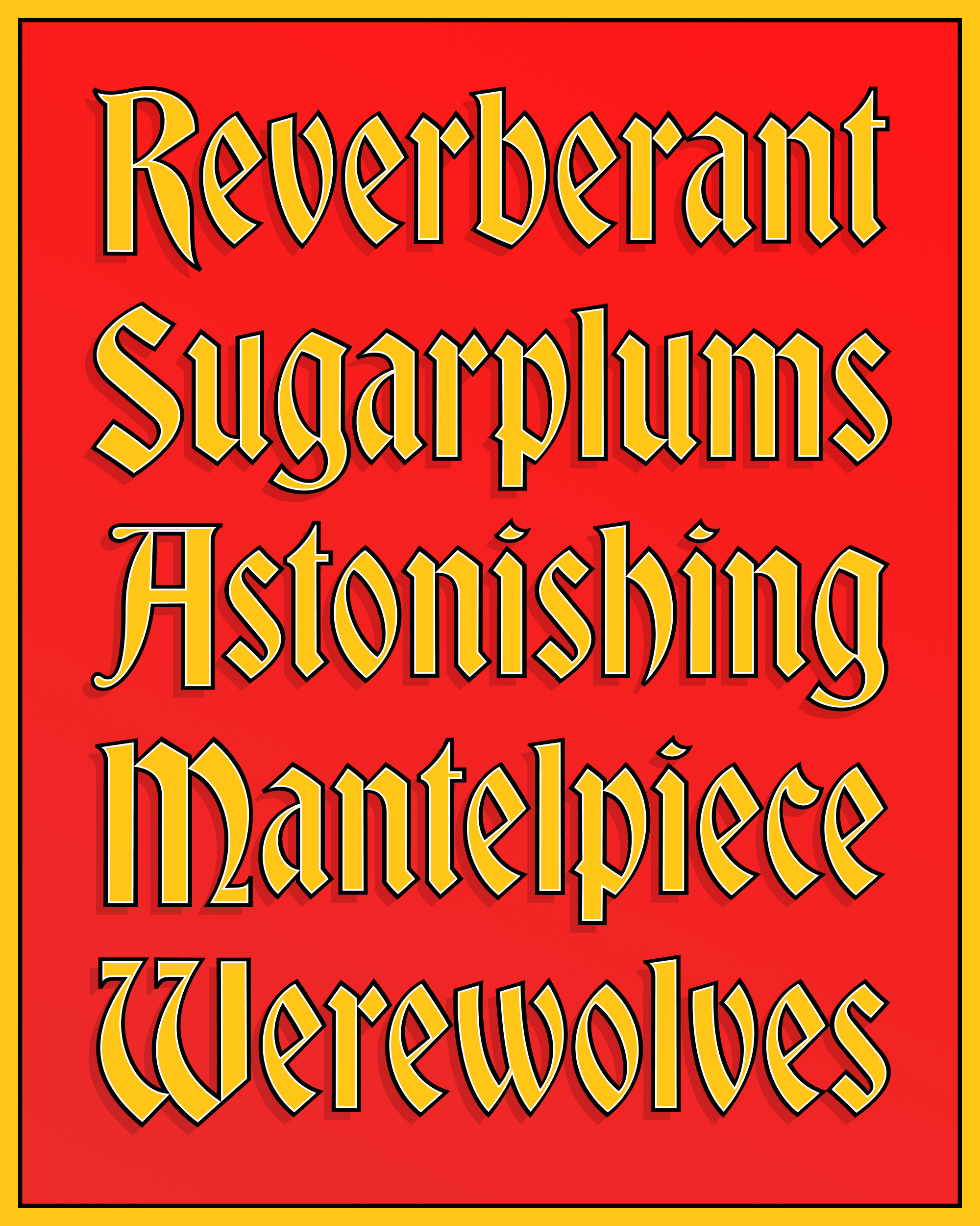
Here I’ve included the Regular (Outline) and Fill fonts, for you to layer as you please. I’ve included color fonts with Red, Gold, and Silver palettes for you to work from, as well as SVG versions of these that will work in legacy apps. And like I did for Nickel, I’ve included a special style (“Color”) which uses the current foreground color in your application to set the Fill.
Please keep in mind that you can always upload these fonts to my Color Font Customizer or use CSS override-colors to create your own palette. And remember that you can use these layers and color fonts in combination with mechanical strokes and drop shadows to customize the look of the letters even further.
This update may be small, but it is mighty! I hope it helps you add a pop of color to your holiday designs, as well as the things you make in the year to come.