October’s Font of the Month: Gimlet Sans Mono (Beta)
Monospace fonts used to be specialty fonts, designed for typewriters, computer programming, and tabular data. But in recent years they have started to take on a more mainstream role in graphic design, offering alternatives to existing type styles that feel just a little more technical, data-driven, or peculiar.
I’ve always been interested in how technical limitations can influence the aesthetic choices in a typeface, and how those choices often then take on a life of their own that transcend the original tech. I feel like this is what is happening with Monospace fonts, which you will often find used in contexts that don’t demand that text is set on a fixed-width grid. My typeface Input is one of many typefaces built around cultivating the feeling of “monospacedness”, even in its proportionally-spaced styles.
At the same time, I’ve been a bit skeptical of the every-sans-needs-a-mono trend…are there really so many use cases for this, and will the sans just get watered down in the process? It was Ruggero Magrì’s idea to create a monospace for my revival of Forma, and it took some convincing to get me on board. But since Ruggero and I released Forma DJR Mono late last year, it has been eye-opening to hear from users how much they appreciate the addition to the family. It has made me reconsider what a general-purpose Monospace can and should be.
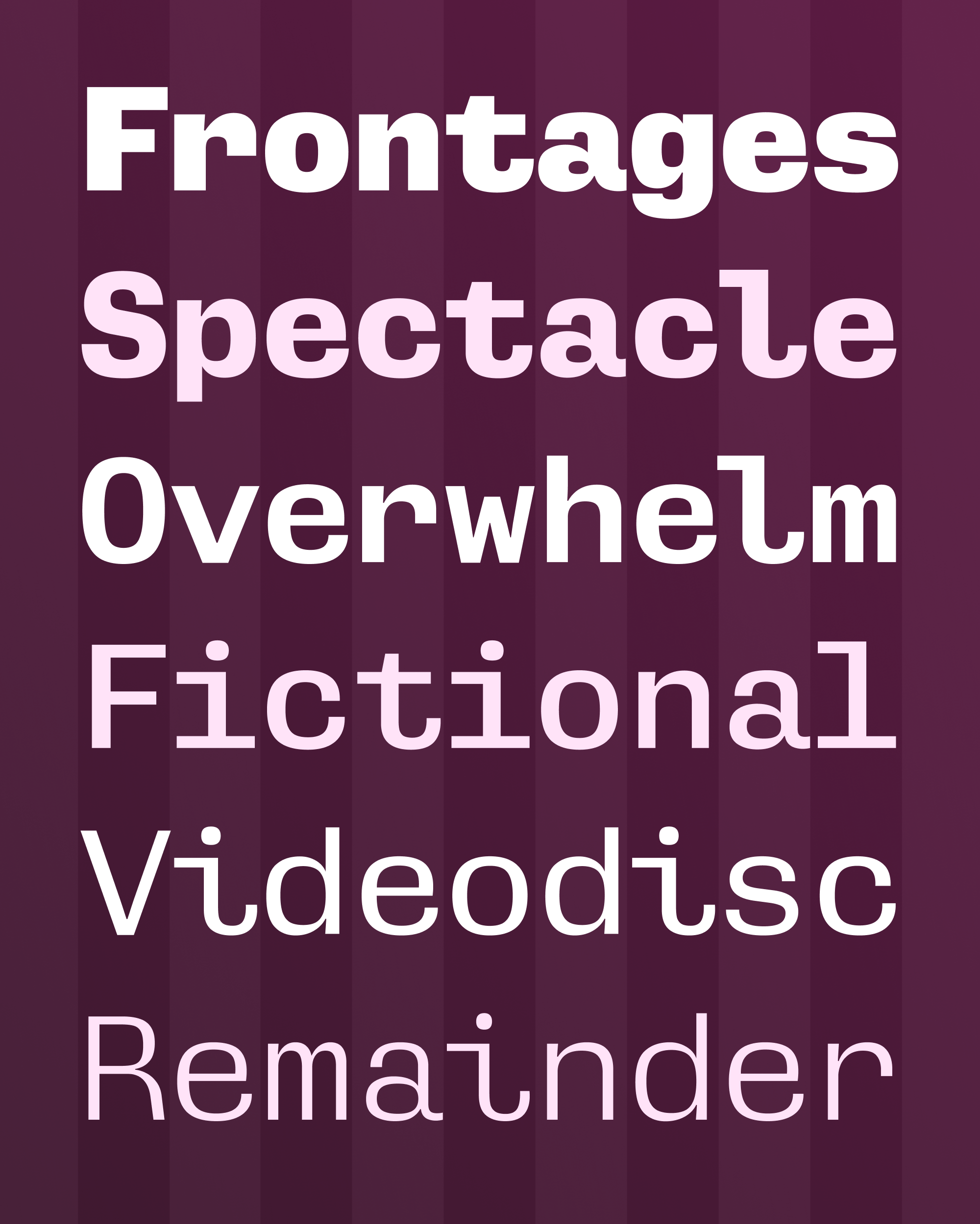
And this month I’ve been working on Gimlet Sans Mono, a monospace companion for my ever-growing quirkhorse Gimlet Sans.
With Gimlet Sans Mono, I tried to leave all of my Monospace baggage behind, and instead design a general-purpose sans serif that just happens to be monospace. I couldn’t decide which of Gimlet Sans’s optical sizes to use as the starting point for the monospace, so I monospaced them all. Is an optical size axis for a Mono useful to anybody? I truly have no idea.
Every monospace font has to confront a core liability: our letters vary in width and complexity, and cramming them all into a single space will inevitably get uncomfortable. It’s like forcing every person you know to wear the same size t-shirt—it may be a perfect fit for some, but others will be swimming in it or bursting at the seams.
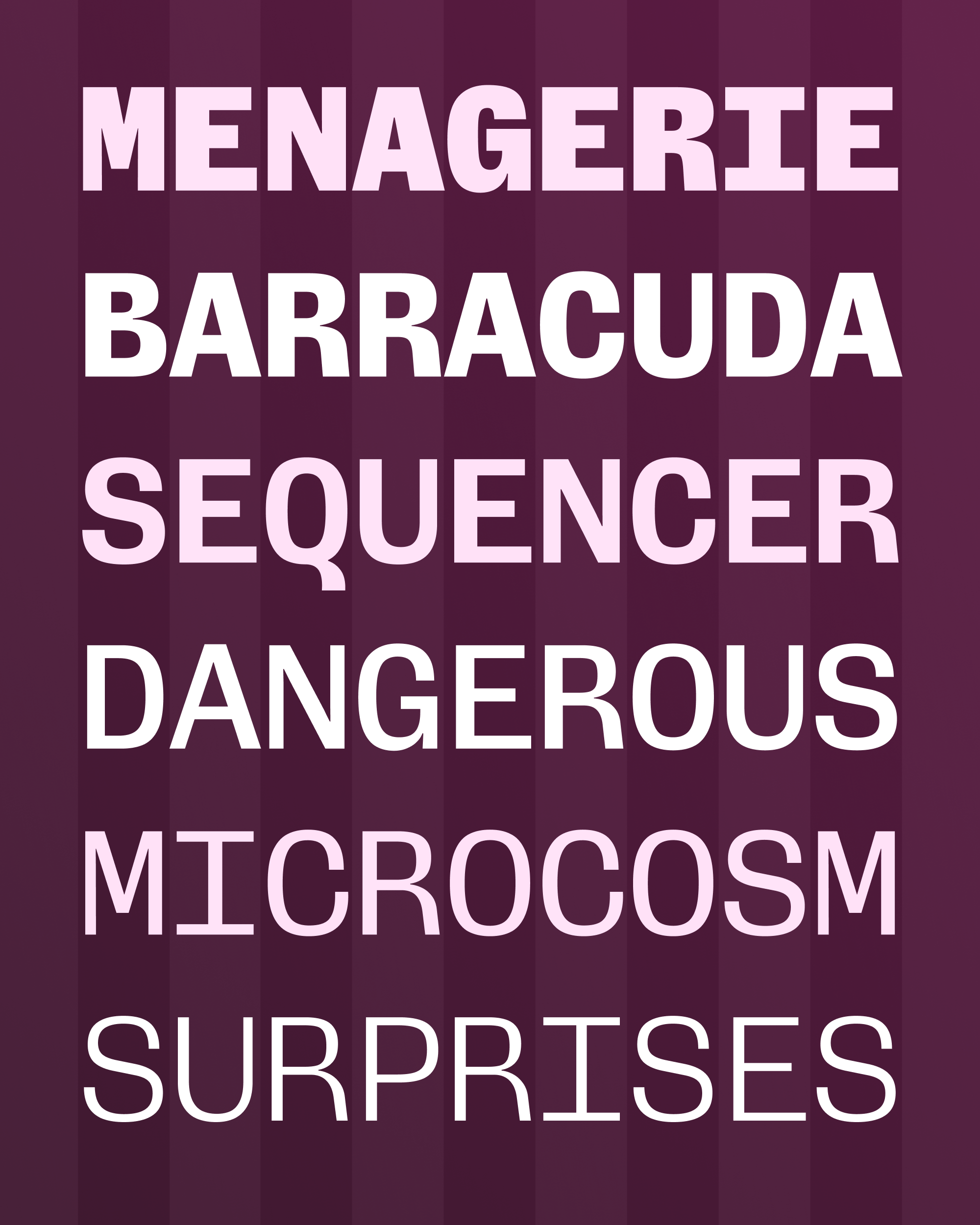
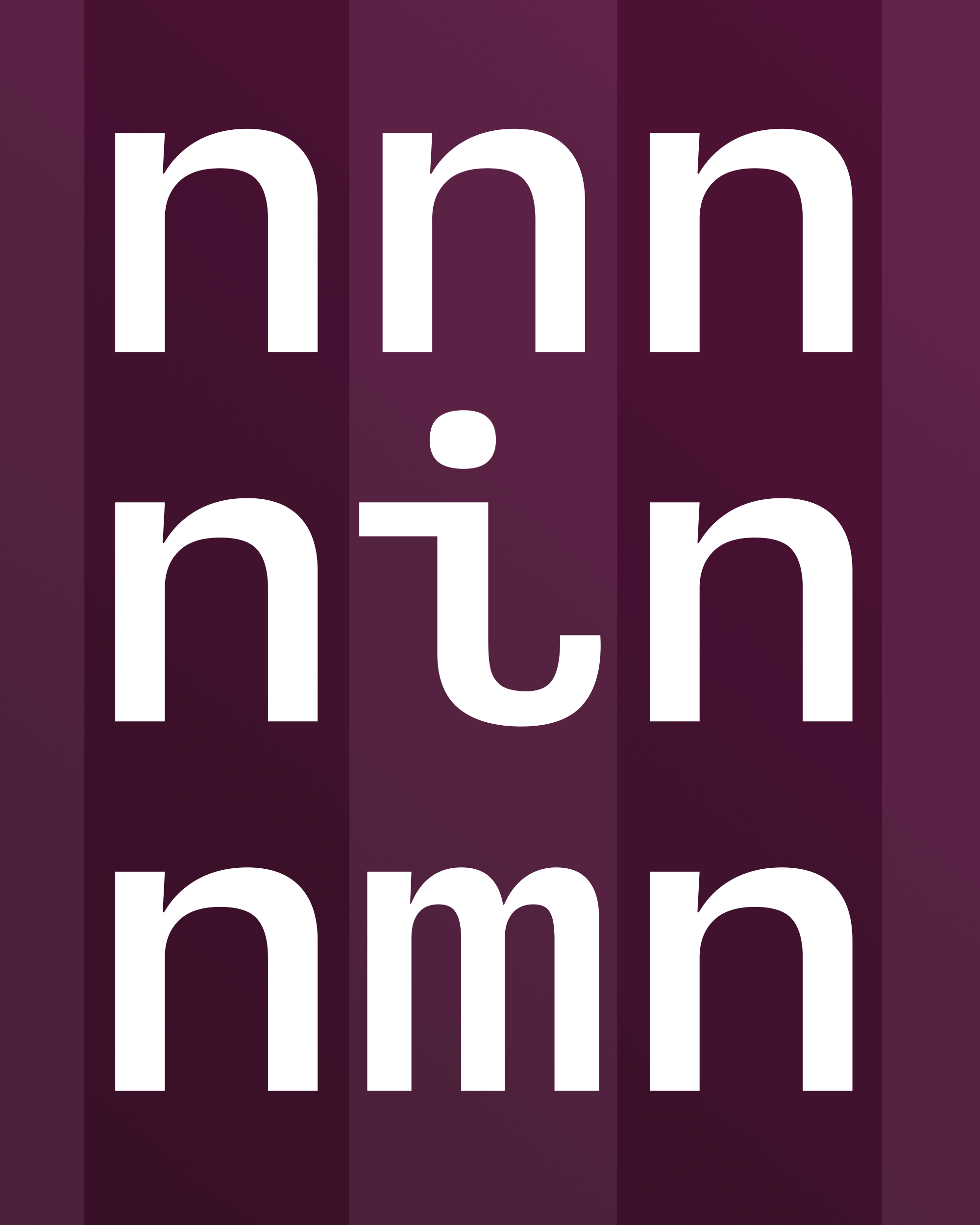
Wide letters like M / W / m / w and narrow letters like capital I and lowercase i / l always require special attention. For the lowercase i and l, I waffled between the conventional three-serif style (see “Fictional” in the image below) and a quirkier flip-curl style that borrows from the bottom of c and t. The former spaced better, since it didn’t leave a huge gap on the lower left. But it just didn’t feel as interesting or emblematic of the typeface. I left it as an alternate, in case you disagree!
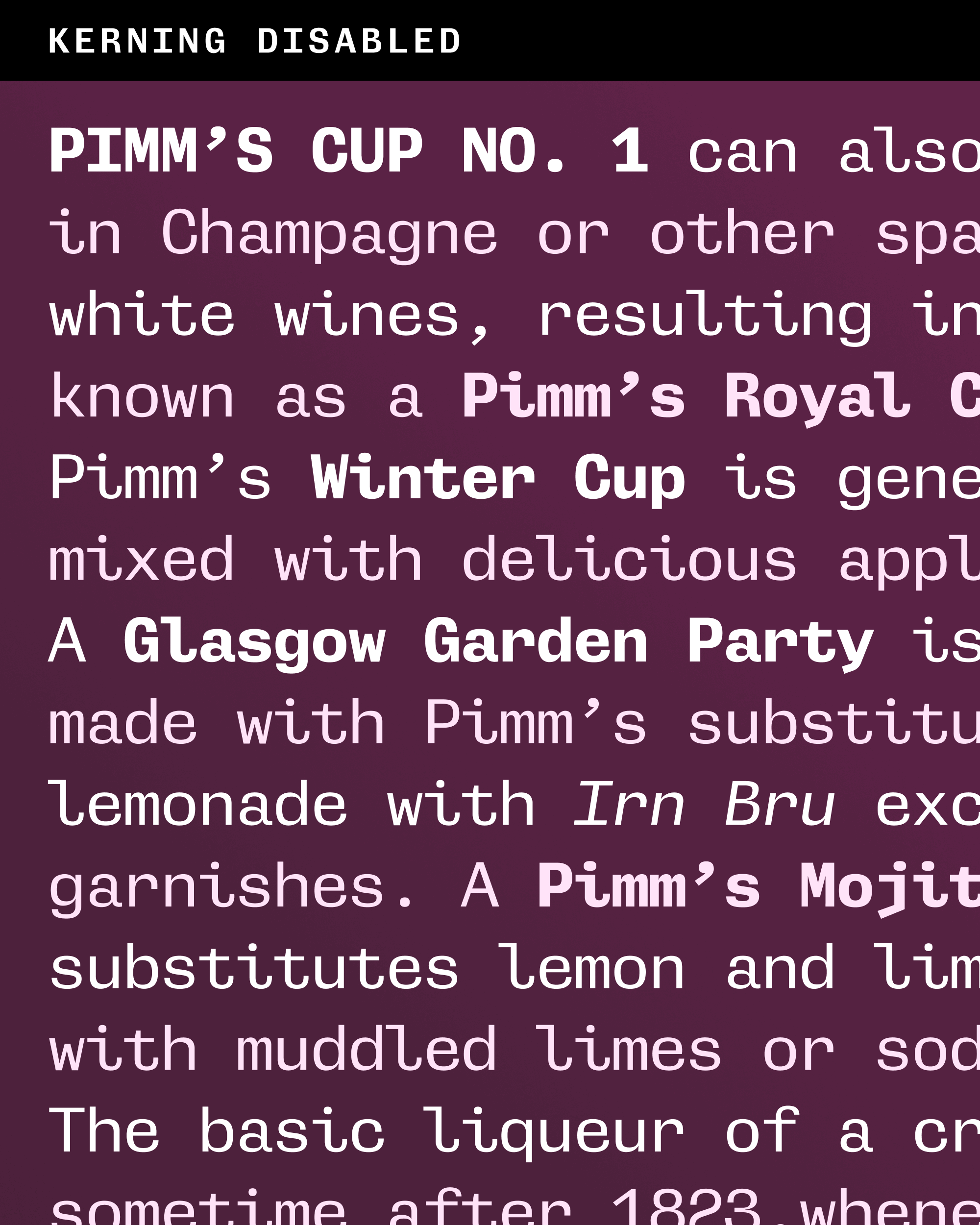
It’s important to note that, as the narrow and wide letters are getting stretched and squeezed, the negative space around them is getting stretched and squeezed as well. This creates an uneven rhythm in text, which is exacerbated by the fact that monospace fonts traditionally have no kerning to help with especially troublesome pairs.
At first I tried to do something similar to the “texture healing” approach popularized by Lettermatic’s Monaspace fonts for GitHub, which contextually widens letters like m and narrows letters like i when they appear in sequence. I really like this idea, but found this approach to be a little too overt for Gimlet Sans…I didn’t want to lose too much of the monospace flavor, and it was a little jarring to see different widths of the same letter appear in the same word (“filmmaker” for example).
I settled on a shift-kerning approach that leaves the letter shapes and widths as they are, but contextually shifts letters to the left or right in an attempt to balance out some of the unevenness. Essentially, I treat the narrow and wide letters like i and m as magnets that can either attract or repel the letters around them, without affecting the monospace grid. The effect is much more subtle than texture healing (maybe too subtle!), but it affects many more pairs.
This shift-kerning approach hacks the Monospace grid, but I also wondered if it would be useful to have a second version of the font that does away with the Monospace grid completely.
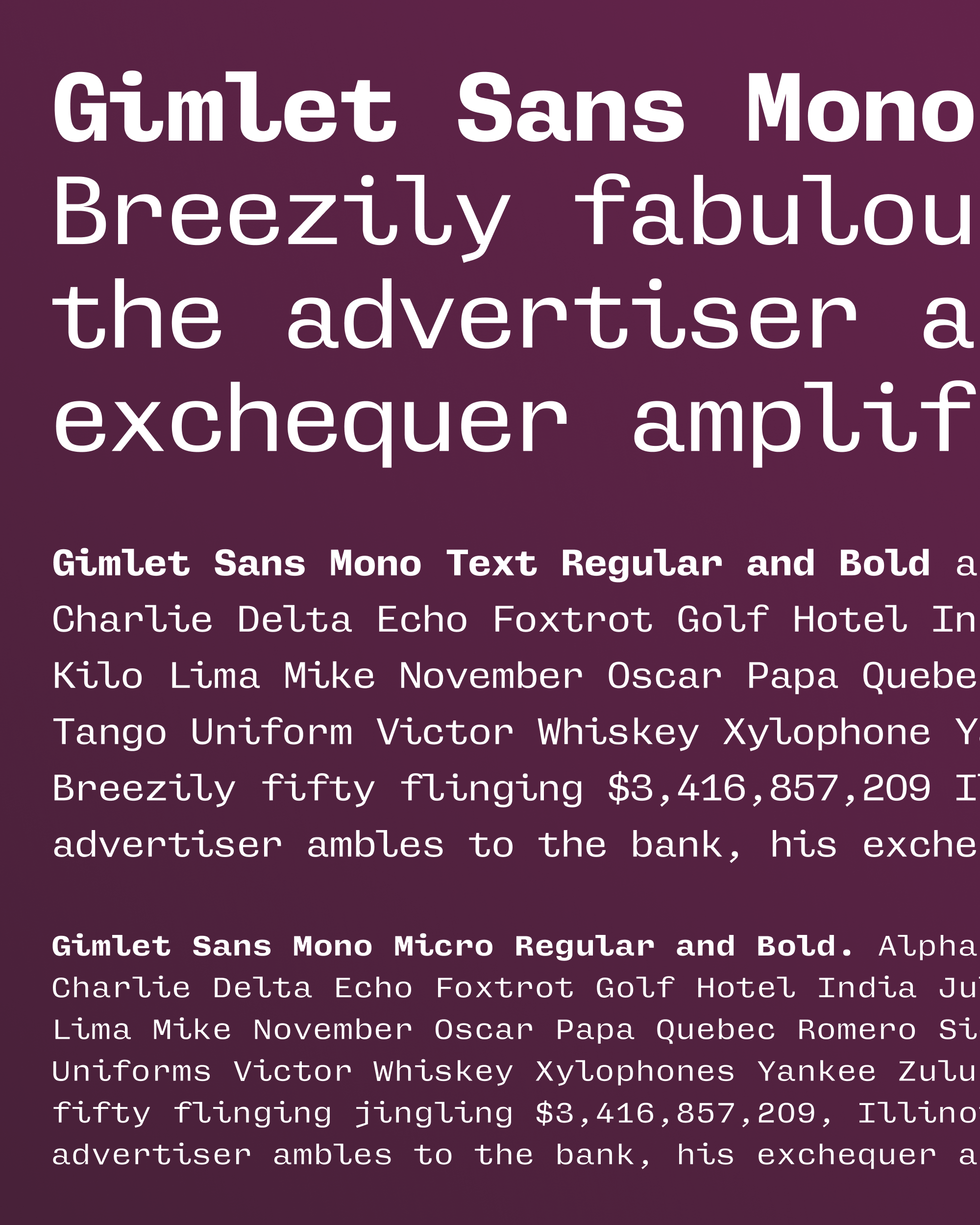
Gimlet Sans UnMono has letterforms that are identical to the Mono, but with proportional spacing and kerning that are a little easier to take, especially at display sizes. My process was simple: I unset the bit in the font that officially makes it a monospace, narrowed the wordspace and some other punctuation like the period and comma, and copied in the kerning from the original version of Gimlet Sans (with a few tweaks here and there).
I’m still not feeling sure about any of this, and I’m still changing things even as I am about to hit “send”...the fonts are very Beta. But I want to hear what you think about my little trip down this monospace rabbit hole. Shift-kerning…good or bad? Will you ever use the Optical Size axis or the UnMono version? I’m genuinely curious to know.