October’s (belated) Font of the Month: Bungee Gothic lowercase
I’m sorry this is so late! It has been a little extra-chaotic over here, and I wanted to give this mailing the attention it deserves. Because, this month, I have for you a tale of three lowercases.
This year, I celebrated Bungee’s ten-year anniversary, and I’ve been thinking about what (if anything) should come next for the all-caps family.
In January, I sent you some narrower widths of the design. And almost as an afterthought, I threw in a quick exploration of a lowercase as well. It looked like this:
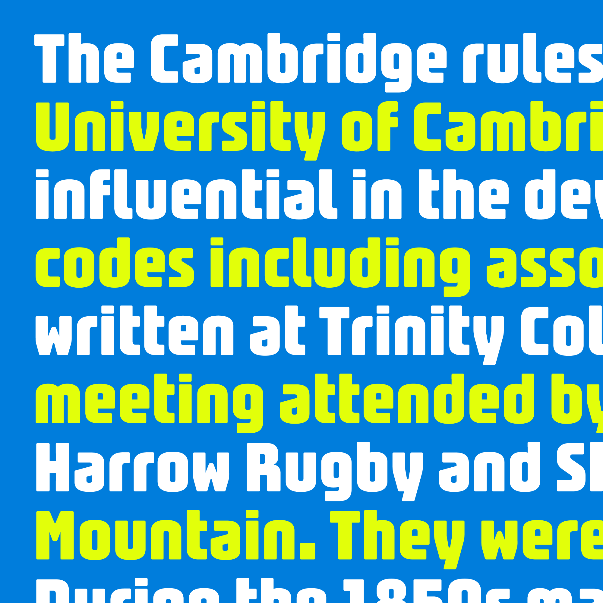
A few people wrote to me about this lowercase, wondering if it wasn’t quite the right match for Bungee’s tone. I think they were right.
It’s pretty common in any font for the lowercase to feel a bit rounder than the caps, but this particular lowercase really exacerbated that difference with its spurless forms and horseshoe n.
I liked the a, but it did stand out. And the whole thing had just a bit too much of a Streamline Moderne thing going on.
So I ditched that design and tried a more conventional lowercase instead:
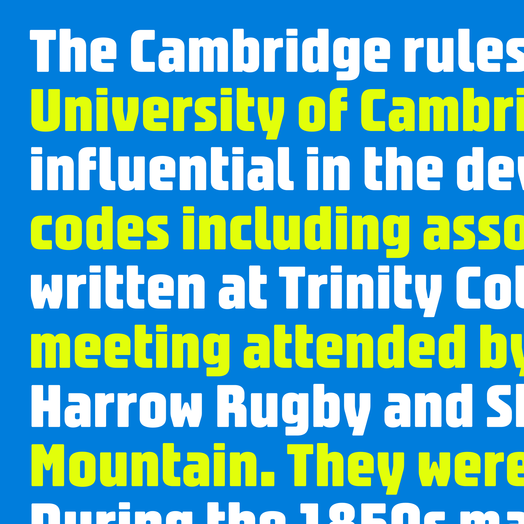
No question—once I added spurs to the letters, the lowercase became a lot more versatile and practical. But after testing it for a while, it started to bother me. It felt too non-specific, like it could be the lowercase for any bold sans serif. I worried that it had strayed too far from Bungee’s gaspipe roots.
I’m not sure if this metaphor totally tracks, but in a way, fonts are like actors and typography is like casting a film. I think of Bungee as a kind of character actor, a distinctive specialist that a film can employ to make a small part really pop. And this version of Bungee feels like it is trying a little too hard to take on a more conventional leading role.
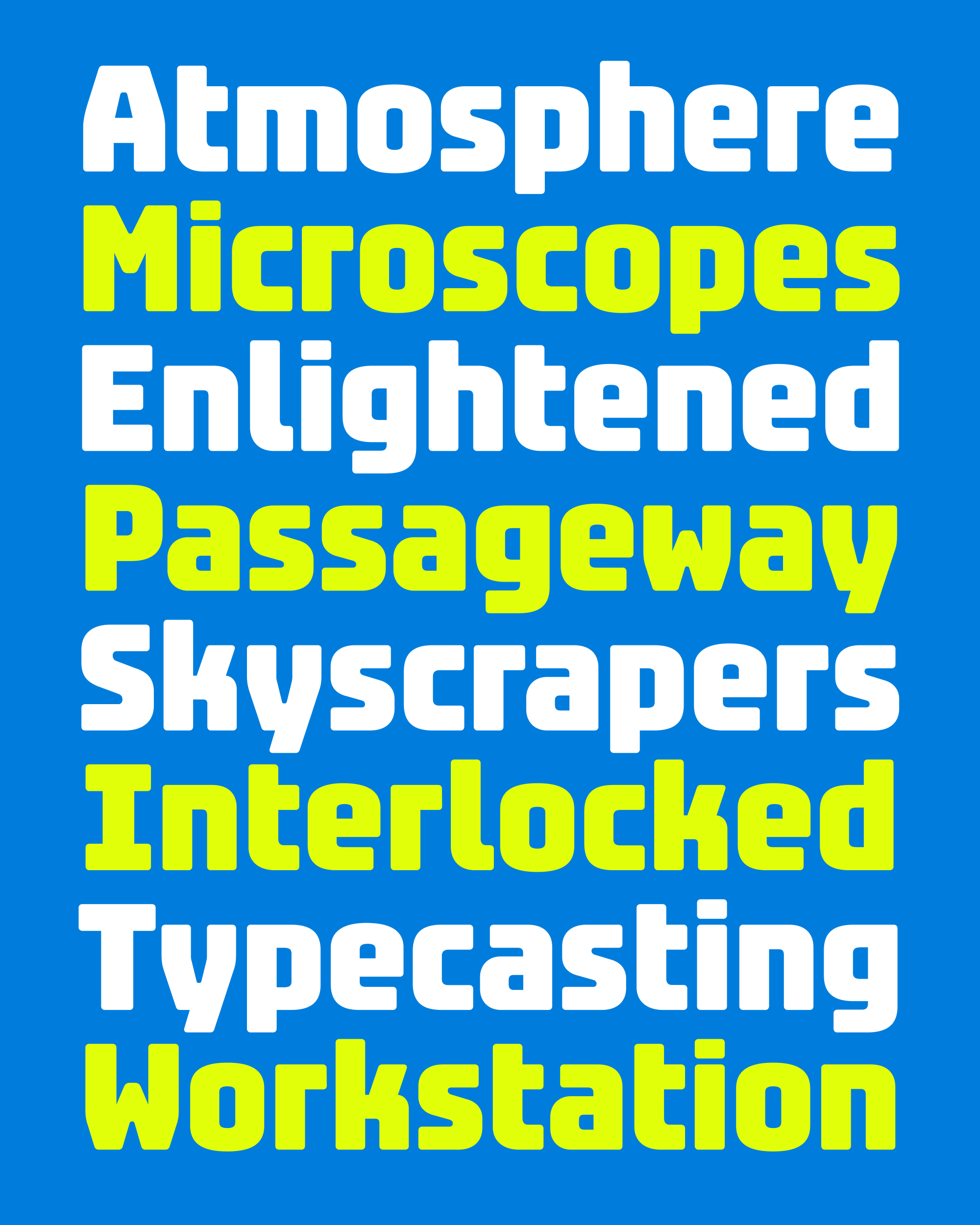
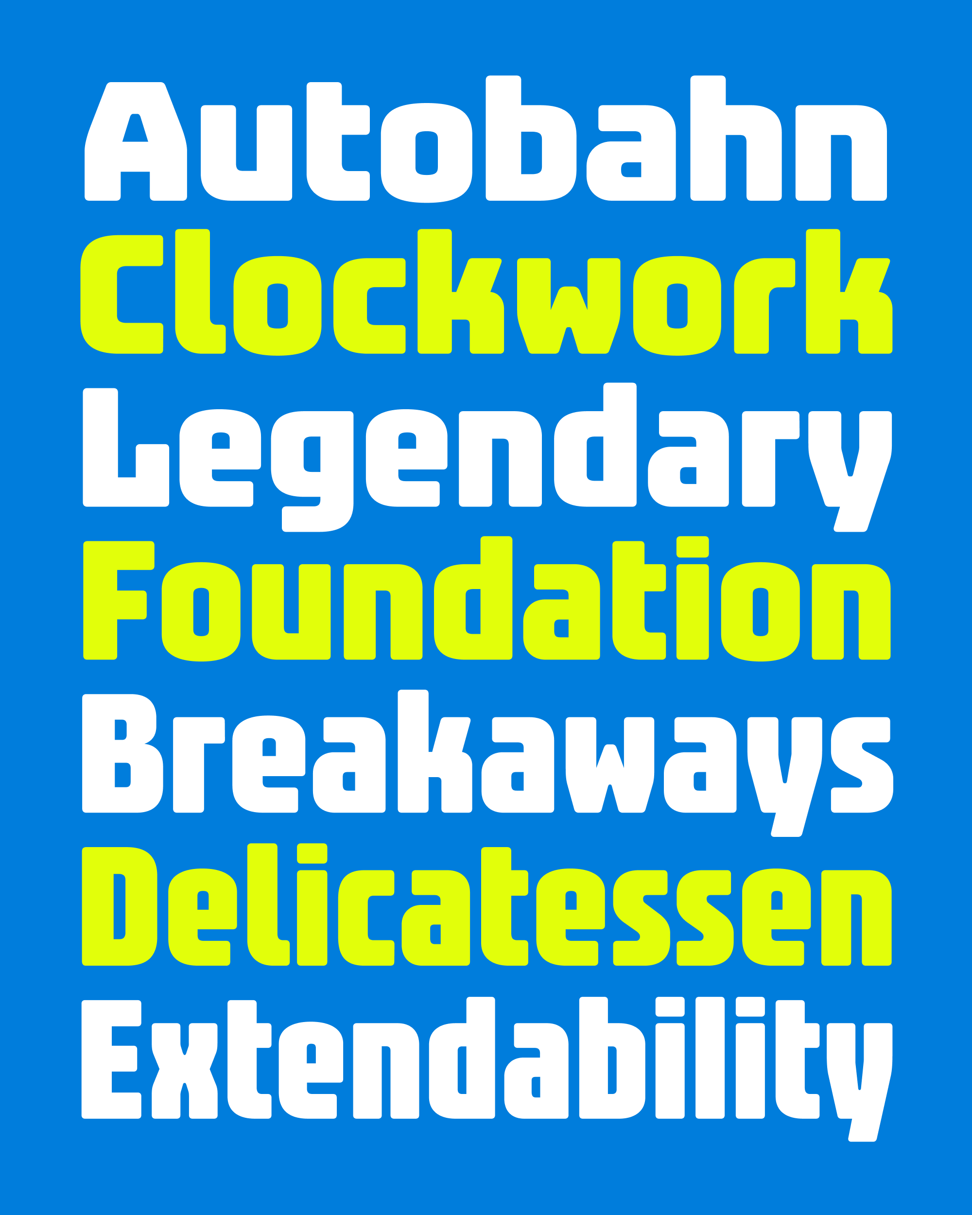
So I tried a third time, and landed here:
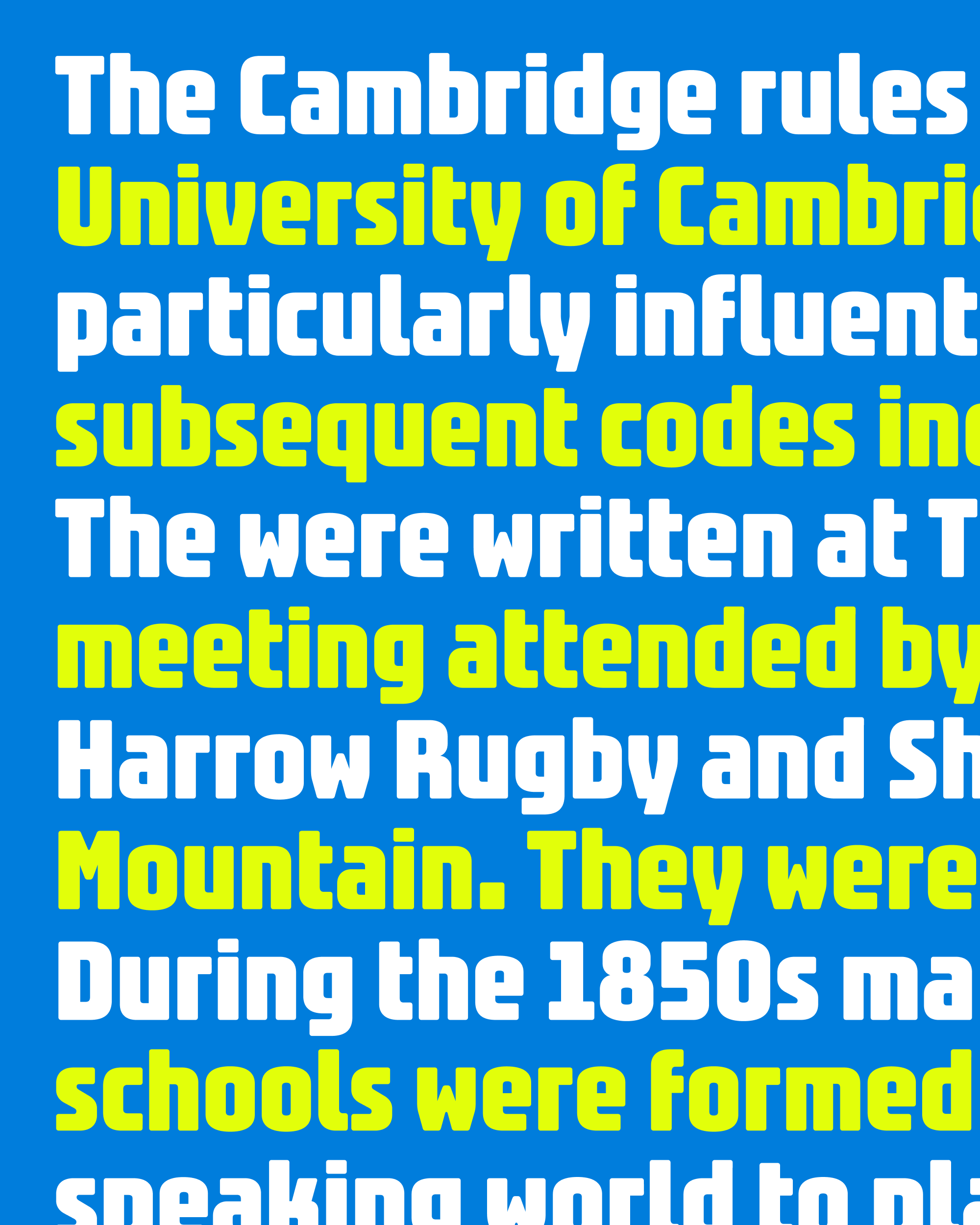
I think that this is closer to striking the right balance. It’s stylized, but not as distracting as the first version. It feels more in line with the construction of Bungee’s caps, and is simpler and gaspipier than the second version.
It’s easy to think of the type design process as a single, continuous progression from sketch to final design. But I often find myself in fork-in-the-road moments like this, pursuing multiple paths that all feel like they could be viable options. In the end, I just need to make the best choice for the typeface and stick with it.
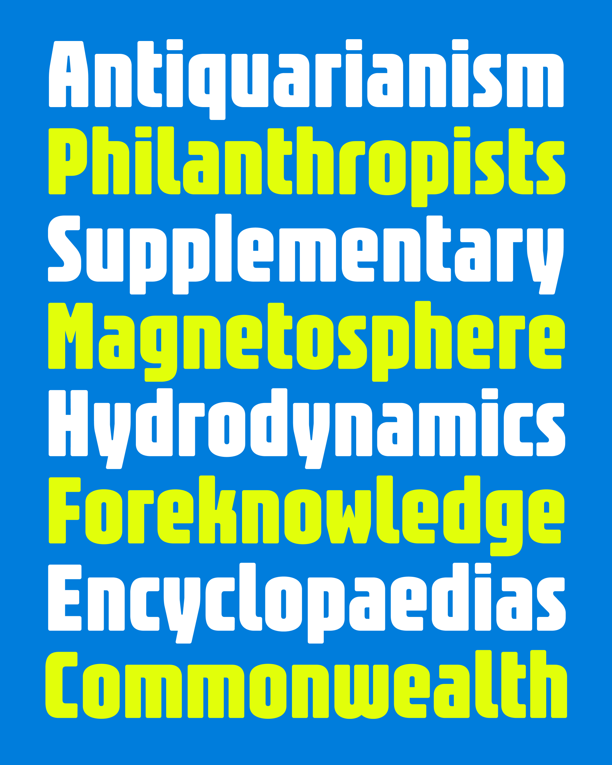
Like all designers (I think), I go through cycles of falling in and out of love with the things I make. I’ve waffled on whether I should even bother with a lowercase for this design—I wonder how many of the folks that use Bungee actually miss it.
But I’m feeling an itch right now to tie up some of the many loose ends that I leave in my wake as I make fonts for the club. And this one felt especially unresolved.
Since this lowercase represents a breaking change from its all-caps predecessor, I’m officially renaming this version to Bungee Gothic to keep it separate in your font menu.
As we wind down this year, I hope you don’t mind that I’m giving myself permission to pursue a couple other small updates and loose ends, which will help me get caught up and back on schedule for 2027. I’ll be back to you soon with another one, and in the meantime I hope your November is off to an excellent start! —DJR