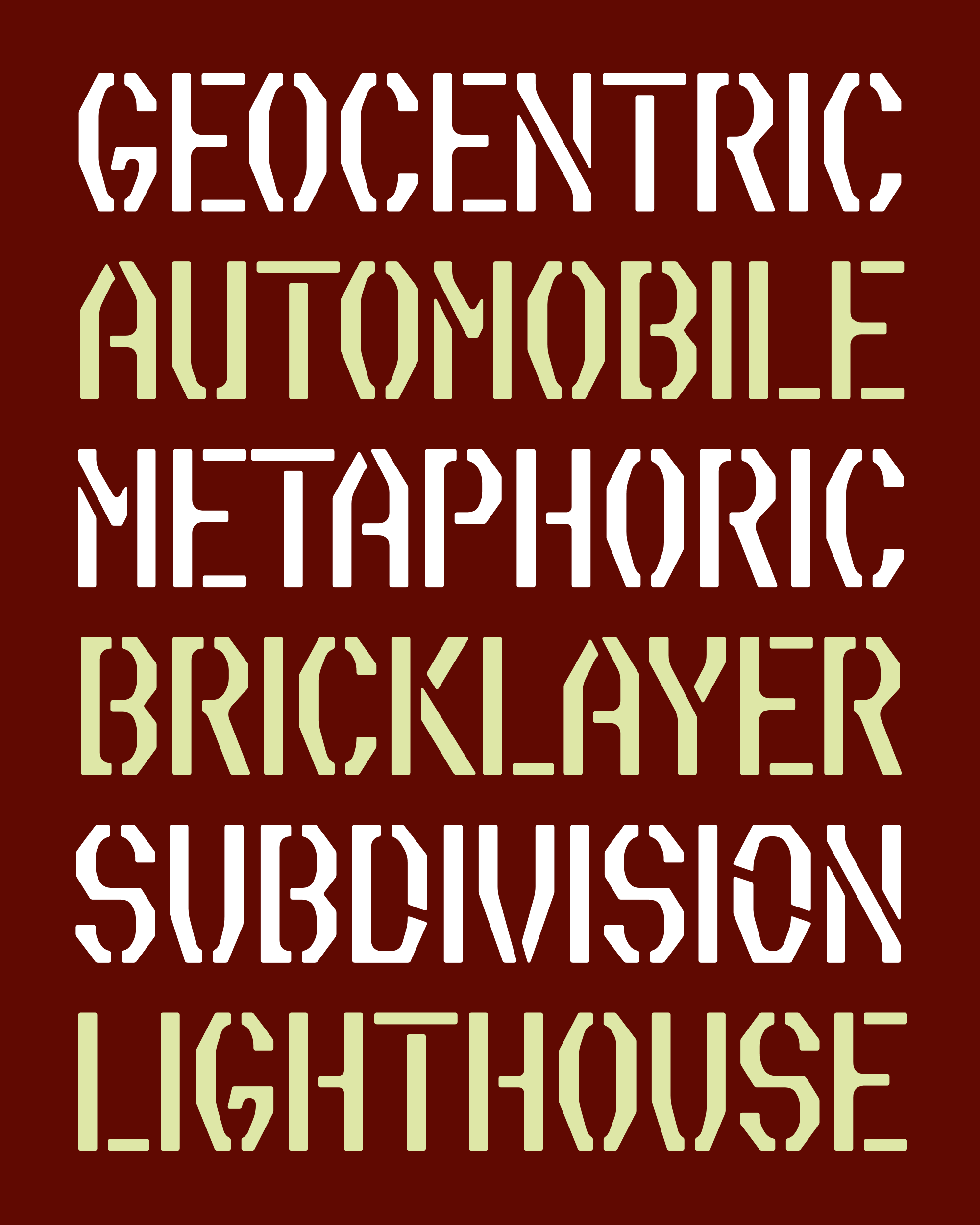
September’s Font of the Month: Slight Chance Stencil
Every font has an origin story, and Slight Chance is no exception. Its story began on the early digital readouts of a cable TV weather channel in Winnipeg, which Matt Hadden and Mark J. Szymanski sought to reproduce for their Environment Canada Weather Channel simulator.
For them, I made ECWC Standard, a straight-up revival that rendered the letterforms with CRT scanlines and tried to capture how the font would have looked in the ’90s on a new-ish TV with a clear signal.
But for me, I wanted to take a second pass at the same source material, and evoke the feeling of signal degradation and video tape decay more abstractly. This is when I developed the design vocabulary of Slight Chance, which combines asymmetrical octagonal exteriors with softened counterforms that look like they’ve slowly worn away.
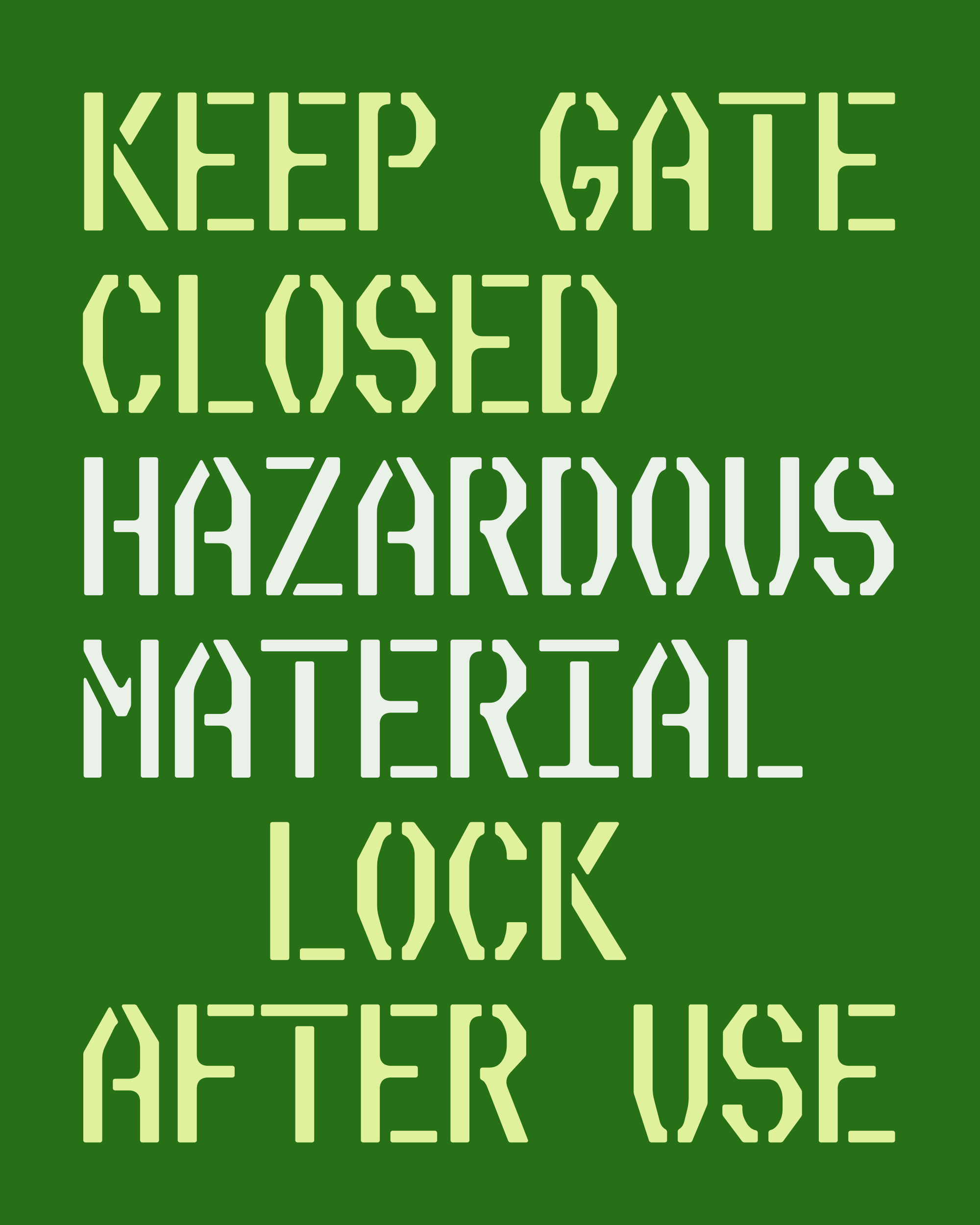
It has been an unexpected joy to see this screen-based design get recontextualized in the physical world, from print publications to the concerts of Indonesian alt rock band Perunggu. I had always imagined Slight Chance as a one-off, but seeing these designers really tap into the font’s worn appearance got me thinking about the design again.
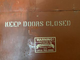
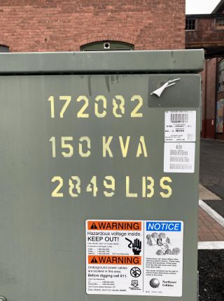
It made me think about the stenciled signs I would see on metal doors and transformer boxes, such as the one above that I photographed in Easthampton, Massachusetts.
It made me think about the fact that, up until now, I have only really drawn “idealized” stencil fonts—Pappardelle Party, the Nickel Stencils, and Megawarp all represent stencils that I want to exist in the world, and don’t reflect the stencils that I actually see.
And it made me think that, if I could just get past this font’s wholly digital origin story, Slight Chance’s letterforms could be perfect for slicing and dicing.
Now, to test that theory, I am sending you Slight Chance Stencil in both proportional and monospaced variants.
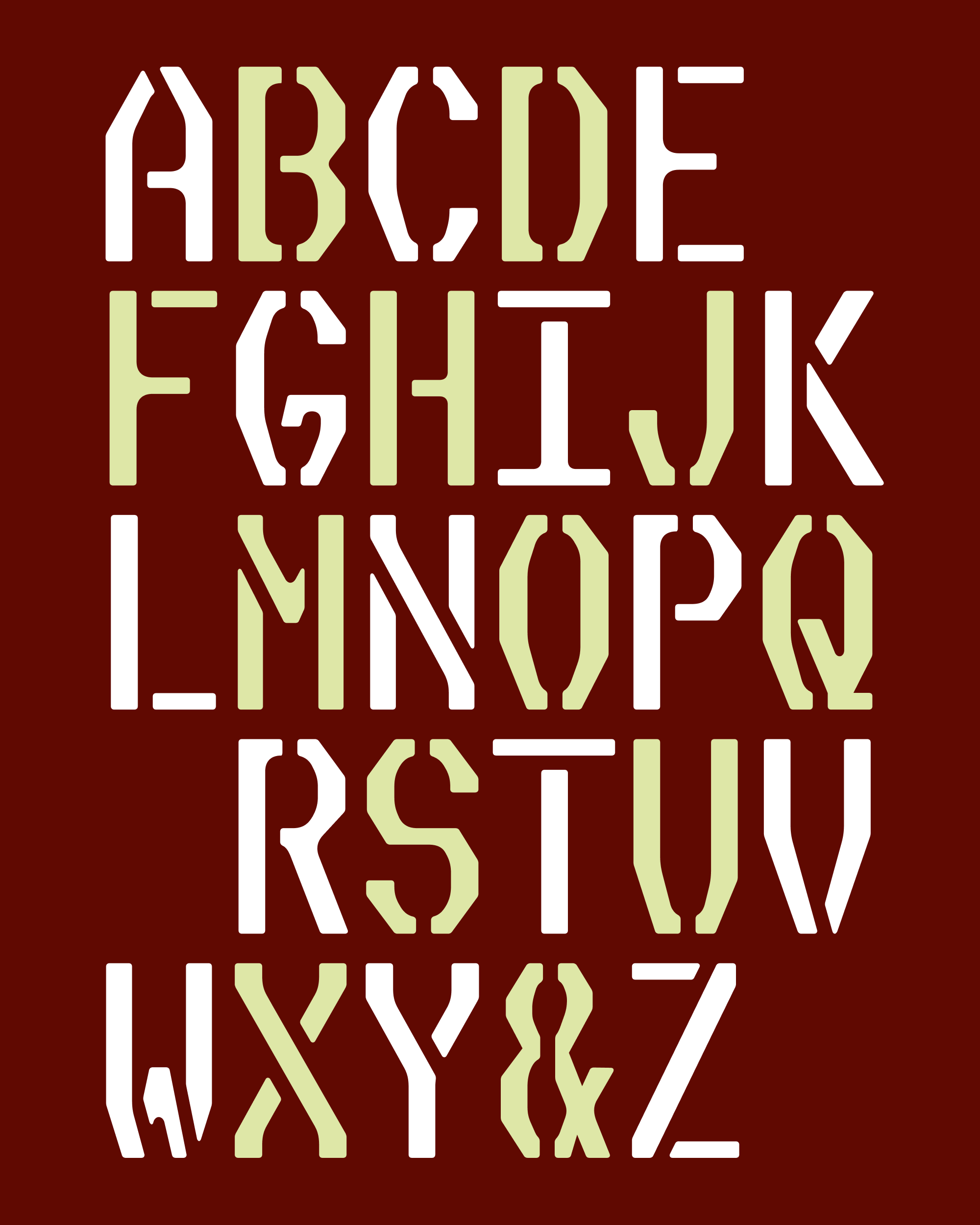
At first, I thought I was going to get creative with the positions and angles of the stencil “bridges” that traverse the letterforms. I tried fun diagonal bridges like the ones pictured below, but I found that the fancier I got, the more distracting the gaps became. And it was important to me that the design didn’t feel too clever or self-aware.
So after much experimentation, I ended up sticking with vertical bridges for the vast majority of shapes. (A handful of diagonal bridges are stashed in an OpenType Stylistic Set.)
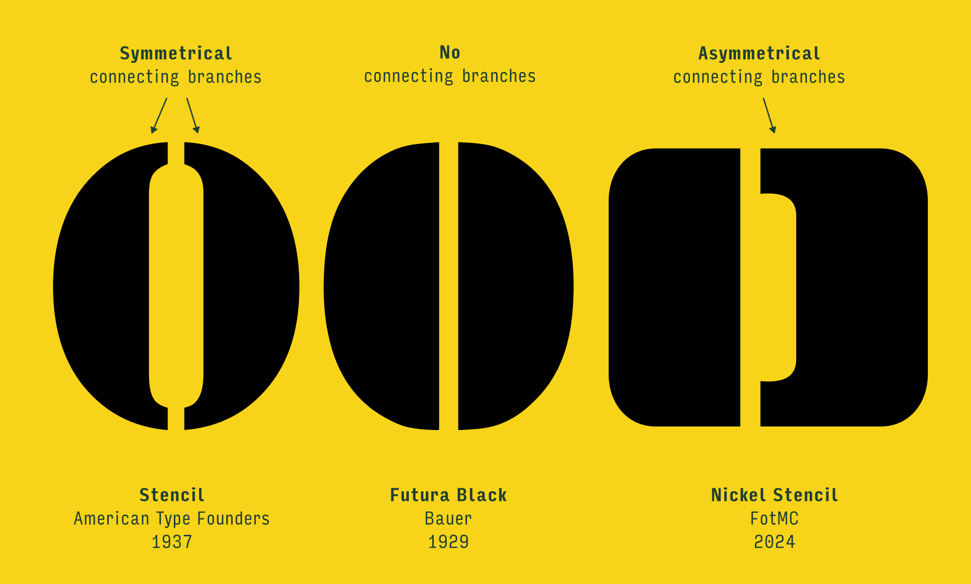
While Nickel Stencil shifts them to the left or right to reduce the clutter of horizontal branches, Slight Chance’s bridges mostly run right down the center, leaving branches on both sides…it’s more clutter, but it’s also more corners to make soft and worn.
I happily made exceptions when this approach left a distractingly short fragment. Sometimes I shifted the bridge to one side or another (see crossbars like B and a), sometimes I used a diagonal bridge (see K and A), and sometimes I used a horizontal bridge (see T and t).
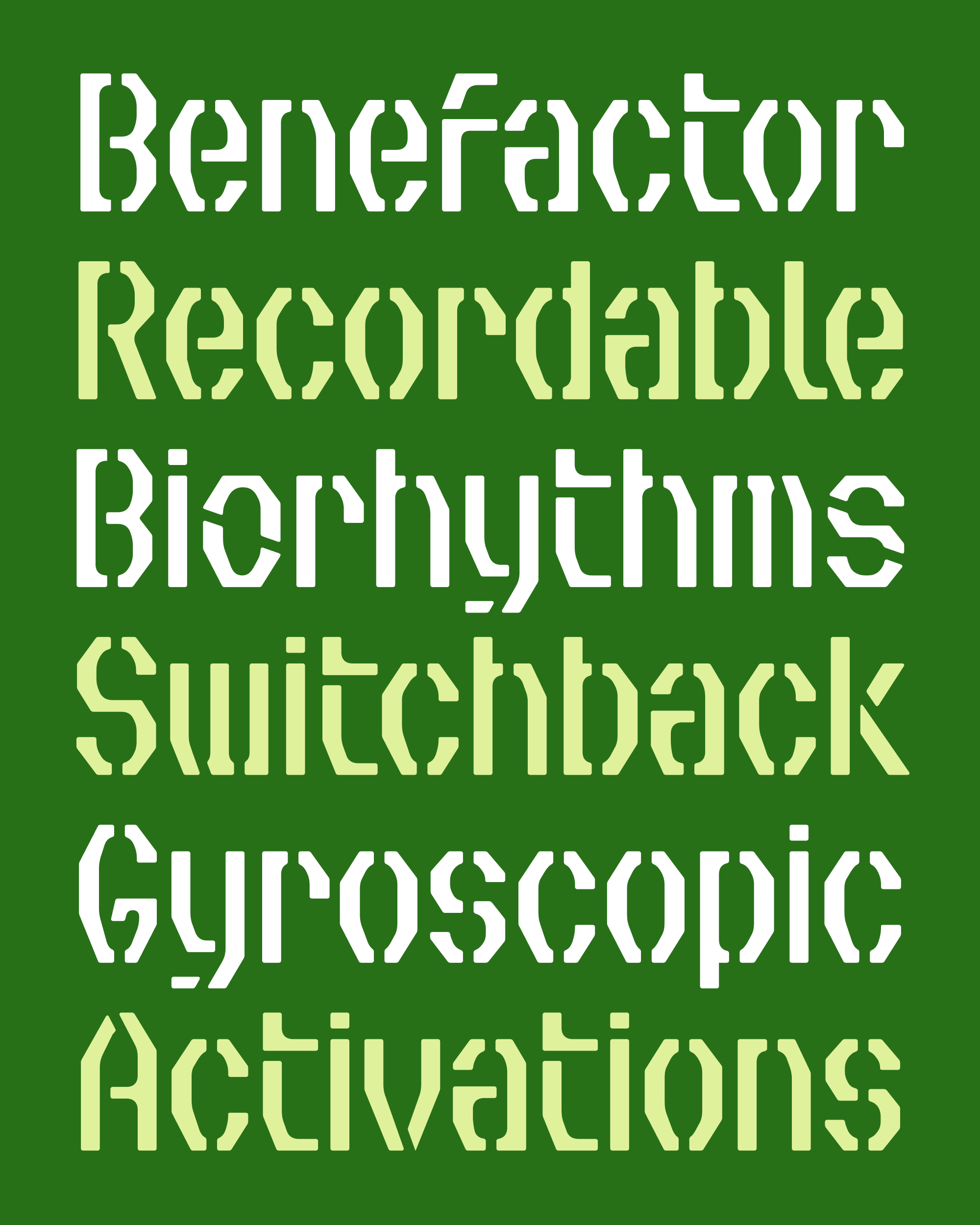
All of this fragmentation definitely accentuates the feeling of decay that was already present in the typeface. And it also seems to underscore the asymmetry in the shoulders of the letters (see A and O), which is the destabilizing element that drew me to the design in the first place.
In addition to Slight Chance Stencil, I’m also including a fresh copy of the original Slight Chance fonts as well. Since last February, I rethought some of the spacing/kerning choices I made, and added a handful of alternates—it’s nothing too significant, but hopefully all those little tweaks add up to something meaningful. (Please uninstall the old fonts before installing these new ones.)
If there’s a slight chance you might use them for something fun, please don’t hesitate to let me know! And have a wonderful month!