May’s Font of the Month: Megawarp
I haven’t been on top of my game this month. I know I had mentioned the italics I was working on for Lithographer Text, but I couldn’t bring myself to go through the focus-demanding, detail-oriented work of finishing them. I will send those fonts to you someday, but today is not that day.
Instead, I desperately needed a reset. I wanted to start something new, where I could lower the stakes, move fast, and have fun. And what I ended up with is a fifth entry in my Megafonts series: Megawarp!
Each of the Megafonts engages with an element of sans serif typography that has been embraced by the science fiction genre—for Megabase it was horizontal stress; for Megavolt, angularity; Megazoid, blockiness; and most recently Megascope, geometry and proportion.
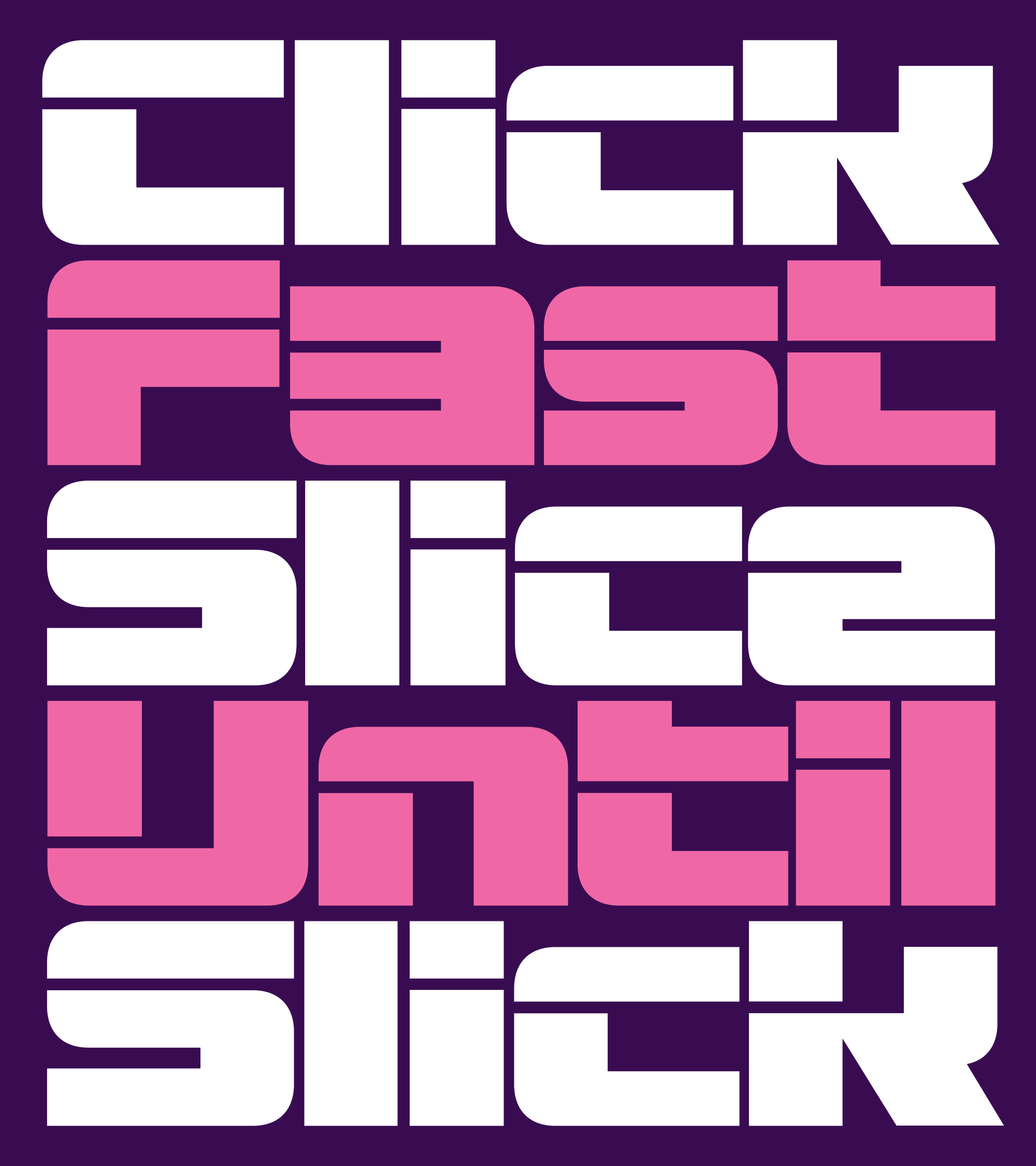
This time, I’ve gone all-in on another key ingredient of the sci-fi milieu: fragmentation. In Typeset in the Future, Dave Addey’s rules of futuristic typography include instructions to “remove an entirely pointless and arbitrary segment of the text”, such as “a horizontal line from the majority of the word.” This technique is perhaps most famously used in Blade Runner’s poster art, where a line of negative space shoots like a laser beam through the upper portion of each letter. (See also Comicraft’s fun interpretation, Running with Scissors.)
.png)
If the laser beam technique can feel a little arbitrary in how it breaks letters apart, I became interested in how these slices could be integrated into a typeface more intentionally. Aldo Novarese’s Stop (recently expanded by the great Dan Rhatigan) demonstrates how letters can be broken down to the bare minimum of what is needed for communication, a concept that was further explored in other geometric stencil faces like Orientation and Svang.
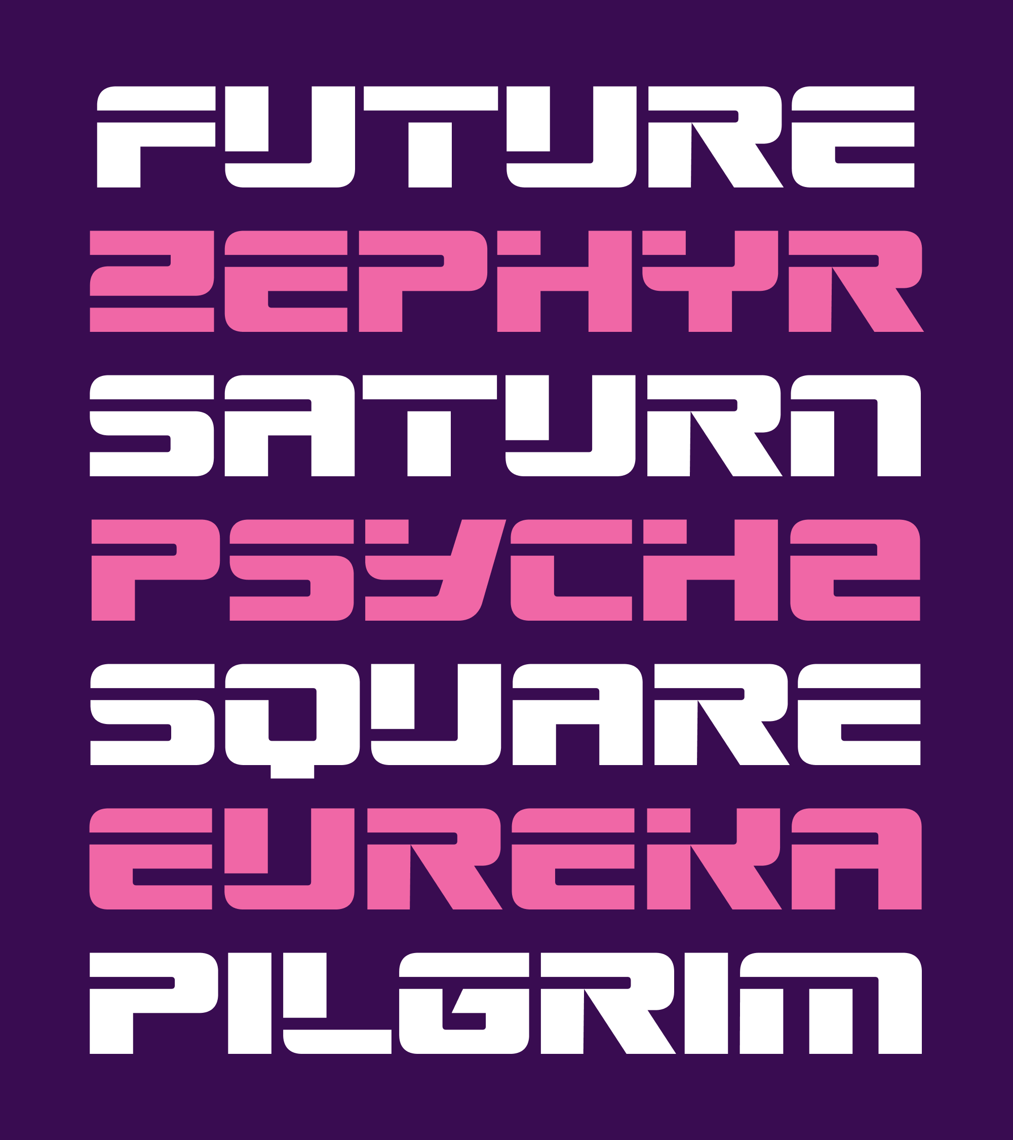
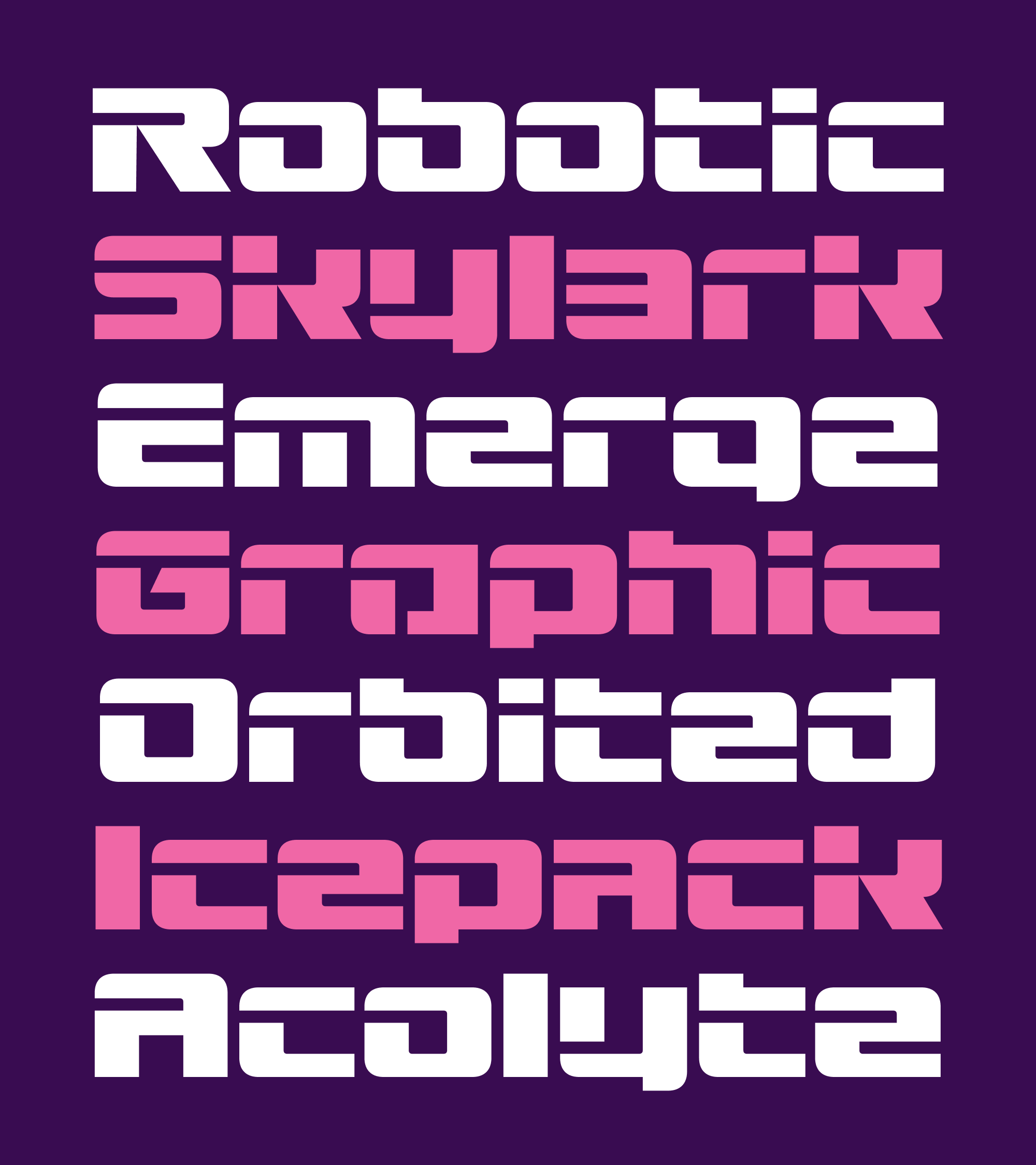
I also spent some time checking out the post-Microgramma squarishness of fonts like Earth and Corporate Image, which employ their slices opportunistically to add distinctiveness and style. I especially love how these fonts open themselves up to the interplay of uppercase and lowercase forms, something I tried to build into Megawarp’s unicase. Using stylistic sets, you can adjust the dial from standard all-caps to a futuristic uncial of sorts:
I started Megawarp using the laser beam approach, but I quickly found myself deviating from it. I developed a loose set of rules to how I would apply slices, which are as follows:
-
A slice can’t be arbitrary—it has to happen at some “event” in the letterform, like a stroke ending or intersection.
-
A letter must get sliced somewhere unless that slice will make it indistinguishable from another letter.
-
If it’s possible to slice a letter in the upper left quadrant, do it. If not, slice it in the lower left quadrant. Strokes on the right side of the letter generally don’t get a slice unless they need one.
There’s not much more to it! The structure of the letterform influences the location of the slice, and the location of the slice influences the structure of the letterform.
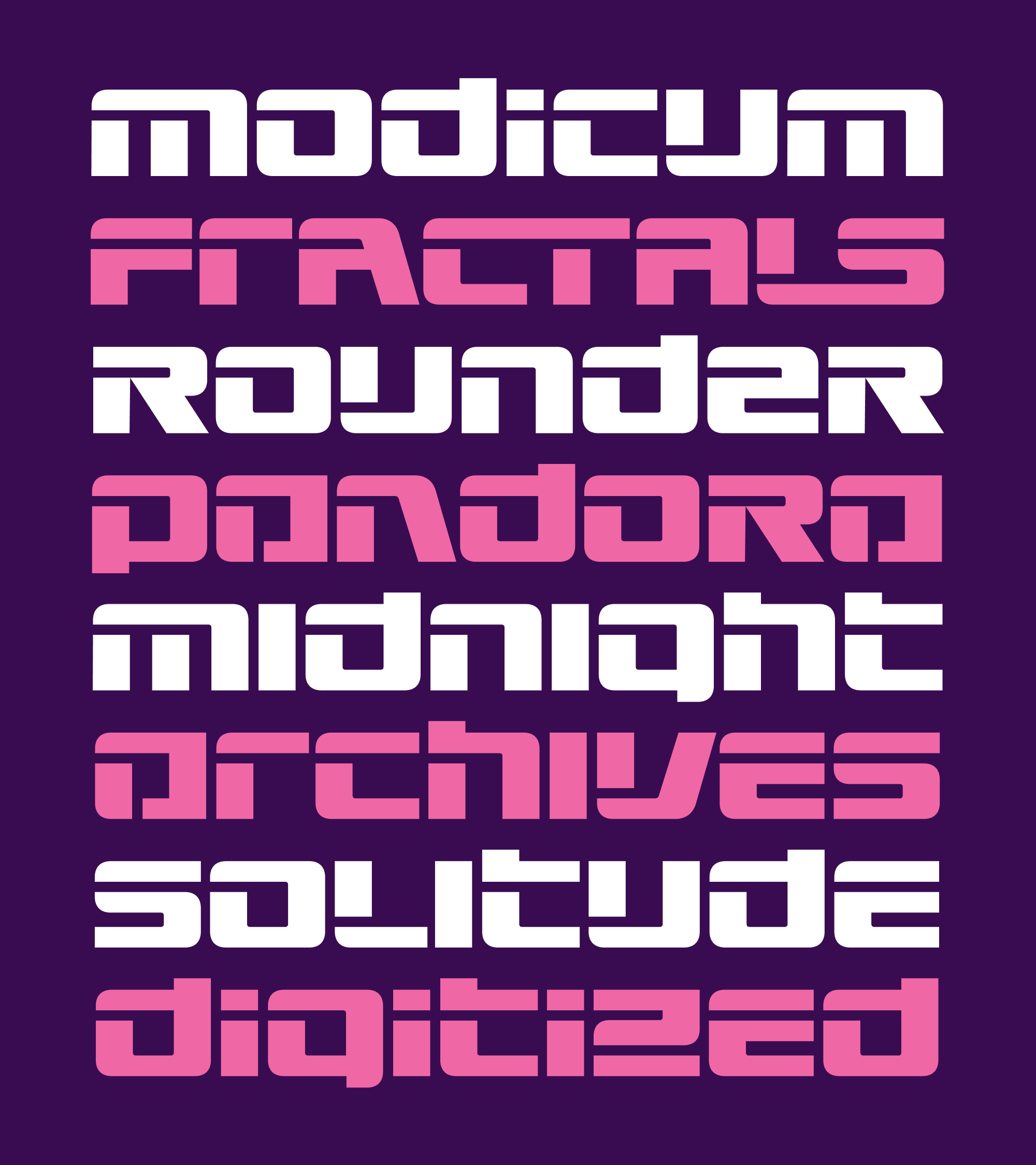
The design is so modular and cut-and-pastey that it was easy for me to iterate on it, try out four or five versions of a letter and see what worked best. (I left a lot of these extra glyphs in the font as alternates…I should probably pare them down eventually.)

When you look at a negative shape in Megawarp, you can never really be sure if you’re looking at a slice or a counterform. Take the default capital A above, for example. Do you see it as a typical capital A with a slice in the upper left? Or do you see it as a lowercase a, with the bottom stroke missing?
This ambiguity led me to some unexpected solutions. On its face, the lowercase e zig-zags like a z, and the three-pronged a looks like a bizarre, stylized numeral 3. If you dig, you’ll find an alternate S that looks more like a backwards C.
These characters are a bit difficult to decipher on their own, but I think they start to work in context—it’s almost as if the more conventional letters help you acclimate to the less conventional ones in real time. (I confess, I still wonder if the default a is a bridge too far, and I might consider swapping it out for a more conventional form in the future. But I figured I should go with my gut at first and pull back later if necessary!)
All of this is to say, this font is meant to be played with. The font has loads of alternates, a huge x-height, and I drew the uppercase and lowercase with the same spacing and vertical stem weights so that you can mix them together as you see fit. (The lowercase i is literally the uppercase I with a slice through it.)
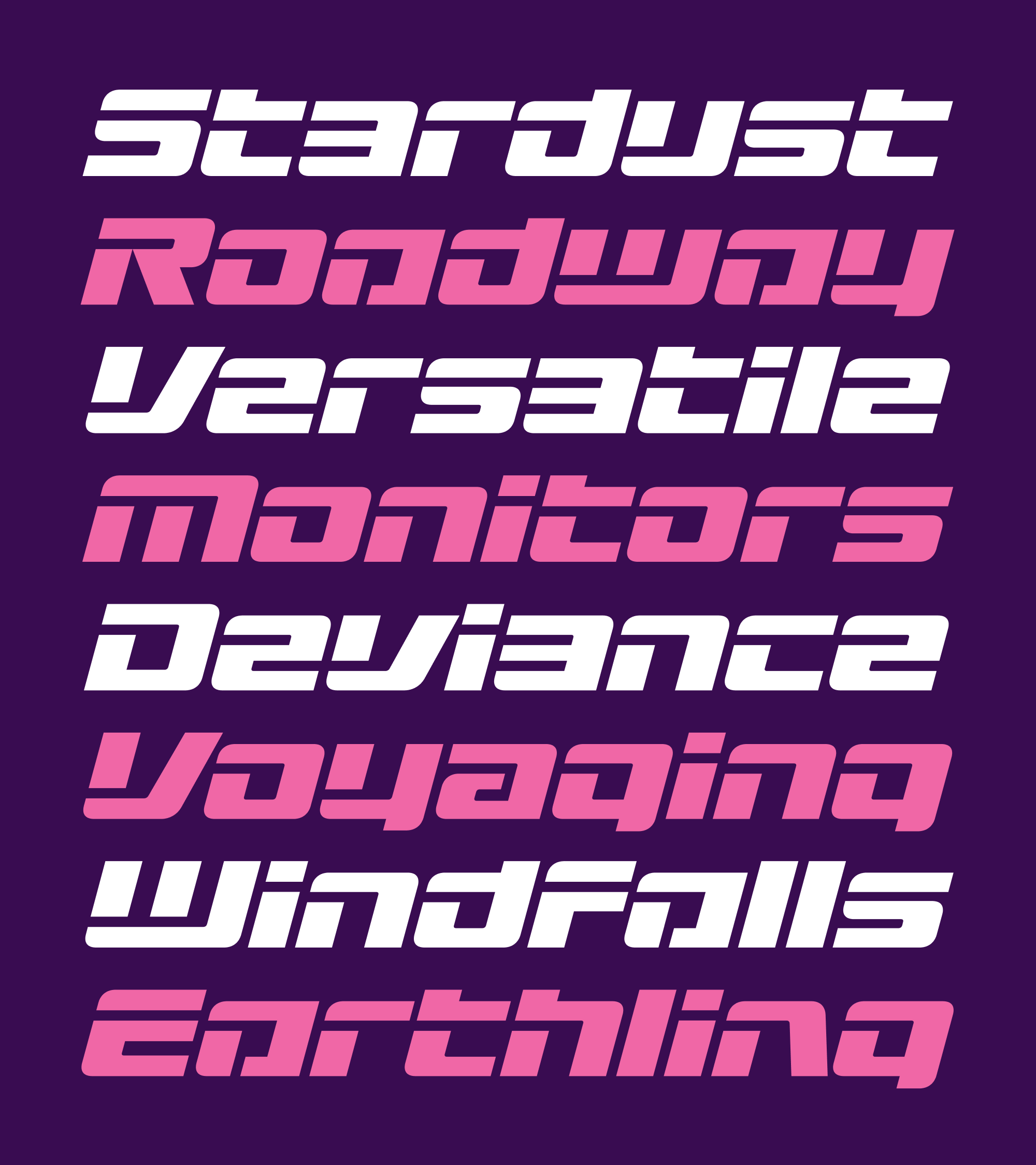
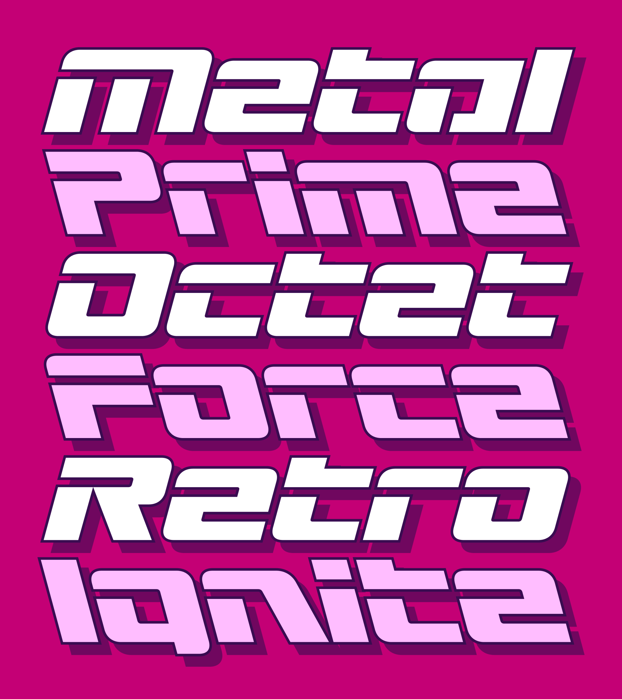
And it might be a bit on the nose with the whole sci-fi theme, but I couldn’t resist including Oblique and Backslanted styles. Feel free to add outlines and drop shades to your heart’s content!
This font is a perfect example of why, nine years in, I think it is still worthwhile to make monthly fonts for you. I was treading water all month, unable to make progress on anything, but the approaching deadline forced me to toss my plans out the window and just make something. And once I got some momentum going, things really started to flow.
Is it the most original thing in the world? Probably not. But I think there are a few inspired moments in there, and I certainly hope that you have as much fun with this one as I did. Warp speed ahead!