NEW: Fit Kannada, by Taresh Vohra
Hot on the heels of the release of Fit Arabic, I am incredibly happy to announce Fit Kannada, designed by Taresh Vohra and released today by Mota Italic.
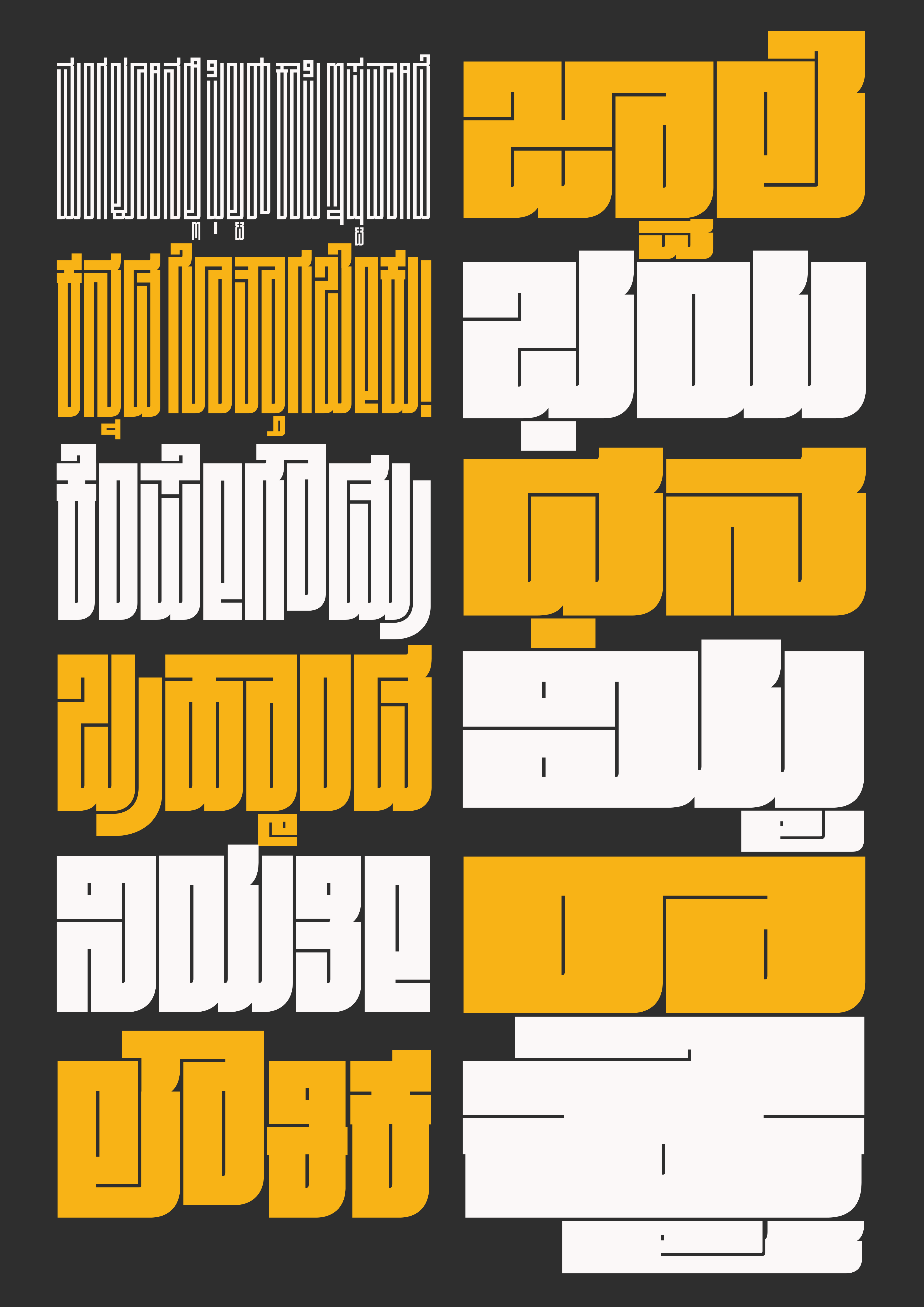
I am not a speaker of Kannada or a reader of the Kannada script, but it doesn’t take an expert to see that the writing system usually involves a lot of curved forms. In Fit, blockiness is king—so when Taresh proposed Fit Kannada to me in 2024, I wasn’t sure that it would be a good, ahem, fit.
But boy am I glad I listened to Taresh—he took this project and ran with it, producing an intricate and mesmerizing design that manages to stay true to both the original typeface and the script. He describes it best: “While [Fit] may be bold and loud, it blends into the typographical landscape of Kannada with its attention to legibility, locally relevant letterforms, and carefully crafted conjunct forms.”
Fit Kannada interprets the script’s complex conjuncts and vowel-sign formations through the modular squeeze of Fit’s visual grammar. But Taresh also took the liberty to expand that grammar to meet the needs of the script when he needed to. Kannada’s “ottu” (small conjunct) forms required drawing these modules at an entirely different scale, with advanced OpenType features that help them cascade gracefully.
Fit Kannada has already been awarded by the Type Directors Club in their TDC72 competition. And I am so happy to see that it is now out in the world!
Thanks to the involvement of Kimya Gandhi and Rob Keller, you can purchase a license at Mota Italic. You can also find it on Adobe Fonts and at Type Network.
Stay tuned for more Indic scripts to come!

The Kannada sign, Siddham (಄)