August’s Font of the Month: Job Clarendon’s Normal width
I just got back yesterday from a week at the beach, and my brain is still in vacation mode. So I’ll keep this one brief!
Last month, I sent you a design that I’ve been trying to crack for 13 years. It was such a relief to get it off my desktop and into the world, and it got me thinking about what else I’ve been sitting on and/or fretting over for too long.
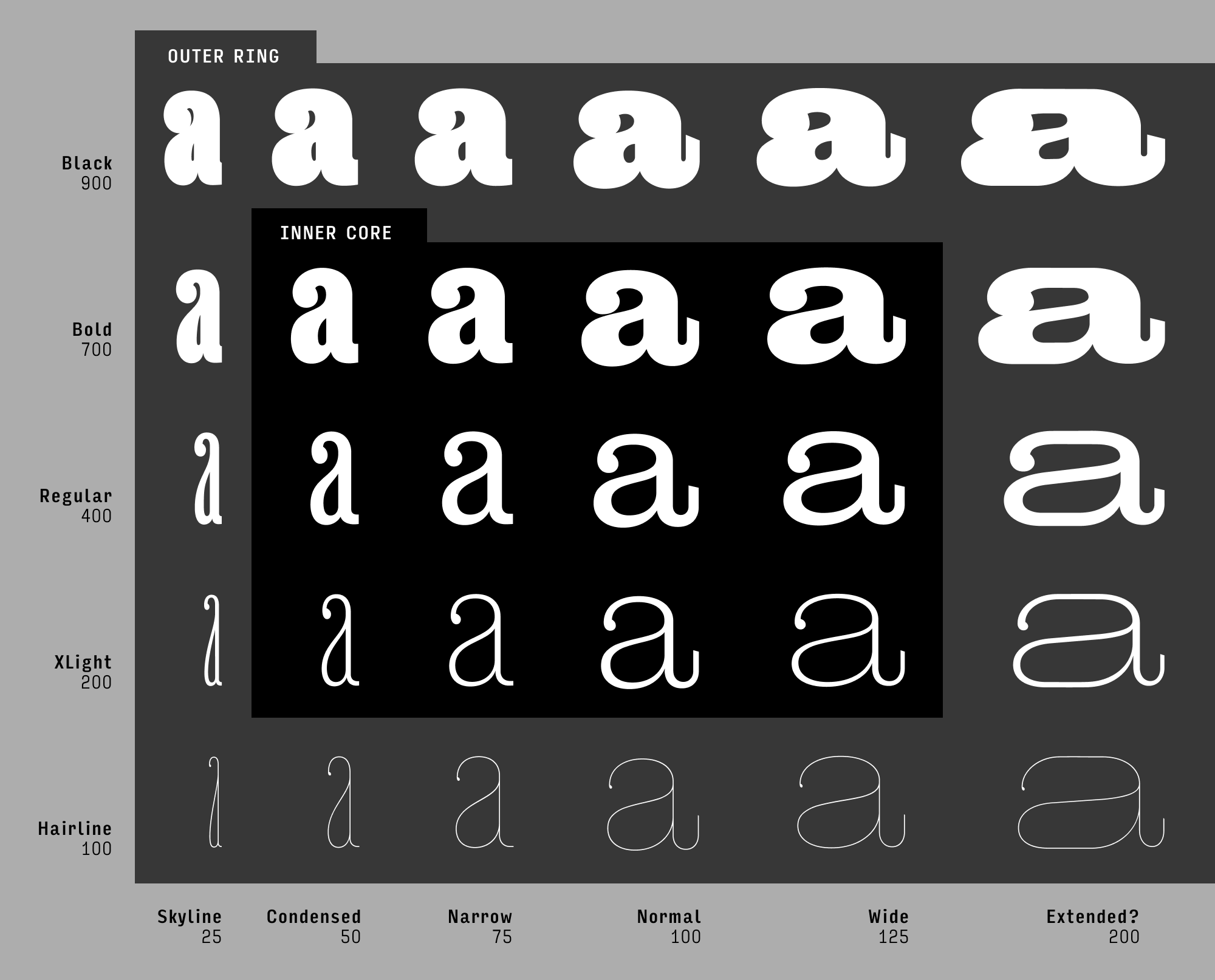
My mind immediately went to Job Clarendon, my collaboration with Bethany Heck. It started off in 2020 as a Condensed typeface, and I’ve been expanding it ever since: a Compressed, a Narrow, a Text cut, and (exactly one year ago) a Wide. But I’ve stalled and stalled on publishing a “Normal” width (100%) that would serve as an anchor for the family and tie all the other widths together.
Every time I open up Job Clarendon’s file, I find 10 new things I want to change. I can’t promise that I’ll stop tinkering, but I do think it’s time to stop stalling. So today, I’m sending you Job Clarendon’s Normal width.
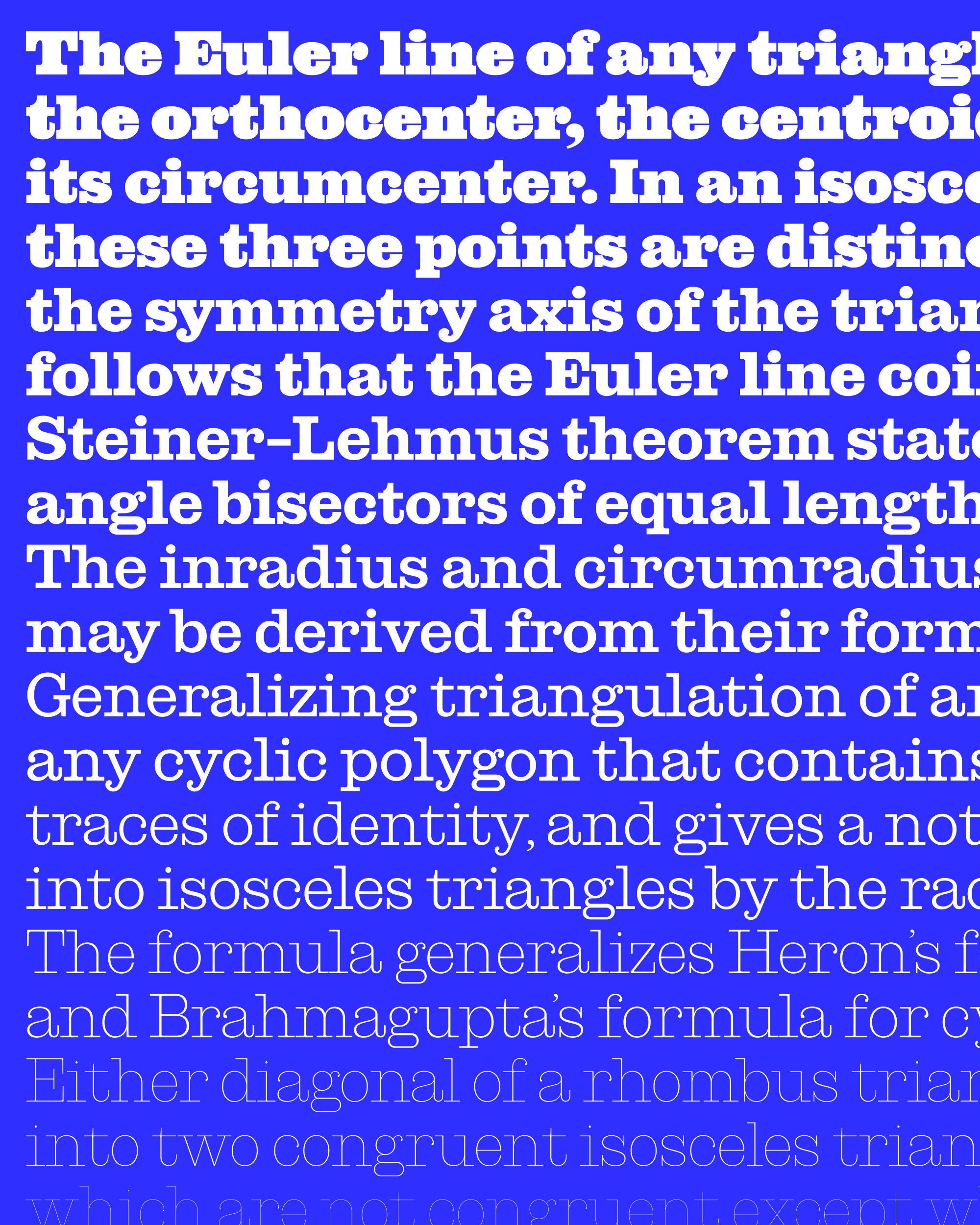
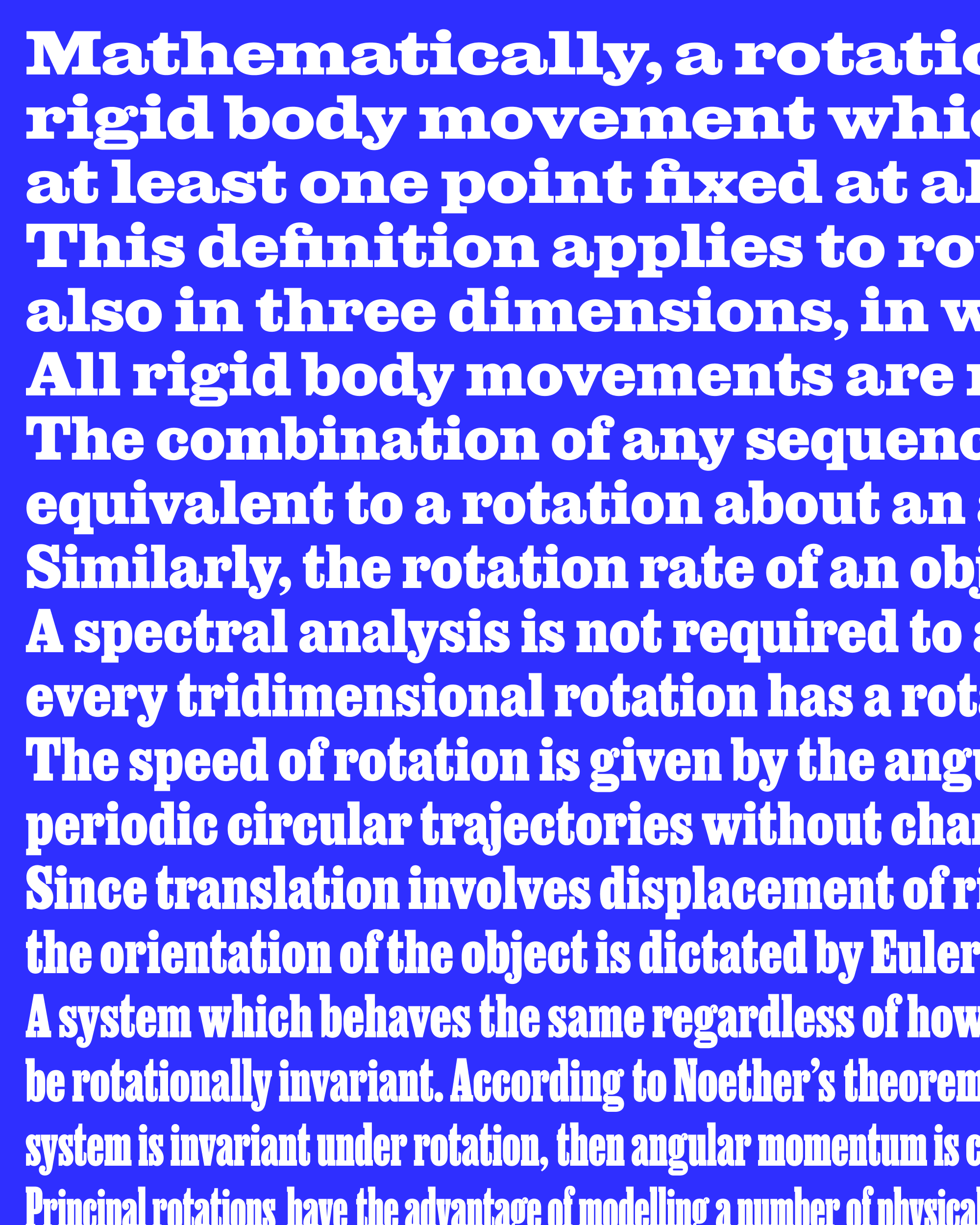
Why did I demur? This width is closest to the canonical Haas Clarendon and the many Clarendons that followed it, and I think I was worried that somehow made this less special. But I’m generally happy with how Job Clarendon Text works, and this Normal width is fundamentally an expansion of that—except it now has a full range of weights from Hairline to Black, and an x-height and vertical proportions that are more in line with the original “Display” cut.
To me, the most interesting part is that the font can now move fluidly across its large range of widths, and I’ve included a variable font in this package where you can try it out for yourself. In addition to Bethany’s art direction, this file includes contributions from Sophia Tai, who worked a lot on the Condensed and Skyline widths, as well as from Jacques Le Bailly.
Because of my constant tinkering, I know there will be some weirdness and inconsistencies in here, so please treat these as Beta fonts. Right now the width axis goes from Skyline (25%) to Wide (125%)…I’m still thinking about that Extended cut!