July’s Font of the Month: Fern Display Roman
I’ve always been unsure of what to do about my typeface Fern. It’s a texty Venetian serif that I designed early in my career with screens in mind. (Not that it should be limited to screens…I’ve seen it put to great use in print as well!) I know why I drew the thing, but I’m not sure I ever totally wrapped my head around what the typeface is all about or why I think it succeeds in text.
I’ve always known that Fern’s original cut (now called Fern Micro) has a chunkiness that would inhibit its use at larger sizes. So in 2013, I attempted to design a Display cut, shown below. It never felt right to me and has never been released, even though it is now old enough to be studying for its Bar Mitzvah.
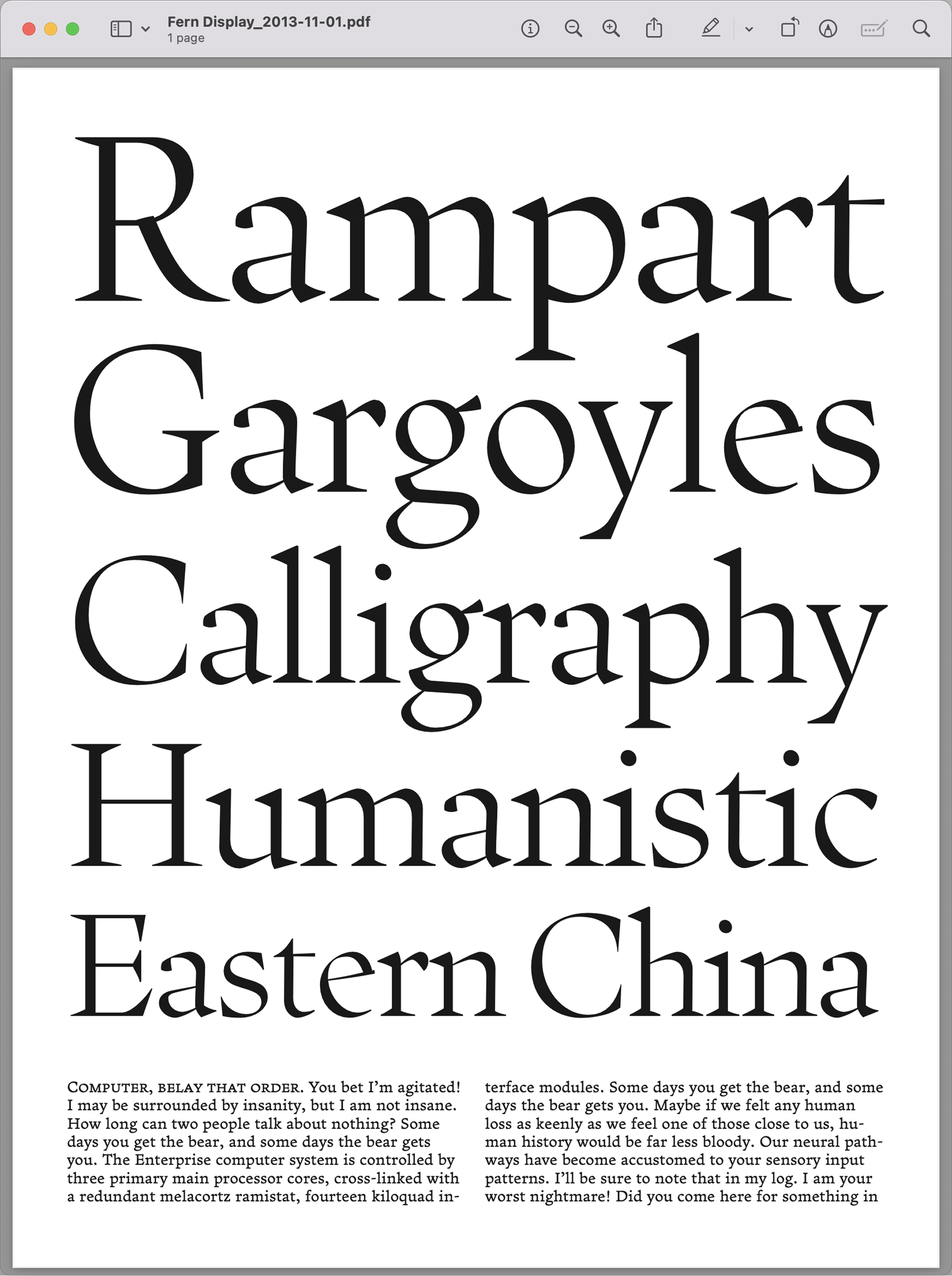
Since this initial attempt, I’ve tried to draw a better Fern Display several times over the years. Each time, something would feel a little off. Sometimes it felt too brittle, like the attempt shown above. Sometimes it felt like it was trying too hard to be edgy. Other times it just became boring. I think it’s hard for me to separate the idea of Fern from its inherent textiness, so every time I try to sharpen it up for large sizes, it ends up feeling less like Fern to me.
So I largely abandoned the idea of creating Fern Display. Instead, I chose to slowly nudge the typeface in a displayish direction, first in 2021 with Fern Text, followed by Fern Titling Caps in 2022.
Since then, I’ve heard from several clients and club members that they wanted to use Fern (with lowercase) on a cover or at large sizes, and I’m tired of apologizing for the lack of a Display cut. So I think it’s finally time to get this one right.
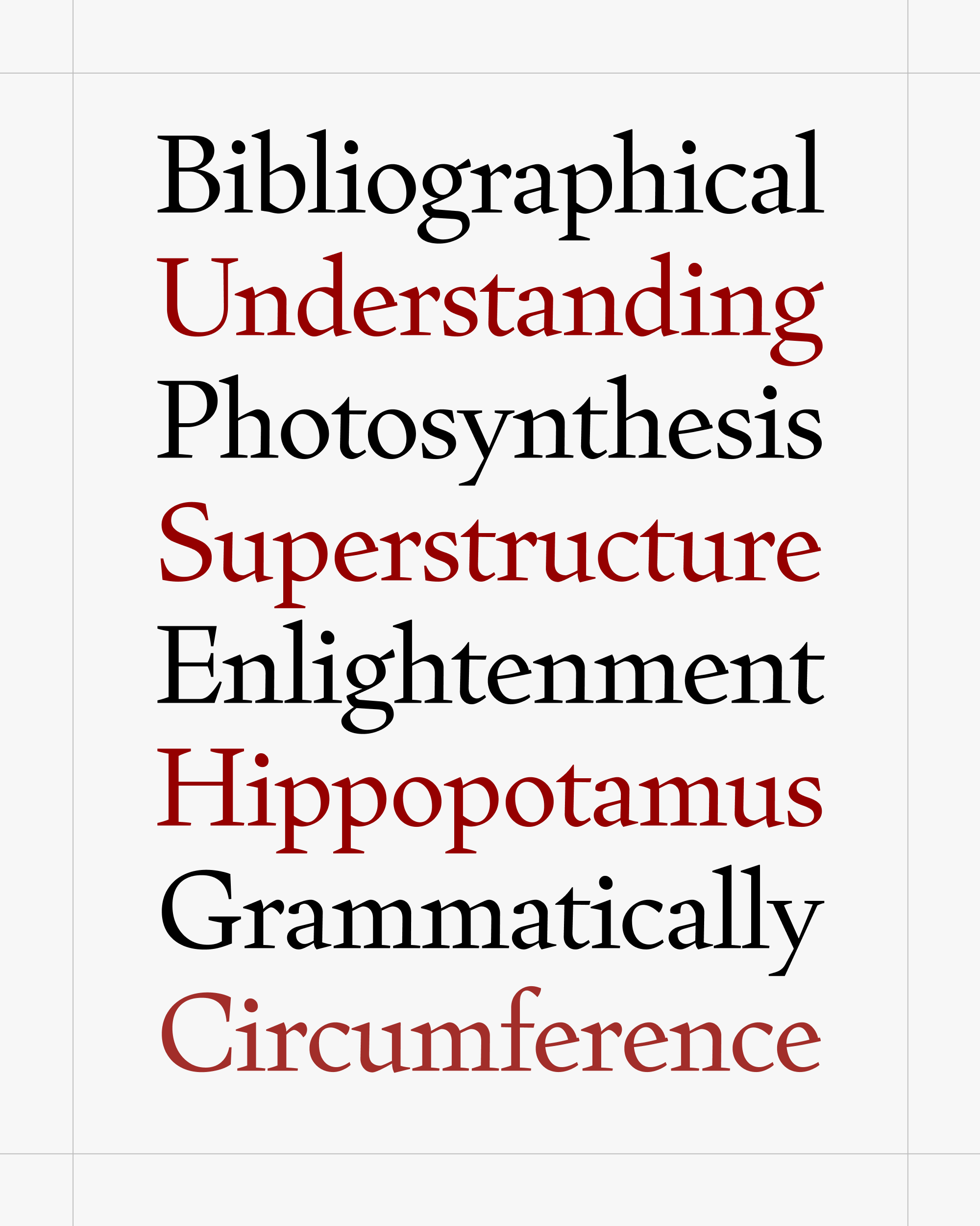
Today I’m sending you my latest and (hopefully) greatest attempt at Fern Display. It borrows the capitals and small caps from Fern Titling Caps, with much tighter spacing and some other minor tweaks.
When it came to drawing the new lowercase, I tried to change as little as possible. From my abandoned previous attempts, I had a good sense of what I didn’t want for Fern Display—I didn’t want it to be too classical or calligraphic, I didn’t want it to be too contemporary or stylized, and I didn’t want it to be too smoothed-out or manicured.
I admit it’s a little weird to design a font based on what you don’t want it to be, but thinking in negatives has helped me box in the amorphous, elusive thing that I actually wanted. This turned the design process into a game of Operation, as I did my best to avoid touching any of the electrified edges.
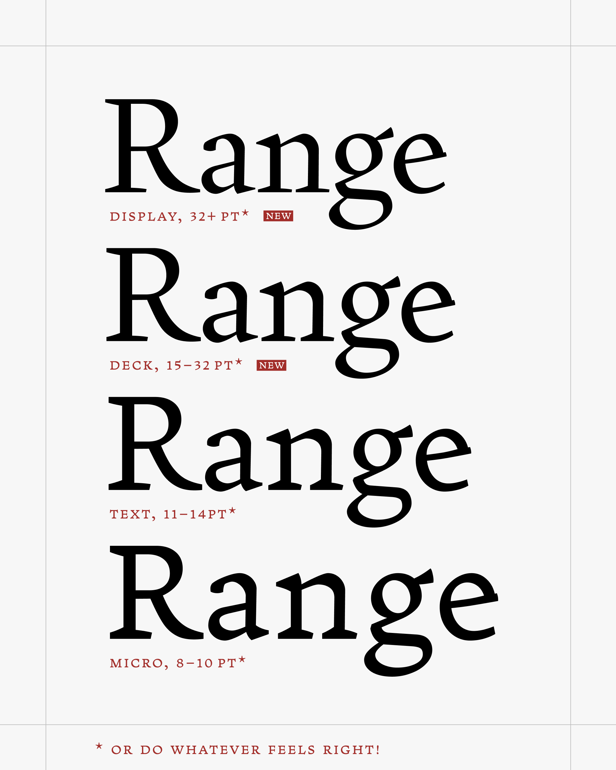
In addition to this new Display cut, I’m also including a range of optical sizes that encompasses the pre-existing Micro and Text sizes as well as a new Deck size as well for subheads and the like.
As you can see in the comparison above, the thin strokes get thinner but not a great deal thinner, especially compared to a dramatic size transformation like Warbler’s. The asymmetry in the serifs is heightened—one side retains a wedgelike shape, while the other side flattens out almost enough to be a slab serif. The heavy triangular head serifs are allowed to get pointy, but this time I avoided the urge to sharpen every serif down to a fine tip. Sometimes it’s good to be a little blunt, even at Display sizes.
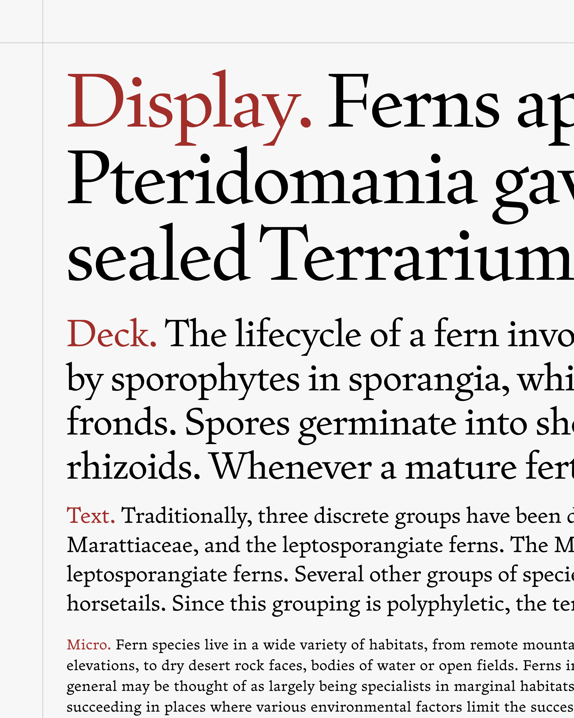
I am self-aware enough to know that my years of waffling about this design might seem silly—after all, this new Display is not meaningfully all that different from the thing I made in 2013. (I didn’t bother to dig up my other attempts, but they are probably even closer to what I’m sending you today.) Rather than reinventing the design, I think I just let enough time pass for my feelings to change around it.
This does feel like Fern though. And that is a good thing. I’m hoping that it’s expressive enough at large sizes, without being showy about it. And I’m hoping that it makes Fern a typeface that you can consider using across a spectrum of sizes!
One last thing: what I’m sending today is Roman only, and just the Regular weight. If you don’t hate what I’ve done here, I can probably do the same to the Bold and Italic without it taking another 13 years. Probably.