April’s font of the month: Polliwog
What follows is an abridged version of the Font of the Month Club’s April mailing:
Conventional wisdom tells us that text typography and display typography have opposite goals: a typeface should never catch the eye in extended text, but on a poster, being eye-catching is kind of the point.
I’ve always been intrigued by fonts that occupy the space between text and display. Subtitles, decks, introductory paragraphs, and text in children’s books are all pretty niche use cases, but they all lend themselves to a certain category of typeface. This typeface can be distinctive and eye-catching on a structural level, but must be drawn plainly enough to be suitable for reading in short bursts. (It’s sort of the counter-approach to last’s month’s font, Gimlet Banner, which features a relatively conventional structure drawn with eye-popping contrast.)
I’m not sure if there is an agreed-upon name for this genre; personally I think of them as “novelty text” typefaces. I also like the term “advertising text,” which I first heard from from David Berlow when describing intended uses for my typeface Trilby. The term recalls midcentury advertising that featured a paragraph of copy, much more than we typically have today.
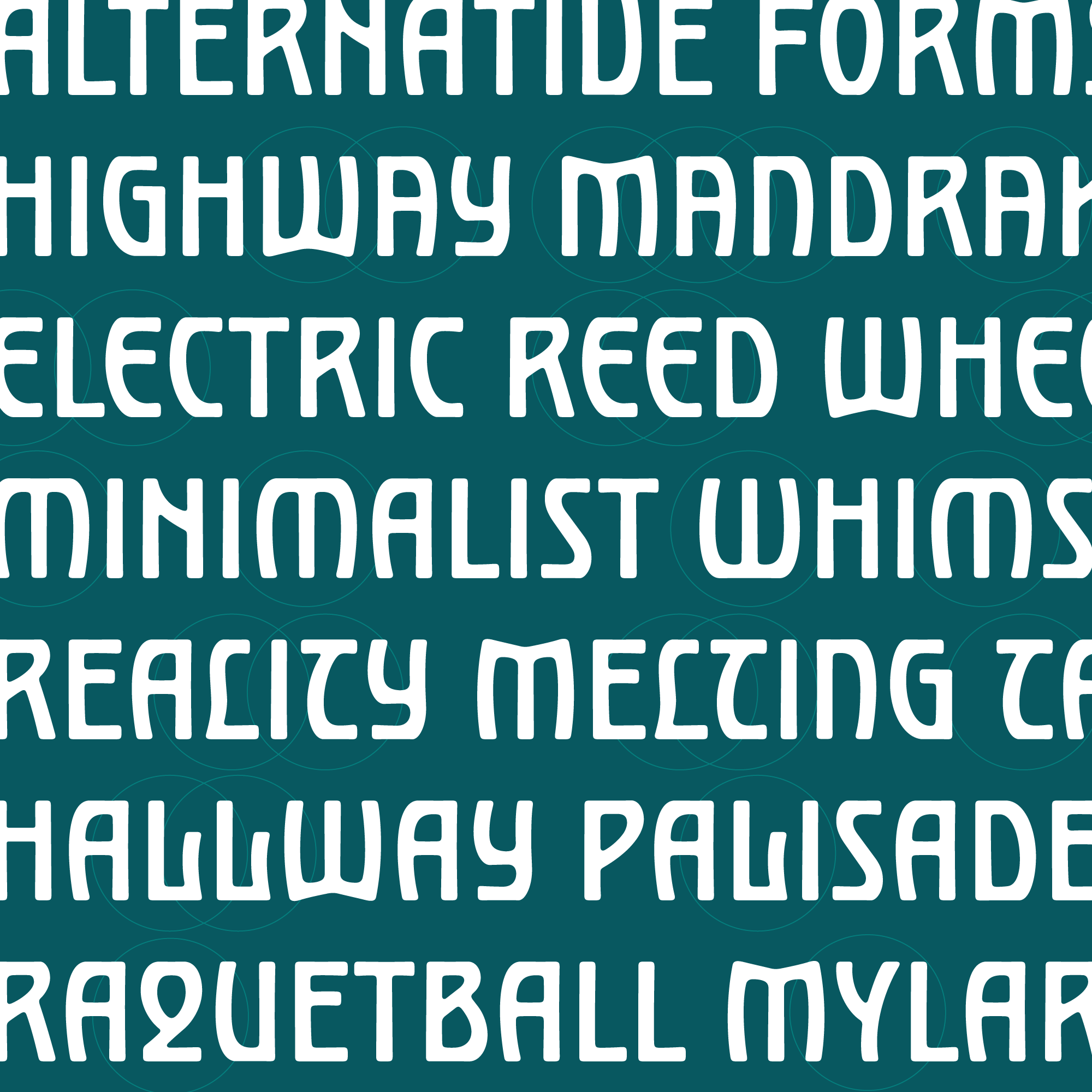
It’s kind of a weird impulse to take a super-interesting idea and then execute it in a boring-ish way. But I think it can be a useful typographic exercise to distill a style down to its essential elements in order to truly understand how a system works. This is what I have attempted to do this month with the whimsical Jugendstil lettering of Max Joseph Gradl.
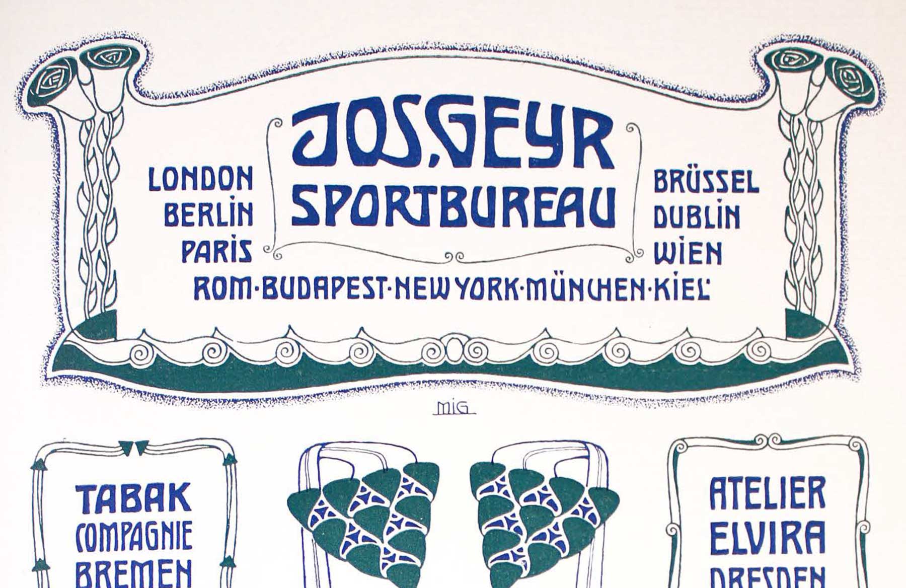
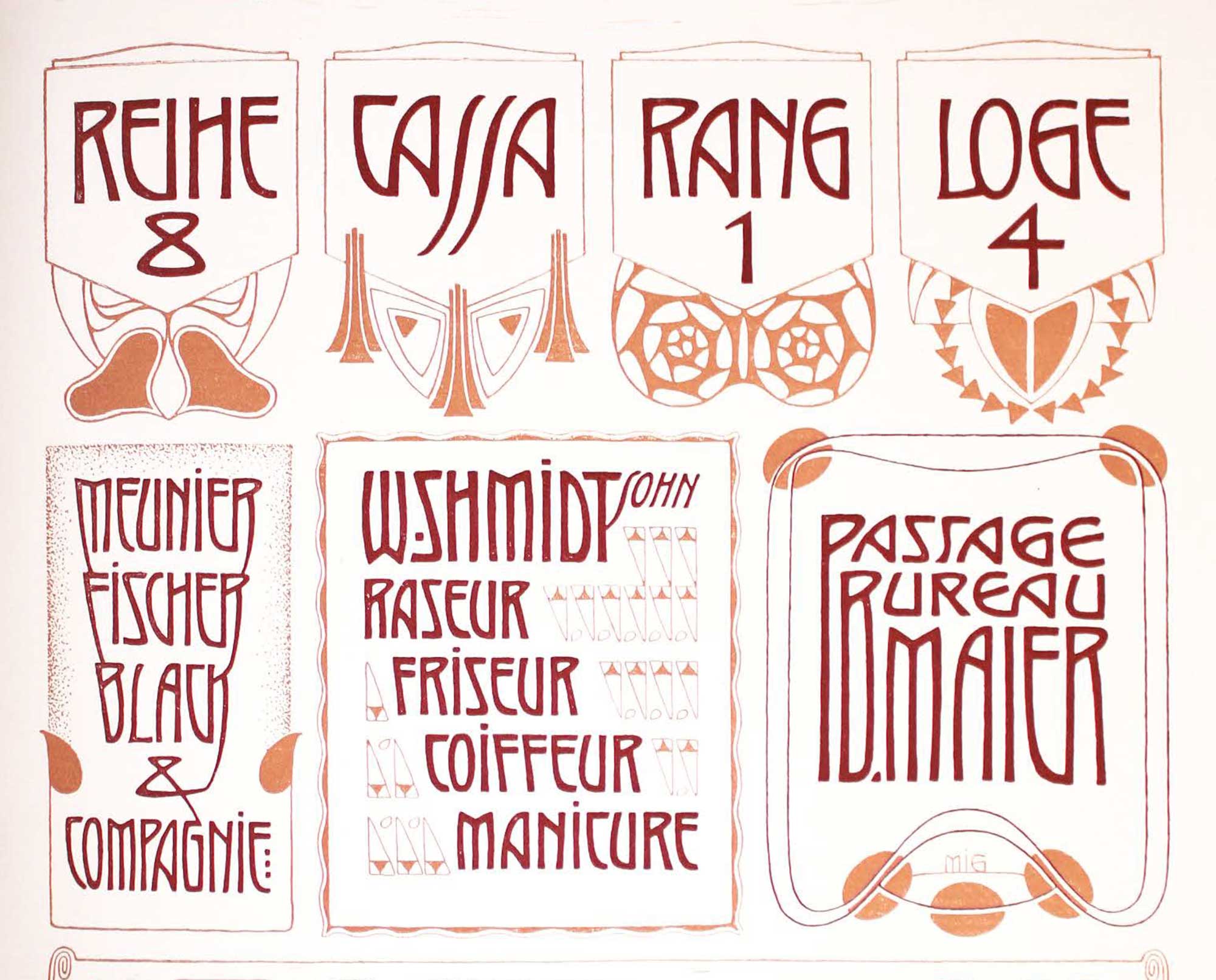
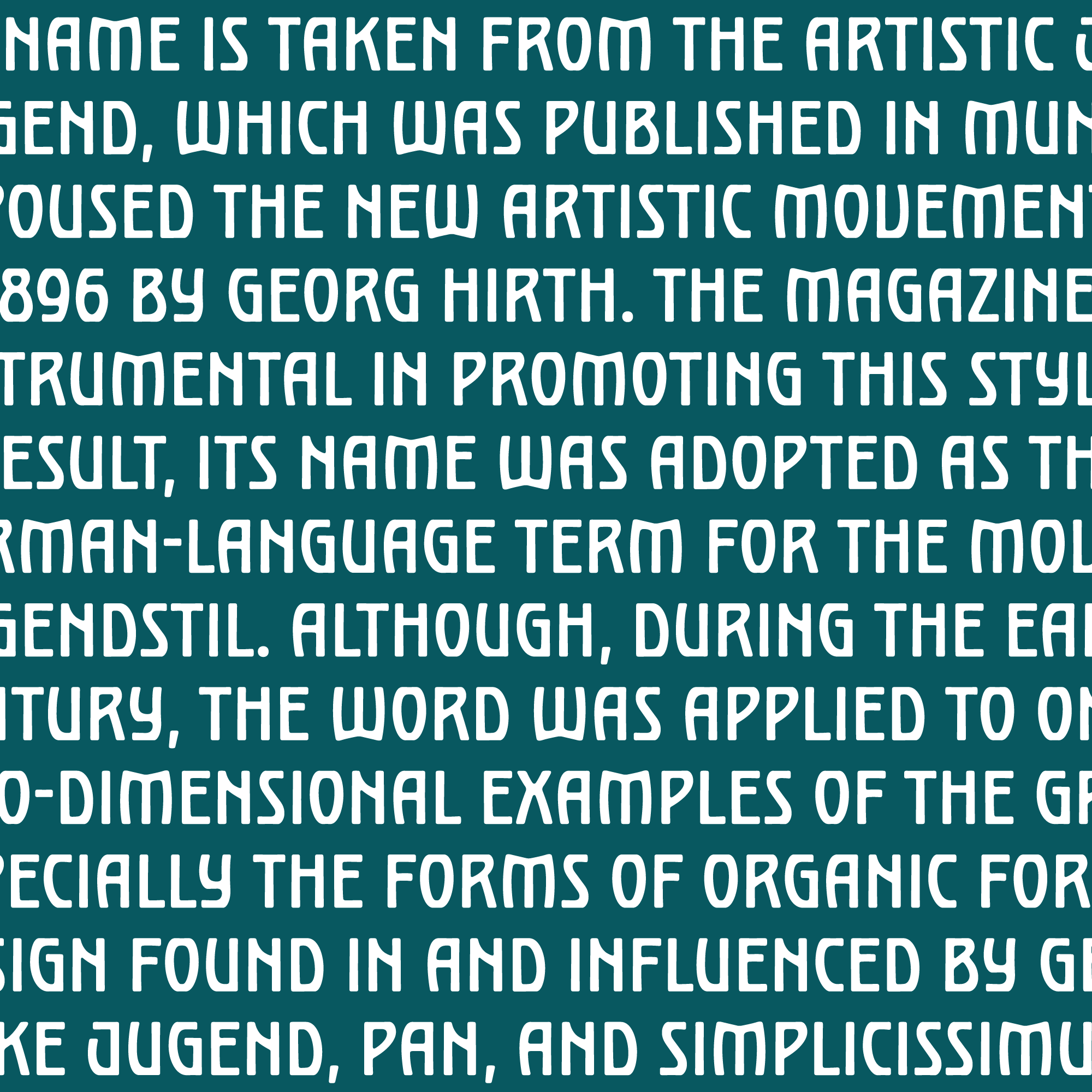
Active around the turn of the twentieth century, M. J. Gradl was a German artist whose diverse body of work in the Art Nouveau style covered jewelry design, wallpaper design, and advertising. There have been various typographic takes on Gradl’s imaginative alphabets in the past, including an early digital version for Microsoft by the aforementioned David Berlow.
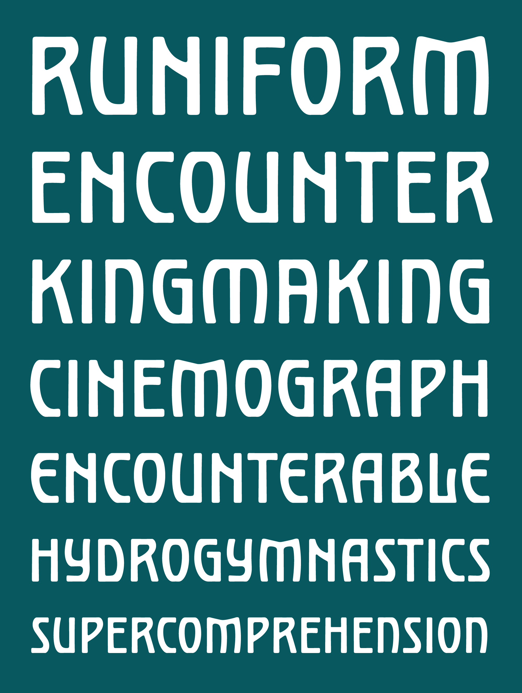
While existing digital interpretations celebrate Gradl’s work in all of its wavy grandiosity, Polliwog thinks small. (The name “polliwog” is actually a synonym for “tadpole.”) The typeface suggests that all you need to create a compelling rhythm in a block of text is a single drop of Gradl’s proto-psychedelic Jugendstil energy.
The core of Polliwog’s interesting texture comes from the juxtaposition of straight stems and broad, swinging curves. Even though letters like A, U, and V are distinctively asymmetrical, there is a great deal of symmetry in the overall design; curves are just as likely to swoop to the left as they are to the right.
Outer curves flatten out abruptly as they hit the tops and bottoms of letterforms, causing the weight to clump up momentarily and emphasizing the horizontality of the line. This unevenness in weight is echoed in the softened and tapered stroke endings, giving a bit of wobble to an otherwise-skeletal design. The font includes a handful of alternates, giving you the opportunity to fine-tune the flavor of your text.
Polliwog is available this April for members of the Font of the Month Club; memberships go for as little as $6/month, so do yourself a favor and sign up today!