June’s Font of the Month: Pennyroyal DJR
One of the most important courses I took in college was “The Book: Theory and Practice”, taught by Barry Moser at Smith College. (I did not attend Smith, but as a student at one of the Five Colleges, I could take courses there.)
It was in this course that I first set Bulmer in metal, which directly led to my admiration of that style and eventually to Warbler. And it was there that I first learned to love wood type, as I trawled the fire-damaged type drawers in the art building’s basement that would crumble as I opened them. But this was not just a letterpress course…we spent time in InDesign too! We were learning about the building blocks of typography, whether those blocks were metal, wood, or digital.
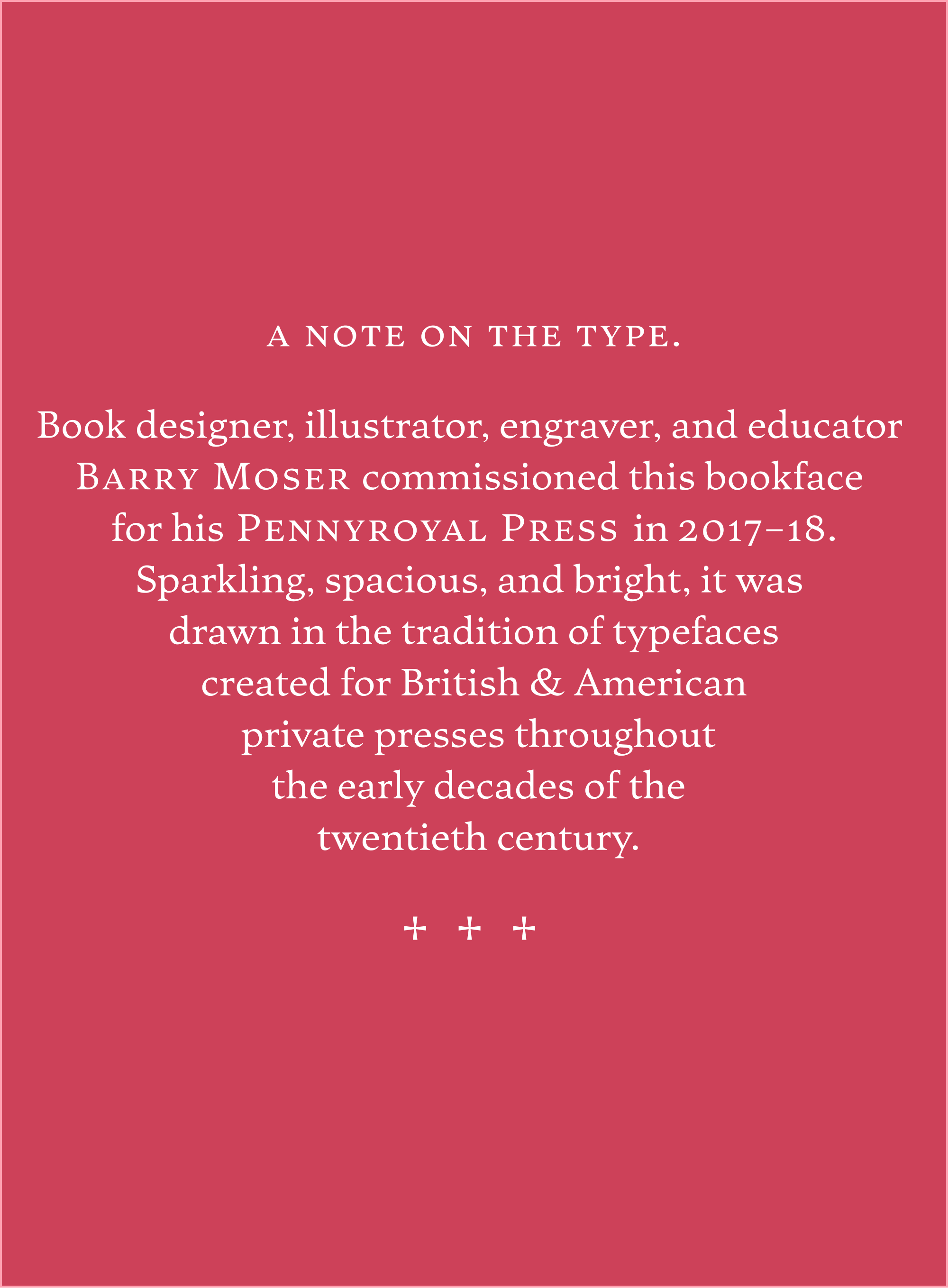
In 2017, ten years later, I moved back to Western Massachusetts and reconnected with Barry. When we met at Jake’s diner in Northampton, he surprised me with a pitch. In addition to being an educator, Barry is an accomplished book designer, illustrator, and engraver—much of which he publishes through his Pennyroyal Press. And in the great tradition of the private press movement of the early twentieth century, Barry wanted to commission a book face to call his own.
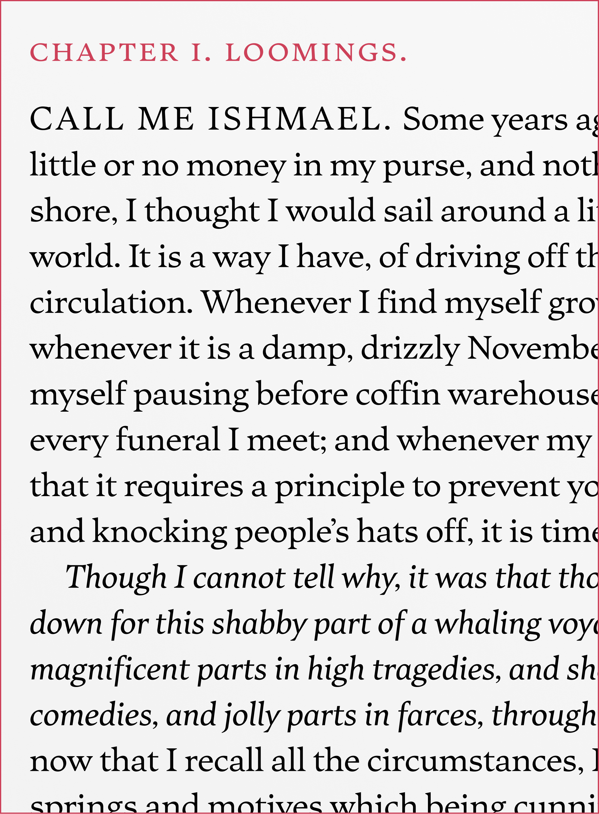
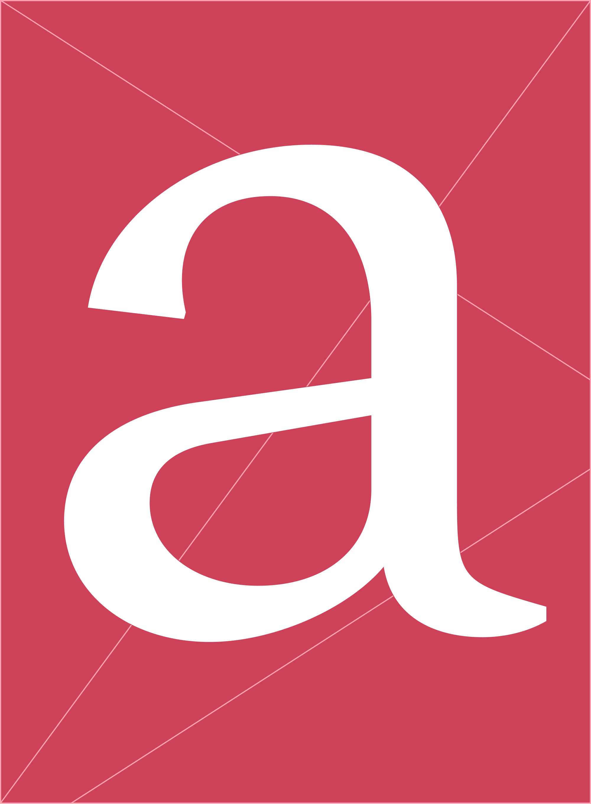
Over the course of the next year, Barry and I met up for lunch every once in a while and looked at proofs together—his preference was to use Moby-Dick as our sample text. He wanted his Pennyroyal typeface to be sparkling, spacious, and bright. Within a couple weeks, we quickly settled on a design with long, wedge-shaped serifs that are softened by sweeping curved brackets.
We kept things pretty loose, reference-wise, relying instead on Barry’s preferences and whatever felt right to me in the moment. Of course we discussed private press faces like the Doves Type, but I tried not to look too closely at them.
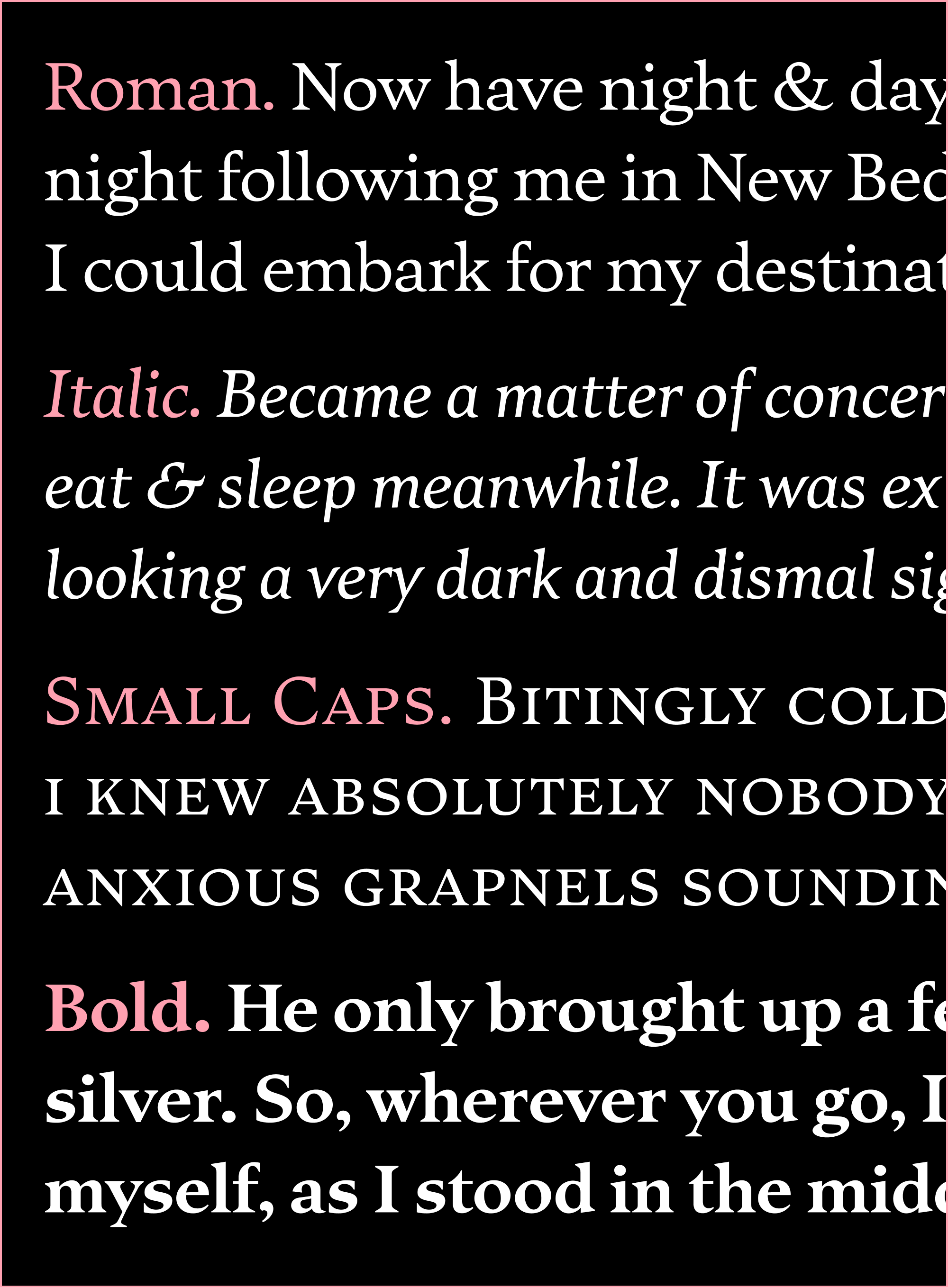
Even though this typeface could be classified as an oldstyle, it doesn’t lean into the chunky, inky, angular side of the genre (as opposed to Fern, for example). I worried that something too Kelmscott-y would compete with the intricate textures and heavy chiaroscuro of Barry’s engravings, and tried to keep the letterforms feeling rational, smooth, open, and airy. This is also true of the Italic, which is drawn at a subtle angle and avoids the narrow, choppy texture that is typical of the genre.
This was a dream commission for me, and Barry has been an incredible partner. He first used the typeface in Pennyroyal’s 2020 printing of Frederick Douglass’s autobiography, accompanied by his engravings. Because the book was printed letterpress from photopolymer plates, we actually ended up producing a slightly lighter version to compensate for the inkspread.
Recently, I’ve been working with Linh Nguyen to expand the typeface into a full series of weights, from Light to Black, each with a companion Italic. I’ve toyed with a titling style as well. And I have been thinking about what else (if anything) should change as this transitions from a custom typeface to a retail one.
I like the idea that a typeface can simultaneously be so personal and specific in origin, but general and versatile in function—something made to address one need can take on a second life solving other typographic problems. I’m excited to see what happens in Pennyroyal DJR’s second life, now that it is travelling out of our hands and into yours.


