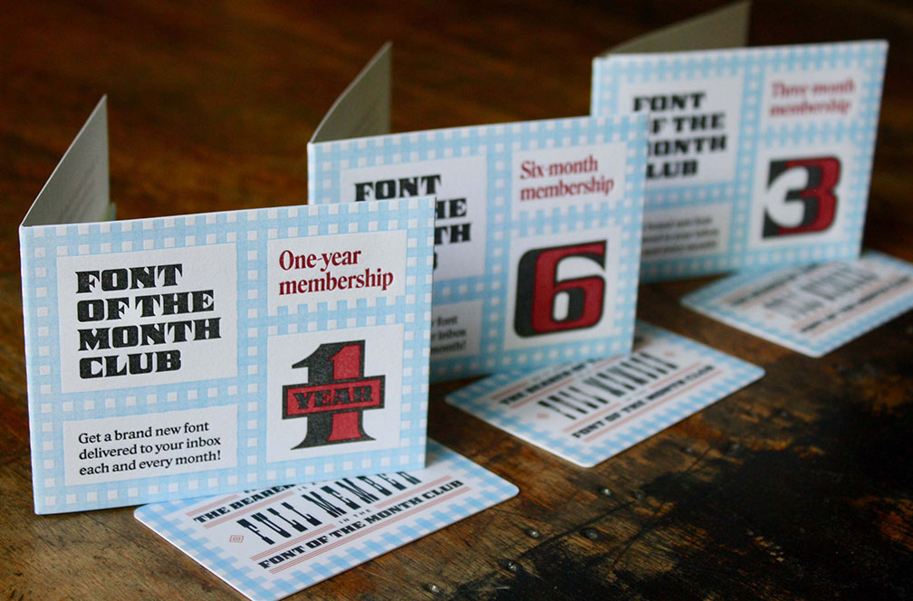
Font of the Month Club sends you a fresh new font every single month! Fonts of the month include distinctive display faces, experimental designs, and exclusive previews of my upcoming retail typeface families. Each font is lovingly designed and produced by me, David Jonathan Ross.
By diversifying your font collection at a minimal cost, the club can push you to try new and interesting type in your work. Learn more »
A few years ago, designer Julia Fletcher made excellent use of my Megafonts in a series of posters for the band Sextile. Julia specializes in making daring and playful poster art for musicians, and I am a big fan of the way she uses type, color, and pattern in her work.
But you might have noticed something about the poster for the Brooklyn show, displayed above. Megavolt is by far the widest of the megafonts, and the way that Julia made it work for her design was to horizontally scale it by 43%.
Megavolt has the benefit of being 100% curve-free, and Julia squished it so much that it actually retains three distinct stroke weights: thick horizontals, thin verticals, and an even thinner crossbar on the E.
Job Clarendon is a typeface that pays homage to job printing — display-heavy designs made for posters and flyers in the heyday of letterpress printing. This page features twenty-six posters that demonstrate that the visual language of job printing is just as vital today as it was then. This month adds a Narrow width to the display family, unlocking the door for rounder, wider widths to come.
Job Clarendon Narrow is a series that should have been a very straightforward interpolation because it’s situated smack in the middle of things that were already complete. But because it sits awkwardly on the fault line between straight sides and round sides, it ended up requiring a bit more TLC than either Bethany or I expected.
Clarendons look good when they’re confidently straight-sided, and they look good when they’re confidently round—there’s plenty of historical precedent for both. But the midpoint, between straight and round, feels a bit indecisive, and I don’t know of many Clarendons that have attempted to bridge the gap. Craw Clarendon Condensed is great, but it’s essentially a squished-down version of the normal width with completely round sides, and no hint of straight-sidedness.
For Job Clarendon, we could have done what most Clarendon families do and simply avoided this width altogether. Or we could have engineered the font with a tipping point where straight forms would magically snap into round forms, bypassing the awkward moment of transition between the two.
Last March, I sent you my first draft of Indoor Kid, the collaboration I have been working on with comics writer/editor/publisher Ellis Bojar. It attempts to fulfill his vision for an expansive designspace in the comic book lettering style: variable axes for weight, width, and slant, plus a special emphasis axis that enlarges letterforms from their vertical center without affecting the stroke weight. It has been so rewarding to see uses of Indoor Kid pop up over the past year, most recently in the latest run of DC’s Harley Quinn lettered by Lucas Gattoni. That gave me some momentum to dive back into the font, and one year later, Indoor Kid is back with a shiny new lowercase!
One year ago, I sent you my first draft of Indoor Kid, the collaboration I have been working on with comics writer/editor/publisher Ellis Bojar. It attempts to fulfill his vision for an expansive designspace in the comic book lettering style:
In keeping with Ellis’s love of the pre-digital era of comic books, Indoor Kid’s lowercase strives for a middle ground between the angular, handwritten captions of Willie Schubert and the rounder, looser style of John Workman’s oeuvre. We attempted to mitigate the small size and repetitiveness of the lowercase with a large x-height and a fair amount of dynamic asymmetry in the gestures—for example, see how triangular the counterforms of b/d/p/q get!
It has been so rewarding to see uses of Indoor Kid pop up over the past year, most recently in the latest run of DC’s Harley Quinn lettered by Lucas Gattoni.
Traditionally-speaking, lettering in American comics is all-caps. Various explanations are offered for this convention—due to the lack of ascenders and descenders, capitals appear larger, require fewer alignments, and allow lines to be packed closer together. There’s also an argument that distinctive shapes of capital letters can withstand the poor print quality of early comics far better than the repetitive gestures of lowercase would.
Ellis first remembers seeing mixed-case text in Kevin Nowlan’s expressively angular lettering from Moonshadow, as well as in underground comics like Art Spiegelman’s Maus. In Maus, it is frequently used to set the narration apart from the dialog, and there is similar precedent for using lowercase in captions, whispers, and gasps.
Matt Hadden and Mark J. Szymanski maintain a simulator of Environment Canada Weather Channel as it appeared on Greater Winnipeg Cablevision in the 1990s, livestreaming current weather. I worked with them to revive the angular bitmap font in use at the time, and then undertook this freer interpretation with both proportional and monospaced versions and an accompanying lowercase. Slight Chance evokes the worn, slightly-degraded texture of letterforms that have endured cable transmissions and cathode ray tubes, contrasting gummy, amorphous interior shapes with a harder-edged, octagonal exterior.
Slight Chance evokes the worn, slightly-degraded texture of letterforms that have endured cable transmissions and cathode ray tubes, contrasting gummy, amorphous interior shapes with a harder-edged, octagonal exterior. Environment Canada Weather Channel as it appeared on Greater Winnipeg Cablevision in the 1990s, livestreaming current weather, maintained by Matt Hadden and Mark J. Szymanski. I worked with them to revive the angular bitmap font in use at the time, and then undertook this freer interpretation with both proportional and monospaced versions and an accompanying lowercase. Videon replaced this antiquated approach with an entirely digital weather readout, developed in collaboration with Environment Canada, which they claimed was the first of its kind in the country.
As I used the font, I started tweaking the letter-spacing and font-weight directly in the browser until it started to feel more like something I would actually want to read. From there, I could move to my font editor and apply those changes more thoughtfully. As promised, here I am at the end of January with some new lighter weights for Ottavio!
I liked that Ottavio’s diagonal axis and thick/thin contrast really shine through in the new Light and Extra Light weights. But, it made the Bold I did recently feel low-contrast by comparison. I didn’t want heavier weights clogging up at small sizes anyway, so I also also added a bit of contrast to the Bold and Extra Bold, on top of the weight change.
As I used the font, I started tweaking the letter-spacing and font-weight directly in the browser until it started to feel more like something I would actually want to read. From there, I could move to my font editor and apply those changes more thoughtfully. Thank you again for your patience as I worked to get caught up to my usual schedule.
In the two weeks since I wrote you last, it dawned on me that I might be doing this thing I tend to do, where I make a font that sits in the valley between Display and Text. Ottavio’s namesake won the Tour de France, but should the font be a sprinter or a long-distance cyclist? Was I selling Ottavio short if I didn’t at least take a stab at optimizing it for extended text?
In this update (Ottavio v0.2), I’ve added three new weights (Medium, Bold, and ExtraBold), small caps, and Italics. The immediate reason for this expansion is to give Caterina more to work with in her designs commemorating the anniversary. But I also wanted to use this opportunity to feel out this design, put it through the paces, and see how it reacts to being emboldened or italicized.
Last July I shared the story of Ottavio Bottecchia, two-time winner of the Tour de France. I loved the response from the cycling enthusiasts among you, seeing photos of your Bottecchia brand bicycles, and hearing about your excitement for the sport and Bottecchia himself.
Bottecchia won his yellow jerseys in 1924 and 1925, which means we are now entering the second year of the centennial celebration of his achievement. So I figured it was a good time to keep things rolling with Ottavio, the font I designed for his great-granddaughter, Caterina Piatti. After all, a typeface inspired by family should be available as a family!
In this update I’ve added three new weights (Medium, Bold, and ExtraBold), small caps, and Italics. The immediate reason for this expansion is to give Caterina more to work with in her designs commemorating the anniversary. But I also wanted to use this opportunity to feel out this design, put it through the paces, and see how it reacts to being emboldened or italicized.
It’s hard to know when the moment is right to expand a single style into a family. On one hand, I want to keep things small and agile for as long as I can, so I can make changes quickly and easily and firm up the core design before blowing it up into thousands of glyphs across multiple variants
Fit is a font that marked a turning point in my career. It is the narrowest font I’ve ever made, and the widest font I’ve ever made. It was the first variable font I put on the market, and I had so much fun making it that it led me to start this club in the hope that I could keep making more stuff like it. It was the font that made me realize that I wanted to take novelty typography seriously, and give it the same attention and prominence in my library as the workhorsey stuff.
I drew Fit as an all caps face so that I didn’t have any ascenders or descenders to worry about. filling up all of the available space was the name of the game. But new writing systems present new challenges.
The new lowercase retains Fit system of corners in the southwest/northeast and curves in the northwest/southeast, but the texture feels subtly different and there and the ascenders and descenders give the wordshapes a fun bounce. And I was pleasantly surpried by how much more readable it is (relatively speaking, of course 😜).
Lentiform is a Lombardic for supporting text, contrasting convex curves with angular cuts, and spiky serifs with curling ball terminals. It was inspired by a plaque that I encountered at the Leeds Industrial Museum. I was struck by how the Lombardic on that plaque offered a lowkey blast of flavor for small headings, setting itself apart while not drawing undue attention.
Lentiform is a Lombardic for supporting text, contrasting convex curves with angular cuts, and spiky serifs with curling ball terminals. <br >It was inspired by a plaque that I encountered at the Leeds Industrial Museum. <br >I was struck by how the Lombardic on that plaque offered a lowkey blast of flavor for small headings, setting itself apart while not drawing undue attention. In contemporary typography, ornamented fonts are used mostly for Display, and rightly so. But here, the Lombardic caps in red play a decidedly supporting role. They offer a lowkey blast of flavor for supporting headings, setting themselves apart while not drawing undue attention. It’s like the spicy ketchup that comes alongside the fries that come alongside your meal—a side for a side dish. On my journey home last Tuesday, I started drawing. I still don’t really know what I’m doing with this font, or what I expect you to do with this font for that matter. But in the spirit of the WIP ethos I spoke about in my lecture, I decided not overthink it and just keep drawing.
While we were working on Job Clarendon, Bethany Heck would occasionally send me scans of French Clarendons from her extensive research into nineteenth century wood types. She encouraged me to think about a horizontal-stress slab that could serve as a kind of B-side for Job Clarendon. This month, I am sending Job French Clarendon, a celebration of the bracketed horizontal stress slab serifs from the heyday of letterpress printing.
While we were working on Job Clarendon, Bethany Heck would occasionally send me scans of French Clarendons from her extensive research into nineteenth century wood types. She encouraged me to think about a horizontal-stress slab that could serve as a kind of B-side for Job Clarendon. This month, I am sending Job French Clarendon, a celebration of the bracketed horizontal stress slab serifs from the heyday of letterpress printing.
Many of the early French Clarendons were beefy and low-contrast, but Bethany and I found ourselves really appreciating some of the examples that we found at the tail end of the wood type era, around the turn of the 20th century. They were sharper, more consistent, and more refined, with big bracketed serifs. We thought they could be an excellent jumping off point for a contemporary French Clarendon type system.
Megabase is a display gothic with strong horizontal stress
inspired by the clunkiness of 19th-century gothics like Gothic
Bold and the space-age funkiness of 1970s designs such as
Aldo Novarese’s Sintex and Bob Newman’s Zipper. Megabase
goes beyond its forebears in emphasizing its horizontality;
while most typefaces strive for an even typographic color,
Megabase embraces its unevenness, allowing topheavy,
bottomheavy, and diagonal forms to stick out like sore thumbs.
The typeface offers several variants of especially disruptive
letters, allowing the designer to calibrate these interruptions.
Megabase is my personal favorite of the Megafonts, even if is not as widely used as Megazoid and Megascope. I am a sucker for horizontal stress (as you might know) and I appreciate its space-age funkiness and the playful up-and-down of its vertical alignments.
I’ve been concerned that Megabase’s thin stems and high stroke contrast made it too delicate, and therefore too difficult to work with in anything but the largest sizes. Don’t get me wrong…this is a display font, and the contrast is kinda the whole point. But I’ve found myself wishing that I hadn’t strayed quite so far from its chunky ancestors like Gothic Bold and Sintex.
A narrower cut of Roslindale! Like the rest of the Roslindale family, this design takes major cues from the Victorian-era serif De Vinne, particularly the narrow, space-saving cuts that began to pop up shortly following its release in 1890.
For Roslindale Compressed, the trick was to balance the funkiness of these historical sources with the smoother, slicker vocabulary of shapes that I’ve already established elsewhere in the Roslindale family.
Meanwhile, narrow fonts tend to take on a picket-fence regularity, with little room for oldstyle-influenced diagonal stress. I sought to preserve and even exaggerate that diagonal stress (see the sagging curves of c, d, and e and the sharp shoulders of m and n) at the same time that I was smoothing out out all of De Vinne’s lumps and bumps.
Ottavio is a dynamic humanist sans that celebrates the 100th anniversary of Ottavio Bottecchia’s victory in the 1924 Tour de France, designed for his great-granddaughter Caterina Piatti. It freely explores shapes that have some connection to cycling, and more abstractly, the idea that an inherently unbalanced object can achieve balance through a sense of constant motion.
Ottavio is a dynamic humanist sans that celebrates the 100th anniversary of Ottavio Bottecchia’s victory in the 1924 Tour de France. I was approached by Caterina Piatti with an unusual request: she wanted me to design a typeface in honor of her great-grandfather. My type families rarely have anything to do with actual families, so I was intrigued! It is an opportunity to freely iterate over shapes that feel in some way connected to cycling, and more abstractly, to the idea that unbalanced, teetering shapes can achieve balance through a sense of constant motion.
Nickel Stencil and Nickel Gothic Stencil are a stocky pair of based on lettering found on the same 1918 Chinese banknote. They retains the squarish forms and closed apertures of the original, but its significantly bolder weight and wider proportions endow it with an intense energy of its own. Despite the fact that it is based on lettering from over a century ago, it has overtones of the midcentury sans serifs like Microgramma/Eurostile as well as squared gothics form the ’70s like Neographik and Serpentine.
Making a stencil font nearly always involves breaking up letterforms into smaller shapes, but what is interesting about them is how that breaking apart is done.
By shifting the bridge of Nickel Stencil’s O to the left, I end up with a lefthand shape that feels more abstracted, like Futura Black, and a righthand shape that feels more like a slice of a conventional letterform, like ATF’s Stencil.
Stencil fonts offer an opportunity to play with the fuzzy line separating what registers in our brain as letterforms and what simply comes across as shapes.
This gave me new appreciation for the humble stencil font, which it turns out is just as practical and relevant in our digital world as it was a hundred years ago.
Job Clarendon is all about display—at least that’s how Bethany Heck and I conceived of the design five years ago. It was inspired by the big, bracketed slab serifs that job printers would use for their everyday posters and flyers in 19th century Britain and America. Over the past year, we completed a multiweight, multiwidth designspace with the help of type designer Sophia Tai, who did a lot of work on the boldest, narrowest styles.
Last year, Bethany, Sophia, and I also worked on wider styles of Job Clarendon for a commission, which also included contributions from type designer Jacques Le Bailly (The client hasn’t announced it yet, so I’ll hold off on sharing specifics for now.) The client and I discussed creating a version of Job Clarendon for body text, but in the end it was dropped from the project. I couldn’t shake the idea that a text face derived from this commission would be an interesting next step for the display-oriented series.
While the original Job Clarendon emphasizes narrowness and density, this text version is light and wide. In many ways it moves closer to the prototypical Haas Clarendon in terms of its overall style and proportion, with a fully round O (only the Bold weight retains any straight-sided counterforms) and long tails on R and a. At the same time, I tried to preserve Job Clarendon’s rigidity in a way that is subtle but hopefully still shines through in text—I’m talking about details like the overly-wide a and the elongated lower bowl of g.
At text sizes, global decisions like weight, rhythm, and proportion matter far more than details like serifs and ball terminals. To make the typeface robust in small sizes, I enlarged the x-height beyond what is typical for the style, and allowed the ascenders to exceed the cap height.
While testing the font, I ended up preferring a slightly lighter weight than I expected to at my target size of 14px / 10.5pt. If the light weight bothers you, I’ve made the last-minute decision to throw in a beefier variant, called “Job Clarendon Text B”; I’m curious to hear if you prefer it!
19th-century Clarendons did not come with italics, so part of what I worked on with my client was figuring out what style of Italic would feel the least anachronistic: all tails, all slabs, or a little bit of both.
Of course, no two type designers would ever agree what that idealized “vanishing point” would look like, but we probably make some assumptions based on what it would need to survive at that tiny size: it’d be wide, spacious, and uncomplicated, with a generous x-height and low contrast.
Indoor Kid is a variable-first comic book superfamily that I made with comics writer/editor/publisher Ellis Bojar. It has all the weights and widths and accoutrements that a typographer might expect from a workhorse sans, but is designed specifically for a wide range of comics dialogue and caption styles.
Indoor Kid is a variable-first comic book superfamily that I made with comics writer/editor/publisher Ellis Bojar. It has all the weights and widths and accoutrements that a typographer might expect from a workhorse sans, but is designed specifically for a wide range of comics dialogue and caption styles.
First and foremost, it needs a flexible width. On a macro level, a typeface with a wide range of widths gives letterers the power to adjust the rhythm of the storytelling to fit the amount of dialogue in the story. My first inclination was to say no—I had very little experience reading comic books, and I knew that comic book lettering is a whole world unto itself…there is already an incredible array of comic book fonts out there produced by specialized foundries.
And on a micro level, it’s extremely helpful to be able to make subtle tweaks to linebreaks and copyfit when typesetting text inside small speech bubbles (without having to resort to stretching the type).
Since then, it has been nearly three years of slow-burn trial and error. I would send Ellis a new batch of fonts, and he would pop them into an existing comic he liked, analyze how it compared to the original, and send lots of feedback. Without his expertise and intuitive sense of what works and what does not, I would be totally lost.
Ellis also requested a custom Emphasis axis that would make it easier for letterers to enlarge and vertically center words or phrases within a block of text. This is a longstanding comic book practice, especially for Bold Italic text.
We were also sure to include features that professional comic book letterers have come to expect. Indoor Kid includes three variants for each letter to give your text a little extra bounce (not unlike the feature I recently added to Daily Special…make sure you have Contextual Alternates on!). There’s also a capital I that is serifed when it is alone and sans serif when set within a word. In addition to my standard character set, you’ll find some extra goodies in the glyph set such as breath marks, stars, hearts, and musical notes that are sometimes found in manga.
Daily Special now has a Lowercase! While the original all-caps design was directly based on Letterfolk’s house style, the lowercase is an original creation. It was commissioned by Letterfolk so that they could use it to produce a separate set of physical lowercase letters that would complement the pre-existing caps.
Alternate glyphs simulate the imperfections of
The new DISPLAY and BANNER sizes correspond to the 1-inch (94pt) and 2-inch (188pt) sizes, respectively. I also threw in some color variable fonts with an optical size axis, because why not? Just keep in mind that these color variable fonts don’t work in all environments, including Adobe apps.
Daily Special is a dimensional color font that simulates the small plastic letters used on felt letterboards. It recalls the prefabricated letterforms you might see used on daily specials board in a diner, or the coffee menu at a café, or the directory of an office building. It was developed for Letterfolk, a producer of elegant letterboards for home decor, and based on their house style. Its interior edges are crisper and more “graphic” than what you would typically see from a 3D bevel effect, taking what is otherwise a fairly workaday style and making it pop.
DAILY SPECIAL IS A DIMENSIONAL COLOR FONT THAT SIMULATES THE SMALL PLASTIC LETTERS USED ON FELT LETTERBOARDS. IT RECALLS THE PREFABRICATED LETTERFORMS YOU MIGHT SEE USED ON DAILY SPECIALS BOARD IN A DINER, OR THE COFFEE MENU AT A CAFÉ, OR THE DIRECTORY OF AN OFFICE BUILDING.
DEVELOPED FOR LETTERFOLK, A PRODUCER OF ELEGANT LETTERBOARDS FOR HOME DECOR AND CUTE FAMILY PHOTO-OPS, AND BASED ON THEIR HOUSE STYLE.
INTERIOR EDGES ARE CRISPER AND MORE “GRAPHIC” THAN WHAT YOU WOULD TYPICALLY SEE FROM A 3D BEVEL EFFECT, TAKING WHAT IS OTHERWISE A FAIRLY WORKADAY STYLE AND MAKING IT POP.
This month, I’ve added a lowercase to Map Roman, a typeface based on the lettering of MacDonald Gill, whose work included a variety of beautifully handlettered maps of London, England, and the world. After stumbling upon his work in a map museum, I tried my hand at a typographical interpretation that attempts to capture the liveliness and authority of his letterforms.
Map Roman receives a new lowercase this month that attempts to capture the calligraphic charm of Gill’s original lettering.
Wonderground Map was a 1914 London Underground map designed by MacDonald Gill and commissioned for the underground by Frank Pick, Commercial Manager of the then-Underground Electric Railways Company of London.
MacDonald Gill was a renowned illustrator at the time of his commission. His Wonderland map has been described as a "mixture of cartoon, fantasy, and topological accuracy" and became an instant hit with the travelling public.
Pomfret is a set of titling capitals with Arts & Crafts flair. After years of encouragement from Roger Black, I began the design as an homage to the work of Bertram Goodhue, famous as the architect of the Nebraska State Capitol as well as the typeface Cheltenham. The skeletons of the letters were initially inspired by the tightly-spaced capitals (especially the restrained R and K) found on his cover for The Knight Errant. Pomfret moves beyond its source material, adopting a more contemporary finish with discretionary ligatures, razor-thin hairlines, and restrained, bracketed serifs. Pomfret’s new Micro size is sturdy, wide, and slabby—a big departure from the delicate, slender serifs of the original Banner style.
Pomfret is a set of titling capitals with Arts & Crafts flair. After years of encouragement from Roger Black, I began the design as an homage to the work of Bertram Goodhue, famous as the architect of the Nebraska State Capitol as well as the typeface Cheltenham.
The skeletons of the letters were initially inspired by the tightly-spaced capitals (especially the restrained R and K) found on his cover for The Knight Errant. Pomfret moves beyond its source material, adopting a more contemporary finish with discretionary ligatures, razor-thin hairlines, and restrained, bracketed serifs. Pomfret’s new Micro size is sturdy, wide, and slabby—a big departure from the delicate, slender serifs of the original Banner style.
I began Pomfret after Roger Black encouraged me to seek inspiration in the work of Bertram Goodhue. I drew the typeface with razor-thin hairlines, which turned out to be a double-edged sword. I loved how they glimmered at the very largest of sizes, but they could be a headache-inducing liability in practically any other context. Pomfret’s new Micro size is sturdy, wide, and slabby—a big departure from the delicate, slender serifs of the original Banner style. While the Micro isn’t quite as elegant as the original Banner style, it opens the door to useful interpolations between the two extremes. These can take the edge off of Pomfret’s super-high contrast and ensure that its hairlines never disappear.
Megazoid is not a font begging for an italic companion. It’s not some bookface that needs a secondary style, and it’s definitely not in need of added emphasis. Megazoid a typeface built up from pure geometry—squares, circles, and trapezoids. But what if I attempted to harness those same shapes, and reassemble them with an Italic mindset? It feels like it shouldn’t work, but Megazoid Italic turned out to be one of the most perversely fun italics I’ve ever worked on.
This juxtaposition of bold geometry and cursiveness has been simmering in my brain since I revived Erbar’s Lautsprescher in 2019, and it was reignited again in 2021 when I visited Cleveland, Ohio for the first time. Aside from hosting some of the best transit logos in the country, Cleveland is where I happened to pass by Zagar Machine Tool Builders, whose distinctive logo emboldened me to draw what is probably Megazoid’s most objectionable letter, a zigzag lowercase r. Don’t worry, there is an alternate. Megazoid is rooted in basic, unsophisticated geometry, so it became of paramount importance that its circles remained circular. In doing so, this became my furthest foray into the exciting world of rotalics, where Italic letterforms are rotated more than they are skewed.
Encrypt your deepest typographic secrets with Input Cipher, and send them to your friends! The font contains substitution cipher variable axes that rotate through A-Z (Caesar’s cipher), ASCII (ROT47), and 0-9 (ROT5). In addition, you can map A-Z to its reverse (Atbash), redact the text completely, and use the Decode axis to gradually reveal your message. It can also read and write Morse code, which you can type with dots and dashes, like this: -- --- .-. ... . -.-. --- -.. .
Encrypt your deepest typographic secrets with Input Cipher, and send them to your friends! The font contains substitution cipher variable axes that rotate through A-Z (Caesar’s cipher), ASCII (ROT47), and 0-9 (ROT5). In addition, you can map A-Z to its reverse (Atbash), redact the text completely, and use the Decode axis to gradually reveal your message. It can also read and write Morse code, which you can type with dots and dashes, like this: -- --- .-. ... . -.-. --- -.. . Substitution ciphers are of little cryptographic value, but they sure are fun!
Bild builds on the features of Trade Gothic Bold and Trade Gothic Condensed No. 20, outliers in Jackson Burke’s famous midcentury grot. These weights are clunkier and narrower than the rest of the family, with echoes of Alternate Gothic and ATF Railroad Gothic. Started in 2012 at the suggestion of Sam Berlow, Bild’s dense texture, narrow proportions, and straight-sided letterforms make it structured but not rigid. The typeface is named after the German word for “image” and was designed with a singular goal: to set a damn fine headline.
Started in 2012 at the suggestion of Sam Berlow, Bild’s dense texture, narrow proportions, and straight-sided letterforms make it structured but not rigid. The typeface is named after the German word for “image” and was designed with a singular goal: to set a damn fine headline.
Bild builds on the features of Trade Gothic Bold and Trade Gothic Condensed No. 20, outliers in Jackson Burke’s famous midcentury grot. These weights are clunkier and narrower than the rest of the family, with echoes of Alternate Gothic and ATF Railroad Gothic. Started in 2012 at the suggestion of Sam Berlow, Bild’s dense texture, narrow proportions, and straight-sided letterforms make it structured but not rigid. The typeface is named after the German word for “image” and was designed with a singular goal: to set a damn fine headline.
Frustration can certainly grind things to a halt, but it can also serve as a fuel that propels projects through periods of doubt and uncertainty. Many of my fonts sit around in a kind of mostly-complete-but can-I-really-call-it-finished? purgatory (for years, sometimes!). It can take an angry moment—“Why the heck is this still sitting around like this?”—to give them that final push out the door.
Bild builds on the features of Trade Gothic Bold and Trade Gothic Condensed No. 20, outliers in Jackson Burke’s famous midcentury grot. These weights are clunkier and narrower than the rest of the family, with echoes of Alternate Gothic and ATF Railroad Gothic. Started in 2012 at the suggestion of Sam Berlow, Bild’s dense texture, narrow proportions, and straight-sided letterforms make it structured but not rigid. The typeface is named after the German word for “image” and was designed with a singular goal: to set a damn fine headline.
Bild builds on the features of Trade Gothic Bold and Trade Gothic Condensed No. 20, outliers in Jackson Burke’s famous midcentury grot. These weights are clunkier and narrower than the rest of the family, with echoes of Alternate Gothic and ATF Railroad Gothic. Started in 2012 at the suggestion of Sam Berlow, Bild’s dense texture, narrow proportions, and straight-sided letterforms make it structured but not rigid. The typeface is named after the German word for “image” and was designed with a singular goal: to set a damn fine headline.
Started in 2012 at the suggestion of Sam Berlow, Bild’s dense texture, narrow proportions, and straight-sided letterforms make it structured but not rigid. The typeface is named after the German word for “image” and was designed with a singular goal: to set a damn fine headline.
Bild imagines an alternate universe where an entire family is built around these straight-sided outliers. I tried to retain the clunkiness of these styles but without any grittiness; I wasn’t going for a warts-and-all revival of early 20th century headline types like Alternate or Railroad Gothic.
Frustration can certainly grind things to a halt, but it can also serve as a fuel that propels projects through periods of doubt and uncertainty. Many of my fonts sit around in a kind of mostly-complete-but can-I-really-call-it-finished? purgatory (for years, sometimes!). It can take an angry moment—“Why the heck is this still sitting around like this?”—to give them that final push out the door.
Rhody is a stocky geometric slab with distinctive vertical serifs in unexpected places. Its jumping-off point was the cover of a 1952 garden calendar that I found in the Mölndals Stadsmuseum outside Gothenburg, Sweden. With narrow, straight-sided forms and curves, Rhody’s quirky, mechanical look is punctuated by extra-gappy inktraps as well as blocky forms of f, j, and t.
Rhody is a stocky geometric slab with distinctive vertical serifs in unexpected places. Its jumping-off point was the cover of a 1952 garden calendar that I found in the Mölndals Stadsmuseum outside Gothenburg, Sweden. With narrow, straight-sided forms and curves, Rhody’s quirky, mechanical look is punctuated by extra-gappy inktraps as well as blocky forms of f, j, and t. So in the new Wide version, I took that elongated stadium shape and flopped it on its side: the sides are curved and the top and bottom are flat.
Lab DJR is a variable color pixel font with variable axes that lets you morph its default square element into a circle, a diamond, and a sparkle. On top of that, you can adjust their size in a variety of ways and even “split the atom” to divide each shape into four similar shapes. But the real fun comes when you mix the axes together and the outlines start to glitch out. When you use two at a time, the transformations are usually somewhat predictable, but after three or more, chaos reigns.
Lab DJR offers variable axes that lets you morph its default square pixel into a circle, a diamond, and a sparkle. On top of that, you can adjust their size in a variety of ways and even “split the atom” to divide each shape into four similar shapes.
The real fun comes when you mix the axes together and the outlines start to glitch out. When you use two at a time, the transformations are usually somewhat predictable, but after three or more, chaos reigns.
Question those who draw letters, curious if you consider yourself to be more of a nudgy-tappy designer or a pushy-draggy one…I think I tend to be more nudgy-tappy myself. You can hear an audible taptaptaptap as I move points around in increments of 1 or 10 units, a method which allows for precise, systematic, and repeatable changes to the shapes in a font.
Megascope is back, this time in a series of weights from Thin to Bold! It’s my take on the expressive Deco-inspired Geometric Sans Serifs of the 1970s, with a unique “Scope” axis that changes the size of the circular elements of the design.
Following those rules, the proportions of the new Thin become even more lanky and exaggerated than they were in the original weight, which I’m now calling Bold. The majority of letters get narrower as they get thinner (as expected), but large circles like O and diagonals like A remain just as wide.
Some measure of legibility and versatility is sacrificed, as what was weird about Megascope becomes even weirder. But it’s fun to hear the gears grind a bit as my little system of circles and diagonals begins to struggle…this is the tension that makes type interesting!
Megascope is my take on the expressive Deco-inspired Geometric Sans Serifs of the 1970s. This style graced many a sci-fi book and album cover in its day, some of which I recently had the opportunity to sift through thanks to a recent moving sale held at a local used bookstore. The typeface is characterized by little circles in letters like B, P, and R that combine geometric roundness and exaggerated proportions. It also features tight spacing, a consistent diagonal stroke angle, and a variable axis that enlarges the circular forms.
MEGASCOPE IS MY TAKE ON THE EXPRESSIVE DECO-INSPIRED GEOMETRIC SANS SERIFS OF THE 1970S. THIS STYLE GRACED MANY A SCI-FI BOOK AND ALBUM COVER IN ITS DAY, SOME OF WHICH I RECENTLY HAD THE OPPORTUNITY TO SIFT THROUGH THANKS TO A RECENT MOVING SALE HELD AT A LOCAL USED BOOKSTORE.
The typeface is characterized by little circles in letters like B, P, and R that combine geometric roundness and exaggerated proportions. It also features tight spacing, a consistent diagonal stroke angle, and a variable axis that enlarges the circular forms.
Glyptic DJR revives Herman Ihlenburg’s Glyptic, a decorative Victorian serif designed in 1878 and issued by MacKellar, Smiths & Jordan. My interpretation leans into the frenzied energy of the design, emphasizing the angularity of the wedges and vertical serifs, and then contrasting them against delicate spirals and curlicues. The spacing is tight—optimized for contemporary use. This month’s update adds an Uncial-inspired lowercase, lining figures, and borders, none of which were present in the original design.
This month’s update started with a sneaky little change I made in August. I love Herman Ihlenburg’s Glyptic, but its U felt off to me. There’s something stilted and overly-mechanical about the squared-off left edges of the vertical stem, and I didn’t like how all the serifs seemed to push out from the letter’s center.
So in my revival, I changed it. I removed the bottom serif and replaced it with a vertical spike—simpler and still sharp. I did the same thing to G, which already has a lot going on and could afford to be less busy. Then I added a bilateral serif to the U, echoing the bilateral serifs you see in the rest of the typeface.
When I first drew it in 2017, Pappardelle was my jam—I even used it in the Font of the Month Club’s original logo. But it always felt like it was more fun for me to make than it was for anyone else to use; even though it’s ostensibly a Display font, it felt too straight-down-the-middle and throwbacky to have any freshness or spark. I typically try to put a damper on “look at me” energy in my typefaces, but Pappardelle needed exactly that. So this month I’m sending you Pappardelle v2, a top-to-bottom overhaul of my beloved little French Antique.
The serifs in this style carry so much weight that everything is thrown off balance, especially in letters like E or p which have serifs on one side but not the other. Horizontal stress is always a bit of an awkward fit with the Latin script, and tension arises when some letters (like H) get overrun with super-thick serifs and others (like O) don’t.
Since I released Warbler Text in February, I’ve received more requests for Warbler Text Bold than for anything else. It’s not a glitzy request, but I get it. Roman + Italic + Small Caps might be enough to typeset a traditional start-to-finish book, but a more complex document calls for more complex typography to guide the reader through it. And in turn, more complex typography calls for more complex type families. A Bold certainly comes in handy!
Since I released Warbler Text in February, I’ve received more requests for Warbler Text Bold than for anything else. It’s not a glitzy request, but I get it. Roman, Italic, and Small Caps might be enough to typeset a traditional start-to-finish book, but a more complex document calls for more complex typography to guide the reader through it. And in turn, more complex typography calls for more complex type families. A Bold certainly comes in handy! But here’s the problem: As I discussed in previous mailings, what I appreciate most about Warbler—and the types William Martin cut for William Bulmer before it—is its quiet, delicate touch, and the quiet, delicate typography that it presupposes. Bolds, on the other hand, tend to be brash. They turn up the volume on a typeface and amplify its features—a caricature of the Roman whose entire purpose is to stick out. Warbler’s attempts to channel the last gasps of pre-Industrial typographic style in Britain, before advertising and mass-market ephemera transformed the design landscape. Its source material dates back to 1790, a time when fonts didn’t come with their own Bold variants. And like with Fern, I’ve been reticent to make the family more than it needs to be.
Six months ago, I sent an update to Nickel Gothic that included lowercase and a couple narrower widths. As I hit “Send” on the mailing, I felt a pang of regret, thinking to myself: “I should have gone narrower!” So this is Nickel Gothic going narrower, first to a Condensed and then to a Compressed. These new styles get pretty far from the 1918 Chinese banknote that served as Nickel Gothic’s jumping-off point, but I think they feel like a logical extension for the family, not to mention a lively variable axis to play with in your headlines.
Nickel Gothic gets its extra strength and heft from the corners of the letter, thanks to the tension between the flat tops and bottoms of the exterior shapes and the rounded tops and bottoms of the counterforms.
The Condensed Sans genre is a crowded one. It’s one of the reasons I’ve hesitated to update Bild even though I know I should…I’m still trying to find the thing that makes Bild special. But for whatever reason, Nickel Gothic feels easier. I said in my April mailing that each letter of Nickel Gothic should land with a resounding thud, and a big part of that has to do with the exaggerated flatness of “round” shapes like O.
I didn’t necessarily feel the need to explore the illegible extremes of something like Barcode (after all, Fit has been there, done that), but as I was looking at uses of Permanent Headline and Compacta I wondered if Nickel Gothic could be a flat-top alternative to those as well. I followed their lead and added a bit of letter spacing to battle the picket-fence-effect that Compressed fonts get when the space outside the letters is equal to the space within them.
Gimlet Sans is a Grotesque sans serif companion to my typeface Gimlet, which was in turn inspired by Georg Trump’s 1938 typeface Schadow. While superelliptical sans serifs can sometimes feel cold, Gimlet Sans harnesses Schadow’s unique blend of geometric clunkiness and organic spunkiness to add some bounce and liveliness to the mix. This month adds optical sizes and italics!
A description in the 1953 Raymond Chandler novel The Long Goodbye stated that “a real gimlet is half gin and half Rose’s lime juice and nothing else.”
Pimm’s can also be mixed with Champagne (or other sparkling white wines), resulting in a drink known as a “Pimm’s Royal Cup.” Pimm’s Winter Cup is generally mixed with warm apple juice. A Glasgow Garden Party is a drink made with Pimm’s substituting lemonade with Irn Bru excluding any fruit garnish. A “Pimmlet” is a gimlet with Pimm’s No. 1 substituted for gin. A Pimm’s mojito substitutes lemon and lime soda with muddled limes and soda water.
The base liqueur of a Pimm’s Cup, Pimm’s, was created sometime after 1823, when James Pimm opened an oyster bar and began serving spirit based punches and cups. Pimm received his first liquor license in 1851, and leased or sold the bar to S. D. Morey in 1856; it changed hands several times afterward. At one point, Pimm, one of his employees, or one of his successors created the first Pimm’s liqueur, designed to be mixed with lemonade, and which was trademarked and commercially released in 1912.
A summer long drink, the Pimm’s Cup is made with Pimm’s No. 1 Cup, an English style (clear and carbonated) lemonade, like Sprite or 7 Up, lemon or lime juice, as well as various chopped garnishes like apple, cucumber, orange, lemon, strawberry and mint or borage, though mint is more common. Ginger ale or ginger beer is used as a common substitute for lemonade. All liquid ingredients are added to a highball glass with ice, followed by garnishes.
The mojito has been presented as a favorite drink of author Ernest Hemingway. It has also often been said that Hemingway made the bar called La Bodeguita del Medio famous when he became one of its regulars and wrote “My mojito in La Bodeguita, My daiquiri in El Floridita” on a wall of the bar. This epigraph, handwritten and signed in his name, persists despite doubts expressed by Hemingway biographers about such patronage and the author’s taste for mojitos. La Bodeguita del Medio is better known for its food than its drink.
Many hotels in Havana also add Angostura bitters to cut the sweetness of the Mojito. Powdered sugar is often muddled with the mint leaves rather than granulated sugar as the former dissolves more readily, while many establishments use simple syrup instead. The Rose Mojito, which is a Mojito variation containing the rose-flavored spirit, Lanique, was first created at the Albert’s Schloss bar in Manchester, England. A Mojito without alcohol is called a “Virgin Mojito” or “Nojito”. The Cojito adds coconut flavor, often through the use of coconut-flavored rum. A dirty mojito calls for gold rum instead of white rum and to use raw sugar or demerara sugar. Demerara is a light brown, partially refined, sugar produced from the first crystallization during processing cane juice into sugar crystals. Adding this to a mojito gives it a caramel-like flavor. A dark rum mojito simply calls for a dark rum to be used instead of white.
Glyptic DJR revives Herman Ihlenburg’s Glyptic, a decorative Victorian serif designed in 1878 and issued by MacKellar, Smiths & Jordan. My interpretation leans into the frenzied energy of the design, emphasizing the angularity of the wedges and vertical serifs, and then contrasting them against delicate spirals and curlicues. The spacing is tight—optimized for contemporary use. Ornaments were prominently featured in Glyptic’s original showings, so I made sure to include some here, as well as contextual alternates and a more decorative K.
Glyptic DJR revives Herman Ihlenburg’s Glyptic, a decorative Victorian serif designed in 1878 and issued by MacKellar, Smiths & Jordan. My interpretation leans into the frenzied energy of the design, emphasizing the angularity of the wedges and vertical serifs, and then contrasting them against delicate spirals and curlicues. The spacing is tight—optimized for contemporary use. Ornaments were prominently featured in Glyptic’s original showings, so I made sure to include some here, as well as contextual alternates and a more decorative K.
So I started with the four letters I actually needed for my title: F, E, R, and N. All I had to do was make them look like Fern Text, but a little less horsey when blown up to 36 or 40px. Then, I applied the same transformations to the rest of the alphabet and small caps. I retained some of the splotchy color that comes from the fluctuation of thick and thin in the serifs and round strokes, and added generous spacing so that titles feel nice and airy. On average, the thin strokes of the Titling Caps are 20 units lighter than in Fern Text.
I WANT FERN TO HAVE A NEW SPECIMEN PAGE, I WANT THAT SPECIMEN PAGE TO HAVE A TITLE, I WANT THAT TITLE TO BE BIGGER THAN THE TEXT, AND I WANT A FONT THAT WILL THRIVE IN THAT LARGER SETTING.
Some of the splotchy color that comes from the fluctuation of thick and thin in the serifs and round strokes, and added generous spacing so that titles feel nice and airy. Fern is rooted in the simplicity of Renaissance books and the twentieth-century private press movement that revived it.
I love it when a type family is allowed to cross the invisible threshold between expected, practical proportions and something that bumps up against the limits of what we can read and perceive. Job Clarendon is already a narrow typeface. But with the encouragement and art direction of Bethany Heck, I’m sending you some new Hairline weights that are so narrow, they make the original version feel like Hellenic Wide!
Job Clarendon is already a narrow typeface. But with the encouragement and art direction of Bethany Heck, I’m sending you some new Hairline weights that are so narrow, they make the original version feel like Hellenic Wide!
In the nineteenth century, job printers relied on wood types in an electric array of widths to fill up their flyers and broadsides. Bethany and I are super curious how contemporary designers can translate this playful approach to typographic proportions to variable fonts, navigating between conventional and extreme proportions to find a sweet spot for each particular project, or perhaps even each individual headline within it. (Unfortunately, I am omitting the variable version for now because some outlines are so brittle they don’t survive the conversion...yet 😅)
Nickel is a stocky engraver’s alphabet based on the inscription of a 1918 Chinese banknote. In this face, the traditionally round letters (like O and S) are straight-sided, as if chiseled from a block. Meanwhile, the traditionally straight letters (like H and N) are dominated by the sweeping curves of large, bracketed serifs. Nickel shares the monumentality of the lettering on today’s American currency, but its squarish forms add a peculiar strengh and energy with overtones of the 1970s classic typeface, Serpentine. This version adds a lowercase and color fonts.
Exactly five years ago, I published the inaugural edition of the Font of the Month Club. I thought I’d be ready to celebrate this anniversary with some big, insightful retrospective on how the experience has redefined my process (which it has) and transformed the way I think about making and releasing type (which it did).
Aforementioned highlight layer adds a little extra oomph and gives Nickel the full color fonts treatment: it now comes as layerable fonts (Nickel Layers) and color fonts (Nickel Color). On the technical front, there’s been recent progress in support of customizable color palettes in Safari and Chrome, which I hope will make my color fonts easier and more fun to use. I’d love to see color palette selection in Desktop apps, but in the meantime you can always use my Color Font Customizer to tweak the color palettes embedded in the font file.
This allowed me to make specific accommodations, most visible in the pinching counterforms of the lowercase. When used alone, I wanted those pinches to feel sharp and incisive. When used with the open shapes, I needed them to shrink or disappear to make room for the inline shapes.
Nickel Gothic is a stocky grotesque based on lettering found on the same 1918 Chinese banknote its serifed counterpart Nickel. It retains the squarish forms and closed apertures of the serifed design, but its significantly bolder weight and wider proportions endow it with an intense energy of its own. Despite the fact that it is based on lettering from over a century ago, it has overtones of the midcentury sans serifs like Microgramma/Eurostile as well as squared gothics form the ’70s like Neographik and Serpentine.
This month’s offering adds a lowercase to the original Wide style, as well as SemiWide and Normal widths.
Nickel Gothic gets its extra strength and heft from the corners of the letter, thanks to the tension between the flat tops and bottoms of the exterior shapes and the rounded tops and bottoms of the counterforms.
The first thing I did was add a lowercase, figuring it would make the typeface that much more versatile. Fortunately for me, Nickel Gothic’s capital “bearded” G, which creates a little divot on the bottom right of the glyph.
An antagonist whose mere presence is so forceful and looming that it casts a shadow over the events of the film—a shadow that propels the story as the hero fights to get out from under it.
This month, I break my own rules and dive back into Warbler, offering three optical sizes for larger settings. There’s a 96pt Banner cut for massive titles, a 48pt Display cut for headlines, a 24pt Deck cut for subheads, and a variable font that encapsulates all the space between Banner and Text—those point sizes are just suggestions.
WARBLER LINE QUALITY LED ME TO SLOW DOWN THE TYPEFACE SO IT FEELS MORE BRITTLE AND ELEGANT THAN IT DOES FORCEFUL OR DYNAMIC.
Curves and bends don’t go directly where they need to go, but meander a bit instead. Ball terminals and vertical serifs are a little smaller than I’d usually make them. The proportions are a little irregular.
Warbler Text is a typeface for extended reading, with an emphasis on the screen. Stylistically, it follows in the footsteps of the types cut by William Martin in 1790 for the English printer William Bulmer, who famously used them in his editions for the Shakspeare Printing Office (sic). This interpretation attempts to showcase the softer side of the Modern serif that Martin cultivated in his designs, a more genteel approach that contrasts with the vigorous, authoritative tone of the Scotch Romans that would follow it.
Readers do not know is unknown exactly when the play was written or first performed, but on the basis of topical references and an allusion. It is usually dated 1595 or early 1596.
The writing period can be placed between 1594 and 1596, which means that Shakespeare had probably already completed Romeo and Juliet, According to Dorothea Kehler.
The Queen might have been its intended recipient, to celebrate the feast day of St. John, but no evidence exists to support this theory. Some have theorised that the play might have been written for an aristocratic wedding. In any case, it would have been performed at The Theatre and, later, The Globe.
The Moon during the night allowing Lysander to escape in the moonlight and for the actors to rehearse, then for the wood episode to occur without moonlight. Theseus’s statement can also be interpreted to mean “four days until the next month”.
Though it is not a translation or adaptation of an earlier work, various sources such as Ovid’s Metamorphoses and Chaucer’s The Knight’s Tale served as inspiration. Aristophanes’ classical Greek comedy The Birds (also set in the countryside near Athens) has been proposed as a source.
Both Procne and Titania are awakened by male characters who have animal heads and who sing two-stanza songs about birds. Another possibility is that, since each month there are roughly four consecutive nights that the Moon is not seen due to its closeness to the Sun in the sky.
The king of the fairies, Oberon, and the queen of the fairies, Titania, have come to the forest outside Athens. Titania tells Oberon that she plans to stay there until she has attended Theseus and Hippolyta’s wedding. Oberon and Titania are estranged because Titania refuses to give her Indian changeling to Oberon for use as his “knight” or “henchman”, since the child’s mother was one of Titania’s worshippers. Night after night, he calls upon Robin “Puck” Goodfellow, his “shrewd and knavish sprite”, to help him concoct a magical juice derived from a flower called “love-in-idleness”, which turns from white to purple when struck by Cupid’s arrow. When the concoction is applied to the eyelids of a sleeping person, that person, upon waking, falls in love with the first living thing they perceive.
Klooster Thin is a new take on the uncial script, and now it has a lowercase! It’s a mix of traditional Roman capitals with round, hybrid forms that would event what the alphabet was like before the lowercase had fully evolved. This typeface is related to the Black weight I drew in 2017, but also has its own unique features: a distinct diagonal stress connecting it to its calligraphic roots, and super-long vertical serifs that add snap and elasticity to the curves and give the letterforms an untamed energy.
Klooster is based on the uncial hand, a script that was popularized many centuries before the existence of the lowercase we use today. So the entire concept of a “lowercase uncial” is anachronistic at best, and this expansion is in some ways a work of historical fiction. Extremely long serifs and snappy, elastic curves are preserved from the original caps, and it introduces new proportions, prominent ascenders and descenders, and even more rounded forms.
This month, I’m sending you my revival of Bradley Initials, a set of ornate drop caps designed as a companion to Bradley, the “fairytale blackletter” that I revived for the club in September 2018. It was based on lettering by renowned illustrator and designer Will H. Bradley, and published by American Type Founders in 1895. This is my first font to come in COLRv1 format!
Note: This font has an extremely limited character set. There is a known bug with the display of accented characters in the color font, so please use the layer fonts instead.
Rustique is an abstracted take on Capitalis Rustica calligraphic hand that was used in Rome during the first several centuries of the common era. Scribes wrote these Rustic capitals with a steep pen angle, producing narrow letterforms with tapering stems, heavy draping diagonals, and a distinctive horizontal stress. Rustique transforms this historical style into an abstract typographic system, amplifying stroke contrast and the swing of curves to produce a design that feels at home in the future as it does in the past.
Rustique is an abstracted take on Capitalis Rustica calligraphic hand that was used in Rome during the first several centuries of the common era. Scribes wrote these Rustic capitals with a steep pen angle, producing narrow letterforms with tapering stems, heavy draping diagonals, and a distinctive horizontal stress. Rustique transforms this historical style into an abstract typographic system, amplifying stroke contrast and the swing of curves to produce a design that feels at home in the future as it does in the past.
When I want to just set some type without any fuss, I start with Output. With a voice that is fresh and a little techy, it is designed to excel in situations where information comes before style, when type must be understated without becoming generic. This month, I’ve converted Output Sans from a conventional font family into a tractable, tweakable variable font. But for now it’s just a proof of concept, and gets a little lumpy as you navigate away from the default Regular style. But I hope sending this out gives me a kick in the butt to keep working on it, as opposed to letting it sit for another five years.
When I want to just set some type without any fuss, I start with Output. With a voice that is fresh and a little techy, it is designed to excel in situations where information comes before style, when type must be understated without becoming generic. This month, I’ve converted Output Sans from a conventional font family into a tractable, tweakable variable font. But for now it’s just a proof of concept, and gets a little lumpy as you navigate away from the default Regular style. But I hope sending this out gives me a kick in the butt to keep working on it, as opposed to letting it sit for another five years.
Roslindale Extended follows in the footsteps of De Vinne Extended, a font that doubled down on the blotchy texture of the De Vinne types and was perhaps the ugliest duckling of them all. Typically oldstyle serifs aren’t taken to extremes in width, but I became curious to see what this might look like in Roslindale, which seeks to smooth out some of De Vinne’s lumpiness and unevenness. The result might be too wide for its own good, but you never know until you try!
Roslindale Extended follows in the footsteps of De Vinne Extended, a font that doubled down on the blotchy texture of the De Vinne types and was perhaps the ugliest duckling of them all. Typically oldstyle serifs aren’t taken to extremes in width, but I became curious to see what this might look like in Roslindale, which seeks to smooth out some of De Vinne’s lumpiness and unevenness. Call me silly, but I think this typeface might be too wide for its own good!
Megazoid celebrates the awkwardness of raw geometry. With little in the way of fine-tuning or optical compensation, it mashes blocky rectangles together with circular counterforms to create striking abstract shapes. Asymmetrical diagonals punctuate the design, adding a touch of unexpected dynamism. The result is a geometric sans that manages to feel just at home on a retro guitar amp as it would on a futuristic interstellar satellite.
Megazoid celebrates the awkwardness of raw geometry. With little in the way of fine-tuning or optical compensation, it mashes blocky rectangles together with circular counterforms to create striking abstract shapes. Asymmetrical diagonals punctuate the design, adding a touch of unexpected dynamism. The result is a geometric sans that manages to feel just at home on a retro guitar amp as it would on a futuristic interstellar satellite. On a conceptual level, geometric shapes endow letters with a timeless beauty, transforming them from handmade marks into emblems of mathematical ideals. But on a practical level, building up letters out of circles and squares is just really, really awkward.
Pomfret is a titling face with Arts & Crafts flair. After years of encouragement from Roger Black, I began the design as an homage to the work of Bertram Goodhue, famous as the architect of the Nebraska State Capitol as well as the typeface Cheltenham. The skeletons of the letters were initially inspired by the tightly-spaced capitals (especially the restrained R and K) found on his cover for The Knight Errant. Pomfret moves beyond its source material, adopting a more contemporary finish with discretionary ligatures, razor-thin hairlines, and restrained, bracketed serifs. And this month I added a lowercase!
One year ago, Pomfret arrived in your inbox. It’s a set of titling capitals I made in response to Bertram Goodhue’s striking cover for an 1892 edition of The Knight Errant. Ever since I took Roger Black’s suggestion to draw something based on Goodhue’s work, I’ve been looking for an excuse to get back to it. So what better way to celebrate Pomfret’s first birthday than with an accompanying lowercase!
Bertram Goodhue’s striking cover for an 1892 edition of The Knight Errant was the inspiration for the design, a subject Roger Black had encouraged me to explore.
Fern is a Venetian oldstyle typeface with exaggerated diagonal stress. Its weight clumps in round strokes and chunky triangular serifs, giving it a rich texture that sparkles even at the smallest size. Its ribbonlike forms are modeled after the Renaissance faces of Nicolas Jenson as well as related twentieth century revivals such as Centaur and Dante. This month, I’ve added a larger “Text” optical size to the family, as well as Bold weights and ornaments.
In spring, I am always taken by surprise here in Western Massachusetts. Since I wrote you last, flowers have started blooming, deer and wild turkey are visiting, and birds are chirping (there’s even a nest directly above my front door!). And the forest floor in the woods around my house—just dirt and dead leaves a few weeks ago—is now covered in a thick blanket of ferns. These ferns are lovely, sure, but I couldn’t help but feel that they were taunting me...a constant reminder that I still haven’t figured out what to do with my typeface Fern, a series that has been described on my website as “coming soon” since 2016!
So, what I’m sending you this month is a “re-tuning” of Fern for those larger text sizes (I’m thinking 11–14pt, but your mileage may vary). It makes the same kinds of changes that I attempted in scrapped Display cut (smaller x-height, higher contrast) but in smaller, subtler moves. I think it does the job!
Fern isn’t trying to be the prettiest, most exquisite interpretation of a Jensonian Roman, and it’s not trying to be a postmodern deconstruction of it either. Fern is just a simple text face.
Several of you have asked for a Bold weight for Fern (a reasonable request!), so you’ll find that in the package as well as an update of Fern Micro. The variable versions unite Text and Micro along an Optical Size axis, which now works automatically in the latest InDesign.
Extendomatic is a monolinear connecting script based on the streamline lettering of the mid-20th century. The typeface juxtaposes flowing, cursive forms with a rigid rectangular skeleton, all connected by an ever-present baseline. In addition to its adjustable weight and slant, Extendomatic’s variable font features a tracking axis that extends the baseline as it spaces out the letters.
Extendomatic is a monolinear connecting script based on the streamline lettering of the mid-20th century. The typeface juxtaposes flowing, cursive forms with a rigid rectangular skeleton, all connected by an ever-present baseline.
Beyond its adjustable weight and slant, the variable font features a tracking axis that extends the baseline as it spaces out the letters. Pretty nifty!
Standing on a sidewalk in Manhattan Beach, I found myself admiring the exaggerated baseline of the “Sounds of the Sea” sign, pictured below, and that’s what got me drawing.
This month, Club Lithographer gets an uppercase! This typeface is a wide-set italic with elongated serifs, blobby outstrokes, and an unusually steep slant (roughly 24°). It’s a response to the typeface Lithographic Italic, credited to Andrew Little and published by A. D. Farmer & Son in the mid-19th century. My rendition plays up the expansion contrast present in this style of lettering, letting the weight quickly swell up in the downstrokes in a way that’s reminiscent of the expanding nib of a pointed pen. It goes even further than pointed-pen lettering by punctuating the beginnings and endings of strokes with expressive blobs.
MAJUSCULE Describes Any Script in Which the Letters Have Very Few or Very Short Ascenders and Descenders, or None at All. by Virtue of Their Visual Impact, This Made the Term Majuscule an Apt Descriptor for What Much Later Came to Be More Commonly Referred to as Uppercase Letters. in Orthography, the Uppercase Is Primarily Reserved for Special Purposes, Such as the First Letter of a Sentence or of a Proper Noun (Called Capitalization, or Capitalized Words), Which Makes the Lowercase the More Common Variant in Regular Text.
Job Clarendon is an homage to the Condensed Clarendon, the versatile bracketed slab serif style that was a mainstay of 19th century British and American job printing. A collaboration with Bethany Heck, this interpretation builds on the Hairline weight published in 2020 and extends the weight range to the opposite extreme. This design changes across weight more than any other typeface I’ve designed: stems get up to 45 times thicker from Hairline to Black, and the average letterform more than doubles in width.
Job Clarendon is an homage to the Condensed Clarendon, the versatile bracketed slab serif style that was a mainstay of 19th century British and American job printing.
Bethany Heck guided this interpretation, which builds on the Hairline weight published in 2020 and extends the weight range to the opposite extreme.
This design changes across weight more than any other typeface I’ve designed: stems get up to 45 times thicker from Hairline to Black, and the average letterform more than doubles in width.
Megavolt is a broad sans serif with no curves. Instead, it relies on an intricate network of trapezoids and 54° angles to communicate forcefulness, intensity, and motion. After beginning the typeface as a formal geometric exercise, I quickly learned that I needed to lean in to its sci-fi and metal connotations. The result is letterforms so severe and uncompromising that they challenge legibility, not to mention good taste!
Megavolt is a broad sans serif with no curves. Instead, it relies on an intricate network of trapezoids and 54° angles to communicate forcefulness, intensity, and motion. After beginning the typeface as a formal geometric exercise, I quickly learned that I needed to lean in to its sci-fi and metal connotations. The result is letterforms so severe and uncompromising that they challenge legibility, not to mention good taste!
Klooster Thin is a new take on the uncial script, a mix of traditional Roman capitals with round, hybrid forms that would event what the alphabet was like before the lowercase had fully evolved. This typeface is related to the Black weight I drew in 2017, but also has its own unique features: a distinct diagonal stress connecting it to its calligraphic roots, and super-long vertical serifs that add snap and elasticity to the curves and give the letterforms an untamed energy.
Klooster Thin is a new take on the uncial script, a mix of traditional Roman capitals with round, hybrid forms that would event what the alphabet was like before the lowercase had fully evolved. This typeface is related to the Black weight I drew in 2017, but also has its own unique features: a distinct diagonal stress connecting it to its calligraphic roots. Striking vertical serifs add snap and elasticity to the curves, endowing the letterforms with an untamed energy.
This month, I add lighter weights to Gimlet Sans, a Grotesque sans serif companion to my typeface Gimlet, which was in turn inspired by Georg Trump’s 1938 typeface Schadow. While superelliptical sans serifs can sometimes feel cold, Gimlet Sans harnesses Schadow’s unique blend of geometric clunkiness and organic spunkiness to add some bounce and liveliness to the mix.
I add lighter weights to Gimlet Sans, a Grotesque sans serif companion to my typeface Gimlet, which was in turn inspired by Georg Trump’s 1938 typeface Schadow.
While superelliptical sans serifs can sometimes feel cold, Gimlet Sans harnesses Schadow’s unique blend of geometric clunkiness and organic spunkiness to add some bounce and liveliness to the mix.
In May’s mailing about Gimlet Sans Black, I wrote about how sans serifs can be exercises in distillation, as there’s a relatively smaller number of details available to set the typeface apart. With narrowing options in an ever-expanding field of sans serifs, it’s easy to feel pressure to add eccentricities that are, for lack of a better term, quirky for the sake of being quirky.
Club Lithographer is a wide-set italic with elongated serifs, blobby outstrokes, and an unusually steep slant (roughly 24°). It’s a response to the typeface Lithographic Italic, credited to Andrew Little and published by A. D. Farmer & Son in 1873. My rendition plays up the expansion contrast present in this style of lettering, letting the weight quickly swell up in the downstrokes in a way that’s reminiscent of the expanding nib of a pointed pen. And it goes even further than traditional pointed-pen lettering by punctuating the beginnings and endings of strokes with expressive blobs.
Club Lithographer is a wide-set italic with elongated serifs, blobby outstrokes, and an unusually steep slant (roughly 24°). It’s a response to the typeface Lithographic Italic, credited to Andrew Little and published by A. D. Farmer & Son in 1873. My rendition plays up the expansion contrast present in this style of lettering, letting the weight quickly swell up in the downstrokes in a way that’s reminiscent of the expanding nib of a pointed pen. And it goes even further than traditional pointed-pen lettering by punctuating the beginnings and endings of strokes with expressive blobs.
Where do I even start with this one? Megabase Open is a hollowed-out version of Megabase, a display gothic with strong horizontal stress inspired by the clunkiness of 19th-century gothics like Gothic Bold and the space-age funkiness of 1970s designs such as Aldo Novarese’s Sintex and Bob Newman’s Zipper. This month’s issue features experiments that fill those hollow spaces with colors and gradients.
Megabase Open is a hollowed-out version of Megabase, a display gothic with strong horizontal stress inspired by the clunkiness of 19th-century gothics like Gothic Bold and the space-age funkiness of 1970s designs such as Aldo Novarese’s Sintex and Bob Newman’s Zipper. This month’s issue features experiments that fill those hollow spaces with colors and gradients.
This month, I’ve finally added wider and lighter Display styles to Roslindale, my cheeky serif typeface. Roslindale takes its inspiration from De Vinne, a typeface named for the famed nineteenth century printer and attributed to Gustav Schroeder and Nicholas Werner of the Central Type Foundry. De Vinne was an oldstyle that couldn’t shake its Victorian sensibilities, designed in a time that was so immersed in the upright Modern style that folks seemed to forget what diagonal stress actually looked like. Roslindale smooths out the clunkiness of the original and dials up the contrast, flirting with the slickness of 1970s interpretations such as ITC Bernase.
I’ve added wider and lighter Display styles to Roslindale, my cheeky serif typeface. Roslindale takes its inspiration from De Vinne, a typeface named for the famed nineteenth century printer and attributed to Gustav Schroeder and Nicholas Werner of the Central Type Foundry. De Vinne was an oldstyle that couldn’t shake its Victorian sensibilities, designed in a time that was so immersed in the upright Modern style that folks seemed to forget what diagonal stress actually looked like. Roslindale smooths out the clunkiness of the original and dials up the contrast, flirting with the slickness of 1970s interpretations such as ITC Bernase.
Heckendon is a bracketed slab serif based on the Condensed Clarendons of nineteenth century British and American poster typography. Under the guidance of Clarendon-enthusiast Bethany Heck, I drew this Hairline style far thinner than any of its Victorian predecessors, and we hope this is only the beginning. Heckendon’s simple and confident forms make it feel industrial-strength even at the thinnest possible weight, while its ball terminals lend it a touch of gracefulness.
Note: An updated version of this font is available as Job Clarendon.
Heckendon is a bracketed slab serif based on the Condensed Clarendons of nineteenth century British and American poster typography. Under the guidance of Clarendon-enthusiast Bethany Heck, I drew this Hairline style far thinner than any of its Victorian predecessors, and we hope this is only the beginning. Heckendon’s simple and confident forms make it feel industrial-strength even at the thinnest possible weight, while its ball terminals lend it a touch of gracefulness.
Pomfret is a set of titling capitals with Arts & Crafts flair. After years of encouragement from Roger Black, I began the design as an homage to the work of Bertram Goodhue, famous as the architect of the Nebraska State Capitol as well as the typeface Cheltenham. The skeletons of the letters were initially inspired by the tightly-spaced capitals (especially the restrained R and K) found on his cover for The Knight Errant. Pomfret moves beyond its source material, adopting a more contemporary finish with discretionary ligatures, razor-thin hairlines, and restrained, bracketed serifs.
Note: An updated version of this font is available as Pomfret v2.
Pomfret is a set of titling capitals with Arts & Crafts flair. After years of encouragement from Roger Black, I began the design as an homage to the work of Bertram Goodhue, famous as the architect of the Nebraska State Capitol as well as the typeface Cheltenham. The skeletons of the letters were initially inspired by the tightly-spaced capitals (especially the restrained R and K) found on his cover for The Knight Errant. Pomfret moves beyond its source material, adopting a more contemporary finish with discretionary ligatures, razor-thin hairlines, and restrained, bracketed serifs.
This expansion of my sans serif Bild leaves the original bold weights behind and explores the lighter end of the spectrum. The sketches for this date back to 2012, when Sam Berlow encouraged me to develop a Grotesque family built around Trade Gothic’s “outliers”: two anomalous straight-sided weights that had little to do with the rest of Jackson Burke’s classic midcentury family.
This expansion of my sans serif Bild leaves the original bold weights behind and explores the lighter end of the spectrum. The sketches for this date back to 2012, when Sam Berlow encouraged me to develop a Grotesque family built around Trade Gothic’s “outliers”: two anomalous straight-sided weights that had little to do with the rest of Jackson Burke’s classic midcentury family.
Gimlet Sans is a Grotesque sans serif companion to my typeface Gimlet, which was in turn inspired by Georg Trump’s 1938 typeface Schadow. While superelliptical sans serifs can sometimes feel cold, Gimlet Sans harnesses Schadow’s unique blend of geometric clunkiness and organic spunkiness to add some bounce and liveliness to the mix.
Gimlet Sans is a Grotesque sans serif companion to my typeface Gimlet, which was in turn inspired by Georg Trump’s 1938 typeface Schadow. While superelliptical sans serifs can sometimes feel cold, Gimlet Sans harnesses Schadow’s unique blend of geometric clunkiness and organic spunkiness to add some bounce and liveliness to the mix. If this kind of constructed sans serif exists on a spectrum, with Eurostile on the sleek-verging-on-sterile side, and Ad Lib on the fun-but-a-little-too-goofy side, my hope is that Gimlet Sans lands right in the middle.
Roslindale is a text and display serif that takes its inspiration from De Vinne, a typeface named for the famed nineteenth century printer and attributed to Gustav Schroeder and Nicholas Werner of the Central Type Foundry. De Vinne was an oldstyle that couldn’t shake its Victorian sensibilities. This Deck series is meant for uses that are between text and display, and includes four weights (Regular–Bold), accompanying Italics, and a variable font.
My work on Roslindale Deck began several months ago, when Stephen Coles used Roslindale Text for the body text of Typographica’s Favorite Typefaces of 2018 (a worthwhile read, by the way!). We thought that the text font looked nice and sturdy at smaller text sizes (say, 10–12pt or 14–16px), but started to look really clunky in the introductory paragraph that is set slightly larger (15pt or 20px). But this size is far too small for Roslindale Display, which is really optimized for headlines more than twice that size. The solution? Something in between. Deck (or Dek) fonts have long been used by editorial designers for subheads and short summaries that sometimes appear directly below the headline of an article. They are optimized to cover the nebulous middle ground between text (extended reading at small sizes) and display (short bursts of reading at large sizes).
Roslindale Deck is narrower and tighter than Roslindale Text, with a higher contrast between thicks and thins. Most of my time was spent making small tweaks to the pre-existing Text and Display families until I was happy with the interpolations between them. Deck optical sizes are still relatively rare outside of editorial design—something that I hope will change as variable fonts with an Optical Size axis become more widespread. Even though they may have started with a relatively specialized use in print newspapers and magazines, it seems to me that there are numerous use cases for medium-size-optimized fonts in contemporary typography, from the large text sizes used in many single-column blogs to blurbs, embedded tweets, and advertising copy.
Dattilo DJR revives the slab serif counterpart to Forma, released between 1972 and 1974 by the renowned type foundry Nebiolo and created by a team of Italian designers led by the inimitable Aldo Novarese. Like Forma DJR, this revival attempts to bring new life to this bygone era of typography, embodying the peculiar collision of midcentury modernist idealism with the smudgy realities of metal, ink, and paper. With rounded corners and tapered serifs, this month’s offering explores the heavier side of the designspace, including Regular, Medium, Bold, and Black weights (not to mention a variable font).
Dattilo DJR revives the slab serif counterpart to Forma, released between 1972 and 1974 by the renowned type foundry Nebiolo and created by a team of Italian designers led by the inimitable Aldo Novarese.
Like Forma DJR, this revival attempts to bring new life to this bygone era of typography, embodying the peculiar collision of midcentury modernist idealism with the smudgy realities of metal, ink, and paper. With rounded corners and tapered serifs, the type- face pairs well with Forma DJR, but has a typewriter-influenced personality that is distinct from its neo-grotesque counterpart.
Megabase is a display gothic with strong horizontal stress inspired by the clunkiness of 19th-century gothics like Gothic Bold and the space-age funkiness of 1970s designs such as Aldo Novarese’s Sintex and Bob Newman’s Zipper. Megabase goes beyond its forebears in emphasizing its horizontality; while most typefaces strive for an even typographic color, Megabase embraces its unevenness, allowing topheavy, bottomheavy, and diagonal forms to stick out like sore thumbs. The typeface offers several variants of especially disruptive letters, allowing the designer to calibrate these interruptions.
Megabase is a display gothic with strong horizontal stress inspired by the clunkiness of 19th-century gothics like Gothic Bold and the space-age funkiness of 1970s designs such as Aldo Novarese’s Sintex and Bob Newman’s Zipper. The typeface goes beyond its forebears in emphasizing its horizontality; while most typefaces strive for an even typographic color, Megabase embraces its unevenness, allowing topheavy, bottomheavy, and diagonal forms to stick out like sore thumbs.
Gimlet X-Ray is an experimental version of my typeface Gimlet that showcases the internal mechanics of a variable font. It wears its insides on the outside, exposing the control points, Bézier curves, and spacing information that defines each letterform. Available as a color font in both COLR/CPAL and SVG flavors, it offers many ways to customize its appearance.
Gimlet X-Ray is an experimental version of my typeface Gimlet that showcases the internal mechanics of a variable font. It wears its insides on the outside, exposing the control points, Bézier curves, and spacing information that defines each letterform. Available as a color font in both COLR/CPAL and SVG flavors, it offers many ways to customize its appearance.
Zenith Slab DJR is a slab serif version of Zenith DJR, a set of Art Deco capitals based on a fire station inscription in Charlotte, North Carolina. In this design, each letter gets a single heavy stem, eschewing traditional weight distribution and enriching words with a distinctive rhythm. The slab serif version enhances Zenith’s Art Deco geometry with angular vertical serifs, which adds a sense of playfulness to the otherwise-spare design. Zenith’s chunky strokes and open spacing make it a perfect choice for headers and packaging.
Zenith Slab DJR is a slab serif version of Zenith DJR, a set of Art Deco capitals based on a fire station inscription in Charlotte, North Carolina. In this design, each letter gets a single heavy stem, eschewing traditional weight distribution and enriching words with a distinctive rhythm.
The slab serif version enhances Zenith’s Art Deco geometry with angular vertical serifs, which adds a sense of playfulness to the otherwise-spare design.
Chunky strokes and open spacing make it a perfect choice for headers and packaging.
Roslindale was inspired by De Vinne, a typeface attributed to Gustav Schroeder and Nicholas Werner and released by the Central Type Foundry in 1892. Whether I like it or not, Roslindale Ultra may owe more to the bold, high-contrast, Victorian-inspired serifs of the International Typeface Corporation (better known as ITC) and designers such as Herb Lubalin, Tom Carnase, and Ed Benguiat that came to define American typography in the 1970s.
Roslindale was inspired by De Vinne, a typeface attributed to Gustav Schroeder and Nicholas Werner and released by the Central Type Foundry in 1892. Whether I like it or not, Roslindale Ultra may owe more to the bold, high-contrast, Victorian-inspired serifs of the International Typeface Corporation (better known as ITC) and designers such as Herb Lubalin, Tom Carnase, and Ed Benguiat that came to define American typography in the 1970s.
Clavichord is a spindly textura inspired by a little-known American typeface from the mid 1800s called Cuneiform or Italian Text. The design is built around a repeating “sparkle” shape that is abstracted from the diamondlike forms made by a broadnib pen held at 45°. Any connection to broadnib calligraphy is severed after that, as the typeface descends into lavish Victorian excess with razor-thin hairlines and decorative ball terminals. The Optical Size axis keeps the hairlines at 0.5pt across a wide range of sizes.
Clavichord is a spindly textura inspired by a little-known American typeface from the mid 1800s called Cuneiform or Italian Text. The design is built around a repeating “sparkle” shape that is abstracted from the diamondlike forms made by a broadnib pen held at 45°. Any connection to broadnib calligraphy is severed after that, as the typeface descends into lavish Victorian excess with razor-thin hairlines and decorative ball terminals. The Optical Size axis keeps the hairlines at 0.5pt across a wide range of sizes.
Lautsprecher DJR is a revival of Lautsprecher, a curious hybrid of cursive capitals and an italic sans-serif lowercase designed by Jakob Erbar. The typeface was released by German foundry Ludwig & Mayer in 1931, but disappeared from their catalog after Erbar’s death and the foundry’s destruction during the second World War. A specimen for this funky design recently made its way to Letterform Archive in San Francisco, and thanks to some cheerleading from Stephen Coles, I have attempted an interpretation for contemporary use.
Lautsprecher DJR is a revival of Lautsprecher, a curious hybrid of cursive capitals and an italic sans-serif lowercase designed by Jakob Erbar. The typeface was released by German foundry Ludwig & Mayer in 1931, but disappeared from their catalog after Erbar’s death and the foundry’s destruction during the second World War. A specimen for this funky design recently made its way to Letterform Archive in San Francisco, and thanks to some cheerleading from Stephen Coles, I have attempted an interpretation for contemporary use.
The Wonderground map is famous for saving the London Underground. But when I first encountered Gill’s work in La Jolla, the map that struck first most was actually Wonderground’s 1922 successor, “In the Heat of the Summer.” Titling caps feel elegant because we allow them to take up the space that they need. So what impressed me about the capitals on this particular map is that they managed to retain so much of their elegance despite being so aggressively crammed together.
The Wonderground map is famous for saving the London Underground. But when I first encountered Gill’s work in La Jolla, the map that struck first most was actually Wonderground’s 1922 successor, “In the Heat of the Summer.” Titling caps feel elegant because we allow them to take up the space that they need. So what impressed me about the capitals on this particular map is that they managed to retain so much of their elegance despite being so aggressively crammed together.
Tortellini is an extended slab serif with horizontal stress. Originally intended as a wide companion for Pappardelle, it took on a life of its own as I incorporated more and more aspects of the Extended French Antique typefaces of the 19th century. The resulting typeface has wider proportions and thinner hairlines than its predecessors, enlivened by a funky mix of squared-off slabs and bouncy, elastic rounds.
Tortellini is an extended slab serif with horizontal stress. Originally intended as a wide companion for Pappardelle, It took on a life of its own as I incorporated more and more aspects of the Extended French Antique typefaces of the 19th century. Receiving wider proportions and thinner hairlines than its predecessors, enlivened by a funky mix of squared-off slabs and bouncy, elastic rounds. As the letters get wider, the slab serifs grow longer. Letters with asymmetrical serifs (like i and u) become even more asymmetrical and start to feel weird alongside the symmetrical letters (like x and o).
Based on metal type found by Indra Kupferschmid, this interpretation captures the rounded corners, tapered stems, and subtle quirks that were byproducts of the printing process. These new “Chiaroscuro” styles go beyond the original weights to explore the extremes of Light and Dark in Forma DJR’s designspace.
Forma DJR revives Forma, the stylish sans serif released in 1968 by the renowned type foundry Nebiolo and created by a team of Italian designers led by the inimitable Aldo Novarese.
Publications designer Roger Black has admired the design for years, so he commissioned DJR to revive it for his 2O13 redesign of Hong Kong Tatler. Based on metal type found by Indra Kupferschmid, this interpretation captures the rounded corners, tapered stems, and subtle quirks that were byproducts of the printing process. These new “Chiaroscuro” styles go beyond the original weights to explore the extremes of Light and Dark in Forma DJR’s designspace.
Bild is a straight-sided sans inspired by two outlier styles found in Trade Gothic, Bold and Condensed No. 20. These styles stand apart from the majority of Jackson Burke’s famous midcentury grot, with a clunky rigidity more in line with Alternate Gothic or Railroad Gothic. Back in 2012, Sam Berlow suggested an entire family stemming from these outliers, and I’ve been toying with the idea ever since.
Every bit as dense and blocky as the original, these new styles take on a rhythm now that things aren’t so squished together. In order to maintain this density, the stroke weight gets significantly thicker as the design gets wider.
Bild is a straight-sided sans inspired by two outlier styles found in Trade Gothic, Bold and Condensed No. 20. These styles stand apart from the majority of Jackson Burke’s famous midcentury grot, with a clunky rigidity more in line with Alternate Gothic or Railroad Gothic. Back in 2012, Sam Berlow suggested an entire family stemming from these outliers, and I’ve been toying with the idea ever since. Every bit as dense and blocky as the original, these new styles take on a rhythm now that things aren’t so squished together. In order to maintain this density, the stroke weight gets significantly thicker as the design gets wider.
Polliwog’s Art Nouveau-style capitals are inspired by the work of German artist Max Joseph Gradl. Rather than adopting the oranmental excess of Gradl’s original, this typeface suggests that all you need is a single drop of that proto-psychedelic Jugendstil energy to create a compelling rhythm. Intended for short bursts of novelty text, Polliwog juxtaposes straight stems with broad, swooping curves that flatten out abruptly as they hit the tops and bottoms of letters. This creates a clumping in weight that is echoed by the softened and tapered stroke endings, giving a lively wobble to an otherwise-skeletal design.
Polliwog’s Art Nouveau-style capitals are inspired by the work of German artist Max Joseph Gradl. Rather than adopting the oranmental excess of Gradl’s original, this typeface suggests that all you need is a single drop of that proto-psychedelic Jugendstil energy to create a compelling rhythm. Intended for short bursts of novelty text, Polliwog juxtaposes straight stems with broad, swooping curves that flatten out abruptly as they hit the tops and bottoms of letters. This creates a clumping in weight that is echoed by the softened and tapered stroke endings, giving a lively wobble to an otherwise-skeletal design.
Gimlet Banner is a funky quirkhorse workhorse inspired by Georg Trump’s 1938 typeface Schadow. At the behest of Nick Sherman, I reimagined the oddball serif as an energetic contemporary workhorse, and this Banner exploration raises the thick/thin contrast to new heights. A multifaceted series that speaks with a singular voice, Gimlet is a rare find: a typeface that is as funky as it is functional.
Gimlet Banner is a funky quirkhorse workhorse inspired by Georg Trump’s 1938 typeface Schadow. At the behest of Nick Sherman, I reimagined the oddball serif as an energetic contemporary workhorse, and this Banner exploration raises the thick/thin contrast to new heights. A multifaceted series that speaks with a singular voice, Gimlet is a rare find: a typeface that is as funky as it is functional.
Nickel Gothic Wide is a stocky grotesque based on lettering found on the same 1918 Chinese banknote its serifed counterpart Nickel. It retains the squarish forms and closed apertures of the serifed design, but its significantly bolder weight and wider proportions endow it with an intense energy of its own. Despite the fact that it is based on lettering from over a century ago, it has overtones of the midcentury sans serifs like Microgramma/Eurostile as well as squared gothics form the ’70s like Neographik and Serpentine.
Nickel Gothic Wide is a stocky grotesque based on lettering found on the same 1918 Chinese banknote its serifed counterpart Nickel. It retains the squarish forms and closed apertures of the serifed design, but its significantly bolder weight and wider proportions endow it with an intense energy of its own. Despite the fact that it is based on lettering from over a century ago, it has overtones of the midcentury sans serifs like Microgramma/Eurostile as well as squared gothics form the ’70s like Neographik and Serpentine.
A sloped Roman was not enough for Roslindale. Like De Vinne before it, Roslindale combines a rational structure typical of the Victorian era with echoes of historicized “oldstyle” shapes. And because Roz has a foot in both the “modern” and “oldstyle” worlds, I felt that its Italic should as well.
Italics can have an especially complicated relationship with their companion Romans. This is because they can differ from the Roman not only in slope, but in cursiveness as well.
Forma and Dattilo share an interesting history as the product of a committee of eight prominent Italian graphic designers led by Nebiolo’s art director, Aldo Novarese. The struggling foundry assembled this committee to create a new “universal” typeface that would compete with the likes of Helvetica and Univers. Indra Kupferschmid documented this unusual tale of design-by-committee in an article that accompanied Forma DJR’s release, and even more detail can now be found in a pair of recent articles by Alessandro Colizzi. Just like Forma, Roger has admired the design for decades, even commissioning a phototype version from Jim Parkinson for a 1977 cover of Rolling Stone when the original metal was unavailable.
Forma and Dattilo share an interesting history as the product of a committee of eight prominent Italian graphic designers led by Nebiolo’s art director, Aldo Novarese. The struggling foundry assembled this committee to create a new “universal” typeface that would compete with the likes of Helvetica and Univers. Indra Kupferschmid documented this unusual tale of design-by-committee in an article that accompanied Forma DJR’s release, and even more detail can now be found in a pair of recent articles by Alessandro Colizzi. Just like Forma, Roger has admired the design for decades, even commissioning a phototype version from Jim Parkinson for a 1977 cover of Rolling Stone when the original metal was unavailable.
Pappardelle Party expands on Pappardelle, a French Antique slab serif inspired by the modernist uses of horizontal stress in the twentieth century, particularly Herbert Matter’s branding for Knoll. This new stencil style further abstracts the design, complete with horizontal bridges that form bands across a line of text. It also combines color font technology, a variable axis, and OpenType contextual alternates to cycle through a sequence of four colors that changes position with each letter is typed.
Pappardelle Party expands on Pappardelle, a French Antique slab serif inspired by the modernist uses of horizontal stress in the twentieth century, particularly Herbert Matter’s branding for Knoll. This new stencil style further abstracts the design, complete with horizontal bridges that form bands across a line of text. It also combines color font technology, a variable axis, and OpenType contextual alternates to cycle through a sequence of four colors that changes position with each letter is typed.
Fern Micro is a Venetian oldstyle that is native to the screen. With exaggerated diagonal stress, Fern’s weight clumps in round strokes and chunky triangular serifs, giving it a rich texture that sparkles even at the smallest size. Its ribbonlike forms are modeled after the Renaissance faces of Nicolas Jenson as well as related twentieth century revivals such as Centaur and Dante.
Fern is my attempt to bring the elegant ribbonlike letters of the Venetian oldstyle to a typeface that is native to the screen. I’ve been kicking it around for the past five or six years, but I never got around to releasing it. In recent months I’ve been revising the design, adding characters, features, and kerning pairs in the hope that I can give it the proper release that I think it deserves. I am sending you Fern Micro’s Regular and Italic weights, designed for extended reading at small sizes. I originally intended for Fern to be part of Font Bureau’s Reading Edge series, and it largely follows the approach of Turnip RE and the other RE faces: large x-height, low contrast, generous spacing, and oversized details that could stand up to the limitations of text rendering at the time.
Not only did I look at Nicolas Jenson’s prototypical Roman, but I spent a lot of time examining the letter shapes and textures of twentieth century interpretations such as Bruce Rogers’s Centaur and Giovanni Mardersteig’s Dante. Fern’s Italic follows Dante’s model especially closely, combining a variety of angles into a unified design. What sets Fern apart is the complete exaggeration of the diagonal stress and the interesting texture that I was hoping would come in even the smallest of sizes and the harshest of onscreen conditions.
With weight clumped in the southwest and northeast, not to mention the strong triangular serifs, I tried to balance a sturdy and dense typographic color with the ribbonlike forms that the Venetian oldstyle is known for. Fern Micro is different than most of my other Fonts of the Month in that it has been used a handful of times over the years, and I have had the benefit of learning by seeing how it was used. This includes a couple books, a poster series, the website for the excellent Song Exploder podcast, and most recently the super-valuable Vietnamese Typography resource by Donny Troung, who also consulted on Fern’s Vietnamese accents.
Even though type on screen has progressed far beyond where it was in 2012, I think that Fern can still be relevant to text typography today. My hope is that sending this to you will be a kick in the butt for me to return to the design and expand it into a useful family. Text on the screen is a different story. It’s easy for these designs to get light and splotchy. Web designers frequently pass over these classics, opting for sturdier alternatives based on Baroque and Enlightenment Romans instead (or, let’s be honest, sans serifs).
Bradley DJR is a revival of Bradley, a typeface released by American Type Founders in 1895. It is based on Will H. Bradley’s cover for the Christmas edition of The Inland Printer magazine, and most records show that it was Hermann Ihlenburg who completed the design. Its simplified forms make it more accessible to readers who aren’t accustomed to blackletter, and this revival seeks to preserve its softness, descending caps, and distinctive storybook character.
Bradley DJR is a revival of Bradley, a typeface released by American Type Founders in 1895. It is based on Will H. Bradley’s cover for the Christmas edition of The Inland Printer magazine. Most records show that it was Hermann Ihlenburg who completed the design. Its simplified forms make it more accessible to readers who aren’t accustomed to blackletter. This revival seeks to preserve its softness, descending caps, and distinctive storybook character.
Map Roman is an elegant set of capitals based on the lettering of MacDonald Gill, whose work included a variety of beautifully handlettered maps of London, England, and the world. After stumbling upon his work in a map museum, I tried my hand at a typographical interpretation that attempts to capture the liveliness and authority of his letterforms.
Map Roman is an elegant set of capitals based on the lettering of MacDonald Gill. Beautifully handlettered maps of London, England, and the world were included in his work. After stumbling upon his work in a map museum, I tried my hand at a typographical interpretation that attempts to capture the liveliness and authority of his letterforms.
Rhody is a stocky geometric slab with distinctive vertical serifs in unexpected places. Its jumping-off point was the cover of a 1952 garden calendar that I found in the Mölndals Stadsmuseum outside Gothenburg, Sweden. With narrow, straight-sided forms and curves, Rhody’s quirky, mechanical look is punctuated by extra-gappy inktraps as well as blocky forms of f, j, and t. The July 2018 edition adds Light, Medium, and Black weights to the Rhody family, as well as a bonus variable font for licensees of the February 2018 edition.
Rhody is a stocky geometric slab with distinctive vertical serifs in unexpected places. Its jumping-off point was the cover of a 1952 garden calendar that I found in the Mölndals Stadsmuseum outside Gothenburg, Sweden. With narrow, straight-sided forms and curves, Rhody’s quirky, mechanical look is punctuated by extra-gappy inktraps as well as blocky forms of f, j, and t. The July 2018 edition adds Light, Medium, and Black weights to the Rhody family, as well as a bonus variable font for licensees of the February 2018 edition.
Merit Badge is a variable color font based on blocky modular letters found in a 1970’s boy scout guide. In contrast to the stark simplicity of its design, the font is technically complex, allowing for variation in weight and serif length, as well as for color to be applied to its three layers. These features make it perfect for animation and experimentation with emerging font technologies.
Merit Badge is a variable color font based on blocky modular letters found in a 1970’s boy scout guide. In contrast to the stark simplicity of its design, the font is technically complex, allowing for variation in weight and serif length, as well as for color to be applied to its three layers. These features make it perfect for animation and experimentation with emerging font technologies.
Roslindale is a text and display serif that takes its inspiration from De Vinne, a typeface named for the famed nineteenth century printer and attributed to Gustav Schroeder and Nicholas Werner of the Central Type Foundry. Roslindale smooths out the clunkiness of the original and dials up the contrast, making for a headline and text face that is eminently usable but still quite distinct. May’s offering includes two Condensed Display weights, Light and Regular, as well as a Bold companion to the text weights.
May’s offering includes two Condensed Display weights, Light and Regular. It smooths out the clunkiness of the original and dials up the contrast, making for a headline and text face that is eminently usable but still quite distinct. Roslindale is a text and display serif that takes its inspiration from De Vinne, a typeface named for the famed nineteenth century printer and attributed to Gustav Schroeder and Nicholas Werner of the Central Type Foundry.
Rumpus Extended is a super-wide typeface with sharp Latin serifs. It is descended from Stephenson Blake’s 1883 Wide Latin, which contrasts super-pointy serifs with super-round forms. Rumpus keeps a bit of the wild side of other Latins, but isn’t as overtly circuslike. Unlike its predecessors, Rumpus has a distinctly humanist structure, evidenced by its interior corners and punctuated by its diamond shaped dots. And the sheer width of Rumpus Extended is enough to give significant heft to any message, no matter how short it may be.
Rumpus Extended is a super-wide typeface with sharp Latin serifs. It is descended from Stephenson Blake’s 1883 Wide Latin, which contrasts super-pointy serifs with super-round forms. Rumpus keeps a bit of the wild side of other Latins, but isn’t as overtly circuslike. Unlike its predecessors, Rumpus has a distinctly humanist structure, evidenced by its interior corners and punctuated by its diamond shaped dots. And the sheer width of Rumpus Extended is enough to give significant heft to any message, no matter how short it may be.
Output Sans Hairlines is a special cut of the thinnest weights of my upcoming release, Output Sans. While its cousin Input is tuned for code, Output is quieter and more versatile, with softer curves and tighter spacing, so it can better confront the demands of varied reading and interaction. With this prototype variable font, you can set the Optical Size axis to the same value as the font’s point size (or even better, your app or browser may do it for you), and the stroke weight will be roughly one point thick (between 34pt–166pt, anyway).
Output Sans Hairlines is a special cut of the thinnest weights of my upcoming release, Output Sans. While its cousin Input is tuned for code, Output is quieter and more versatile, with softer curves and tighter spacing, so it can better confront the demands of varied reading and interaction. With this prototype variable font, You can set the Optical Size axis to the same value as the font’s point size (or even better, your app or browser may do it for you), and the stroke weight will be roughly one point thick (between 34pt–166pt, anyway).
Rhody is a stocky geometric slab with distinctive vertical serifs in Supported Languages include: unexpected places. Its jumping-off point was the cover of a 1952 garden calendar that I found in the Mölndals Stadsmuseum outside Gothenburg, Sweden. With narrow, straight-sided forms and curves, Rhody’s quirky, mechanical look is punctuated by extra-gappy inktraps as well as blocky forms of f, j, and t.
Rhody is a stocky geometric slab with distinctive vertical serifs in Supported Languages include: unexpected places. Its jumping-off point was the cover of a 1952 garden calendar that I found in the Mölndals Stadsmuseum outside Gothenburg, Sweden. With narrow, straight-sided forms and curves, Rhody’s quirky, mechanical look is punctuated by extra-gappy inktraps as well as blocky forms of f, j, and t.
Extraordinaire is an adjustable hairline sans inspired by single-stroke lettering of the Art Deco period, particularly the signs that I saw on early 20th-century buildings in São Paulo, Brazil. Its uppercase descends below the baseline so that the small caps appear vertically centered, and the round endings of its strokes gives the face a breezy, informal feel. Designers can use its variable axes to maintain a consistent stroke weight across different sizes, or layer multiple shade distances together to create a variety of dazzling effects.
Extraordinaire is an adjustable hairline sans inspired by single-stroke lettering of the Art Deco period, particularly the signs that I saw on early 20th-century buildings in São Paulo, Brazil. Its uppercase descends below the baseline so that the small caps appear vertically centered, and the round endings of its strokes gives the face a breezy, informal feel. Designers can use its variable axes to maintain a consistent stroke weight across different sizes, or layer multiple shade distances together to create a variety of dazzling effects.
Klooster is a thick, broad titling face modeled after the uncial script. While the uncial script dates back to the fourth century, this rendition has its origins in a twentieth century ex-libris shown in D. Giltay Veth’s 1950 book Dutch Bookplates: A selection of modern woodcuts & wood engravings. Some letters resemble Roman capitals as we know them, while others lean towards the rounded forms destined to eventually become our lowercase. Bursting with energy, Klooster’s harsh angles contrast with its gestural curves.
Klooster is a thick, broad titling face modeled after the uncial script. While the uncial script dates back to the fourth century, this rendition has its origins in a twentieth century ex-libris shown in D. Giltay Veth’s 1950 book Dutch Bookplates: A selection of modern woodcuts & wood engravings. Some letters resemble Roman capitals as we know them, while others lean towards the rounded forms destined to eventually become our lowercase. Bursting with energy, Klooster’s harsh angles contrast with its gestural curves.
Roslindale Text is a serif for extended reading that takes its inspiration from De Vinne, a typeface named for the famed nineteenth century printer and attributed to Gustav Schroeder and Nicholas Werner of the Central Type Foundry. De Vinne was an oldstyle that couldn’t shake its Victorian sensibilities, designed in a time that was so immersed in the upright Modern style that folks seemed to forget what diagonal stress actually looked like. Roslindale smooths out the clunkiness of the original and dials up the contrast, flirting with the slickness of 1970s interpretations such as ITC Bernase. Sure it can be a bit cheesy at times, but aims for a creamy brie instead of a stinky bleu.
Like its headline companion, Roslindale Text takes its inspiration from De Vinne, a Victorian oldstyle with heavily bracketed serifs and a distinctive diagonal stress. De Vinne was designed in the 1890s by Gustav Schroeder and Nicholas Werner of the Central Type Foundry, and was named for the famed nineteenth century printer Theodore Low De Vinne. I didn’t see much precedent out there for Italics in the De Vinne style, so as a result Roslindale Text’s italic is mostly improvised. I probably could have done more research, but sometimes it is nice to just get drawing.
The trickiest part of this design was striking the right balance between utility and flavor. I didn’t want to distill all of the De Vinne-ness out of this design, but I knew it needed to be palatable in paragraphs. In addition to the italic, I also added small caps which are well-suited to the design’s Victorian charm. Overall, it is still very much a work in progress, but I feel like it is finally coming together. Font of the Month Club has been mostly focused on display typography, and I hope that the members enjoyed this little departure into the realm of text.
Pappardelle is a French Antique slab serif inspired by the rationalized, modernist uses of horizontal stress in the twentieth century, particularly Herbert Matter’s branding for the furniture designer Knoll. Its vertical stems range from dense to delicate across the duplexing family, but its thick horizontal strokes always stay the same. Ample letterspacing will counterbalance Pappardelle’s condensed forms in a fresh and surprising way; think about adding some tracking to accentuate its stacatto rhythms.
Pappardelle is a French Antique slab serif inspired by the rationalized, modernist uses of horizontal stress in the twentieth century, particularly Herbert Matter’s branding for the furniture designer Knoll. Its vertical stems range from dense to delicate across the duplexing family, but its thick horizontal strokes always stay the same. Ample letterspacing will counterbalance Pappardelle’s condensed forms in a fresh and surprising way; think about adding some tracking to accentuate its stacatto rhythms.
Bild builds on the features of Trade Gothic Bold and Trade Gothic Condensed No. 20, outliers in Jackson Burke’s famous midcentury grot. These weights are clunkier and narrower than the rest of the family, with echoes of Benton’s Alternate Gothic and ATF Railroad Gothic. Started in 2012 at the suggestion of Sam Berlow, Bild’s dense texture, narrow proportions, and straight-sided letterforms make it structured but not rigid. The typeface is named after the German word for “image” and was designed with a singular goal: to set a damn fine headline.
Note: An updated version of this font is available in Bild Widths.
Bild builds on the features of Trade Gothic Bold and Trade Gothic Condensed No. 20, outliers in Jackson Burke’s famous midcentury grot. These weights are clunkier and narrower than the rest of the family, with echoes of Benton’s Alternate Gothic and ATF Railroad Gothic. Started in 2012 at the suggestion of Sam Berlow, Bild’s dense texture, narrow proportions, and straight-sided letterforms make it structured but not rigid. The typeface is named after the German word for “image” and was designed with a singular goal: to set a damn fine headline. I also tried to keep some balance of the rigid and organic forms in the typeface, contrasting straight-sided forms like c and p with the curves of s and a. My hope is that this will allow the typeface to walk the line between a “poster font” like Impact and a versatile sans serif.
Crayonette DJR is a revival of Crayonette, a typeface designed by Henry Brehmer and first issued by Philadelphia’s Keystone Type Foundry. Until now, this typeface has survived without a digital interpretation that does it justice. This delightfully quirky italic features horizontal stress, luxurious curves, and oversize swash capitals. Crayonette DJR retains the key features and proportions of the original, but improves its spacing and tames a few of the wilder letterforms. Use this typeface with care, and it won’t take too much to add a healthy dose of that weird and wonderful Victorian charm to your page or screen.
This is a revival of Crayonette, a typeface designed by Henry Brehmer and first issued by Philadelphia’s Keystone Type Foundry. Until now, this typeface has survived without a digital interpretation that does it justice. This delightfully quirky italic features horizontal stress, luxurious curves, and oversize swash capitals. Crayonette retains the key features and proportions of the original, but improves its spacing and tames a few of the wilder letterforms. Use this typeface with care, and it won’t take too much to add a healthy dose of that weird and wonderful Victorian charm to your page or screen.
Zenith DJR is a set of Art Deco capitals based on the inscription on a fire station in Charlotte, North Carolina. In this design, each letter gets a single heavy stem, eschewing traditional weight distribution and enriching words with a distinctive rhythm. Zenith also avoids the glitz and glam of Broadway, the famous contrasted sans, instead finding its voice in the stoic optimism of Art Deco geometry. Zenith’s chunky strokes and open spacing make it sturdy enough for smaller headers and extended inscriptional text, and its layerable inline can ensure that its unusual texture will truly shine.
Zenith DJR is a set of Art Deco capitals based on the inscription on a fire station in Charlotte, North Carolina. In this design, each letter gets a single heavy stem, eschewing traditional weight distribution and enriching words with a distinctive rhythm.
The glitz and glam of Broadway, the famous contrasted sans, instead finding its voice in the stoic optimism of Art Deco geometry.
Chunky strokes and open spacing make it sturdy enough for smaller headers and extended inscriptional text, and its layerable inline can ensure that its unusual texture will truly shine.
Roslindale is a text and display serif that takes its inspiration from De Vinne, a typeface named for the famed nineteenth century printer and attributed to Gustav Schroeder and Nicholas Werner of the Central Type Foundry. De Vinne was an oldstyle that couldn’t shake its Victorian sensibilities, designed in a time that was so immersed in the upright Modern style that folks seemed to forget what diagonal stress actually looked like. Roslindale smooths out the clunkiness of the original and dials up the contrast, flirting with the slickness of 1970s interpretations such as ITC Bernase. Sure it can be a bit cheesy at times, but aims for a creamy brie instead of a stinky bleu.
Roslindale is a text and display serif that takes its inspiration from De Vinne, a typeface named for the famed nineteenth century printer and attributed to Gustav Schroeder and Nicholas Werner of the Central Type Foundry. De Vinne was an oldstyle that couldn’t shake its Victorian sensibilities, designed in a time that was so immersed in the upright Modern style that folks seemed to forget what diagonal stress actually looked like. Roslindale smooths out the clunkiness of the original and dials up the contrast, flirting with the slickness of 1970s interpretations such as ITC Bernase. Sure it can be a bit cheesy at times, but aims for a creamy brie instead of a stinky bleu.
Nickel is a stocky engraver’s alphabet based on the inscription of a 1918 Chinese banknote. The font is the first offering in the Font of the Month Club!
In this face the traditionally round letters (like O and S) are straight-sided, as if chiseled from a block.
Meanwhile the traditionally straight letters (like H and N) are dominated by the sweeping curves of large, bracketed serifs. Nickel shares the monumentality of the lettering on today’s American currency, but its squarish forms add a peculiar strengh and energy with overtones of the 1970s classic typeface, Serpentine.
Nickel is a stocky engraver’s alphabet based on the inscription of a 1918 Chinese banknote. In this face, the traditionally round letters (like O and S) are straight-sided, as if chiseled from a block. Meanwhile, the traditionally straight letters (like H and N) are dominated by the sweeping curves of large, bracketed serifs. Nickel shares the monumentality of the lettering on today’s American currency, but its squarish forms add a peculiar strengh and energy with overtones of the 1970s classic typeface, Serpentine.
F.A.Q.
Is this club for real?
Yes! The club is a great way for me to share my work early and often, and a great way for you to diversify your font library at a minimal cost. It’s part-Patreon, part-Substack, part-font subscription service; a goofy concept I admit, but one that I take very seriously. I’ve been emailing out a font every month since May 2017…that’s months of typographic goodness!
Can I get past issues of the club?
Yes! Back issues can be ordered from this very page for $24 (includes a free club membership) or $12 for existing members. And now members can also access many back issues through the Fontstand Pilot Program during the course of their membership at no additional charge.
What are the fonts like?
Every month is different. Sometimes the fonts are one-off styles, other times they’re a piece of a larger family, an expansion of a previous release, or a variable font that includes multiple styles. Sometimes they’re a bit experimental, other times they are functional workhorses. Sometimes they’re caps-only, other times they’ll have a decked-out character set. (I do always try to make sure they are usable in all major European languages that use the Latin alphabet, and most have support for Vietnamese as well.) I will say this: whatever these fonts lack in completeness, they will make up for it in charisma!
What is the license like?
Club fonts are distributed under my standard Mini license, which permits you use of the font in perpetuity on up to 3 desktop workstations, websites with up to 15,000 monthly web visitors, and 1 e-book/app.
Ugh, subscriptions…
Yeah, I hear you on this. This is why I made Font of the Month Club different than most subscriptions in two crucial ways:
Recurring payments are 100% optional: you can order a yearlong subscription as a one-time purchase, and then re-up as often as you’d like.
The fonts you get won’t disappear; every font I send comes with a perpetual license, so you can keep on using them long after your subscription ends.
Do I qualify for the discounted membership?
This is for you to determine. I truly believe that the $6/month full membership is a good deal and a fair price. But I also realize that capitalism is far from fair, and that not everyone has the resources to make the club a part of their monthly expenses. I want this club to be inclusive of all font lovers; if you cannot afford the full price, the discounted membership is for you.
Does my download link expire at the end of the month?
No! The download links in the Font of the Month Club mailings should keep working for a while, and you can also access past downloads on your downloads page while logged in. If a membership or back issue isn’t associated with your account or if a link isn’t working, please let me know and I can hook it up.
I don’t have a credit card handy. Can I pay a different way?
Sure! I can accept non-renewing membership fees via PayPal, Venmo and other payment platforms. Just let me know what you’re paying for, and I’ll send you a code that you can use to activate your subscription.